Landing pages are an important part of the booking funnel. They help you convert your paid traffic, carefully targeted and acquired by your marketing efforts, into profitable direct bookings.
You can always simply drop your paid traffic onto your website’s homepage, but you’ll risk losing a lot of interest and focus straight away. Landing pages have a single message for a single campaign, so they’ve focused on converting the traffic that lands there.
Landing pages allow you to send the right message to the right person at the right time.
However, there are a few do’s and don’ts to cover with your landing pages.
Today, we’re going to take you through a few Do’s for your landing pages, and a couple Don’ts. To get the most from your landing page…
Do:
- Set up your landing page correctly
- Add urgency to your landing pages: “Sale is for X rooms until X date”
- Ensure all the relevant information is present. You don’t want the user to leave the page to start looking elsewhere for information!
- Send users to a responsive booking engine
- Check it out on mobile and make ensure the experience is as good as desktop
Don’t:
- Drop your users too far into the booking process. They need to be inspired first.
- Have the main call to action below the first fold – on all devices
Before we go over those do’s and don’ts, here’s a quick reminder of why landing pages are such a powerful way to convert paid traffic.
Landing pages are a powerful way to convert paid traffic
Landing pages are more focused than a homepage or a random site page, like a gallery.
They give you a place that caters to specific segments of your target market, e.g. your wedding market. If you’re running a wedding campaign, you can use a landing page as the page that people ‘land’ on when they click on one of your ads.
When you bring people who clicked on a specific ad to a page designed for that campaign, your campaigns achieve higher conversion rates and bring in more revenue.
Landing pages show people exactly what they expected to see when they clicked. You know that they’re probably interested (because they clicked!), and the landing page gives them the extra details they need to press the ‘Book Now’ or ‘ download’ button.
Set up your landing page correctly
1. Headline
Studies reveal that the typical consumer is exposed to hundreds, even thousands of advertising messages a day (here’s a quick snapshot of how that’s possible).
Naturally, we ignore most of these messages.
If your goal is to sell something as big as a hotel stay, then, it’s an absolute must that you cut through the clutter.
A killer headline that quickly grabs your ideal guest’s attention is a good start. If your user doesn’t make it past your headline, there’s no way she’s going to hit to your “book now” button.
A case study by Content Verve revealed a huge 38.46% increase in conversions by simply tweaking a weak headline into a strong one. While that’s pretty dramatic, it showcases the importance of a strong headline.
How do you make sure your headlines are strong every time?
You can spend hours dissecting high converting headlines, and it’s easy to overthink. To save you time, here are two keys to success:
- Talk to your ideal guest: look at your customer personas, build a campaign designed to appeal to one or two of them, and write the headline in language and terms they’ll appreciate.
- Promise a benefit: a great offer, key information, or a captivating image. Think “Win a Midweek Break for Two,” “Discover the Best of Clare, or “Escape to Kinsale’s Sunny Shores”. Ideally, yours will be better than those!
If your headline does the two things above, you’re doing good.
Make it straightforward, easy to read, and most importantly, offer a great benefit to your audience.
2. Hero Shot
Your hero shot is a picture or video illustrating your special offer. If you have a high quality video, we encourage you to use it: Videos can improve conversion rates by up to 80%.
Your hero shot should be at least mostly above the fold – no one should be scrolling to look at it. “A picture is worth a thousand words”, so take advantage of that.
Take a look at this hero shot on a landing page from Druids Glen:
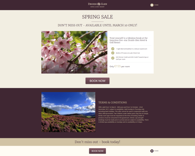
The bright spring image fits in perfectly with both their brand colors and their spring sale.
Keep your hero shot full of color, and reflect the feel of your hotel, whether that’s luxurious, a boutique, or built for families.
3. The Benefits
Your potential guest probably doesn’t care about your hotel… yet. You haven’t had the chance to win their loyalty yet. They don’t care about how fancy your gardens are, or that you have a 5 star rating that you and your staff work hard to maintain.
Your guests care about how your hotel and its features will benefit them.
It’s important to use words that highlight the perks and pluses of booking with you.
One simple way to ensure that your landing page is more benefit driven is to use the “so what?” test. Simply read through any statements or features about your hotel and ask, “so what?”
Let’s say your hotel landing page makes the following statements:
- Children’s play area
- Close to the sea
Here’s how they become more benefit-driven and pass the “so what?” test:
- Let your kids play safely while you spend time with your significant other.
- A beach right outside your door!
It doesn’t need to be complicated! Start by thinking about your visitor’s needs and how you meet them, then carry on from there.
4. Social Proof
If you’re not using social proof on your hotel landing pages, you’re missing out.
Social proof is extremely effective because, as humans, we care about what our friends and family think about us. People are also innately sceptical. This is even truer when making important decisions about accommodation and housing, and it’s easy for that scepticism to turn into a quick ‘no thanks’ when you’ve got the entire internet at your fingertips.
However, we’re more inclined to do something if other people are doing it – so tell your guests about all the happy customers you’ve had!
People might doubt the claims you make about your hotel, but they’re more inclined to believe an genuine-seeming testimonial from someone who has slept, ate, relaxed and lived in it.
Reviews and testimonials are powerful ways to use social proof on your hotel landing page. In 2014, a consumer study by BrightLocal.com showed that:
- 88% of consumers read reviews to judge local businesses
- 72% of consumers will act after reading a positive review
- 88% of consumers trust online reviews as much as personal recommendations
Here’s an example of a strong landing page with great social proof from WebDAM:
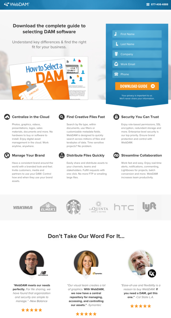
Source
This landing page uses client logos, actual pictures of their clients, reviews, and stars to overcome the natural objections we have when investing in something. For your hotel, consider asking guests for images to use with their reviews, display star ratings, and display the text of the review.
To get testimonials for your landing page, start by asking previous guests to put up a review on your site or elsewhere. You can even get more testimonials by offering small discounts on items at your hotel in exchange for some honest words.
5. Call To Action
Your landing pages should always include a highly visible button with a clear call to action on it. Everything on your landing page is designed to get people to do one thing: book!
The next step towards making a great landing page for your hotel, then, is to ensure that your call to action button stands out. Take a look at the landing page for the Perivolas resort below.
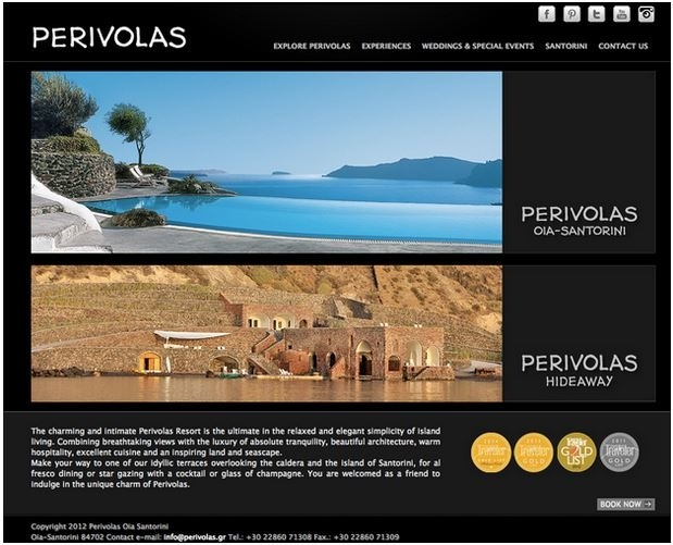
Can you spot what’s wrong with the call to action for the resort? Actually, can you even spot the call to action?
It’s small, grey – which doesn’t stand out with the black background and other grey elements on the page – and there are other links on the page, which diverts attention.
Happily, there are easy fixes for all of this! Here’s how to fix those call-to-action woes:
- Change the colour of your button
- Make your button more central
- Adjust the size of your button
- Tweak your call-to-action copy
To find the CTA button that works best for you, start testing. If your landing pages have enough traffic, you can test different sizes, colours and copy. When you hit gold, you’ll know, because simple tweaks will cause noticeable conversion spikes.
If your landing pages have lower traffic, don’t worry about A/B testing. However, if you’re running a long campaign, you can switch up the text every few weeks to see if that causes your bookings to jump.
Add urgency to your landing page
Putting urgency or scarcity cues on your page, especially near your ‘Book Now’ button, can help drive conversions. When we realize there’s less of something, we generally want it more – think of trying to resist taking the last cookie!

Yum
What’s the difference between urgency and scarcity? Ugrency is a time constraint, and scarcity is a numerical constraint.
To highlight urgency, you can display time constrains by telling the reader when the competition or offer will end. Some hotel marketers even add a live countdown timer which displays how much time is left to take part. Net Affinity offers Action Bars, tools that can be customized with a countdown, a calendar, or text. See one in action here.
Use Scarcity to drive more participants
Competitions often use scarcity to encourage entrants. In the copy, they make it clear that there will be only ‘4 lucky couples’ who will win, or say there are only 2 coupons available. This shows that the product is scarce and more people will want to take part.
You might have already noticed this on Amazon. When a product is scarce, they display the number of items left in stock in big red letters. People driven by fear of the product being gone, or envy, will want to buy it before somebody else does.

Final Checks
When you’ve gone through the above steps, there are two important final checks to make:
Do you have all the relevant information on the page?
Are there important start or end dates? What’s the price? Who is the target audience? How can they participate/book/sign up?
Check and make sure your hotel’s branding is present and clearly visible, your top benefits are highlighted, and you have some form of social proof.
Does your landing page look good on mobile?
This is one it’s easy to overlook if you’re in a rush to launch. However, even the best responsive landing pages sometimes need a bit of tweaking.
To look for problems that aren’t obvious on desktop, make sure you check out your landing page on phones and tablets before you click ‘go’ on your campaign. Much of your campaign traffic will likely come through mobile. Be prepared.
Guide users through a responsive booking engine
Whether your users are on desktop or mobile, there should be an accessible, easily navigated booking engine for them to use.
If your booking engine isn’t up to scratch, you risk losing your users as soon as they try to make a booking.
Your booking engine provider should provide a clean, simple solution for both desktop and mobile devices. This benefits not only traffic from your landing pages, but all the traffic on your site. If you truly wish to drive direct bookings, your booking engine needs to be as intuitive as one they’d find on a big OTA or third party site.
Don’t dump users in too late in the booking process!
Net Affinity data shows that landing users on a page on your main website, rather than in your booking engine, increases conversion rate strongly.
Users are more likely to simply bounce out of your website if the first thing they see is a page in your booking engine.
Here’s the equivalent: imagine clicking on a shoe ad and being taken to a checkout page with the shoe already in your cart. You didn’t get to check out the different colors, look at other shoes from the seller, or even decide if you were sure you wanted them!
You want to be clear and direct in your message to visitors, but you don’t want them to feel forced into deciding.
A landing page is the perfect compromise. It sends only the message you want (instead of all the distracting messages on your homepage), it’s exactly what guests want to see (because they clicked on the ad), and it leaves the door open to either book, come back later, or leave.
Conclusion
Used properly, landing pages send the right message to the right person at the right time.
They help convert paid traffic into direct bookings.
Instead of simply dropping your carefully-acquired paid traffic onto your website’s homepage, you’ll bring them to pages with a single message for a single campaign. Focus your efforts where they’re likely to succeed.
Does your hotel use landing pages? Which do’s and don’t’s are you ticking off the list above?
Words By Taylor Smariga