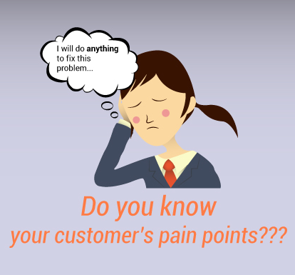
Heat maps help solve invisible problems on your hotel website. We call these problems ‘pain points,’ and every website has them. What exactly are they, though?
The ‘pain points’ you can’t see are the kind that can really get in your way when it comes to conversion rates. These are the subconscious biases that either propelled them deeper into your hotel website, or forced them to click the back button – and they can be just as important as the obvious problems. An invisible pain point might be a CTA that’s unclear, or even something like a banner being on the right of a page instead of the left. Before, we had to rely on guesswork and intuition to solve these problems. Today, though, we have tools like heat maps.
(Image source)

What are heat maps good for?
Research and analytics are instrumental for improving bookings. They help you track visitor behavior. Trying to boost bookings without them is like trying to go on a trip without a guide: you’ll still see the same things, but without any context or clues to let you know why they’re important.
The problem, though, is most hoteliers will often rely on just Google Analytics, surveys, and questionnaires. These are all great tools: they tell you about how visitors behave on your site and give you valuable insight.
However, they don’t show visitor activity the way heat maps can.
What are Heat Maps?
What are heat maps, exactly? Heat maps can work in a few different ways. They can track the movement of a mouse across your webpage, they can reflect where your visitors have clicked, or they can reflect how far a user has scrolled down a page. There are a few other ways heat maps can work, and there are different schools of thought on which ways are the most accurate.
Essentially, every type of heat map is trying to reflect where your visitor’s attention is on the page. Unlike Google Analytics, heat maps can show:
- Whether or not people are scrolling all the way down and consuming your content
- The exact links, words, or buttons people click on a given page
- The most popular portions of your webpage
This makes them powerful tools for fixing hard-to-spot pain points, reducing friction, and boosting hotel website usability. In today’s post, we’ll go over the importance of heat maps for improving usability. We’ll also break down a few heat map studies to give you actionable takeaways to convert more visitors into guests.
Let’s go.
Why are Heat Maps Important? Capture Last Minute Bookings
“34% of marketers selected visual assets as their most important content.” (Social Media Examiner)
(Image source)
What can heat maps help you with, in practical terms? Well, one thing they can help with is capturing last minute bookings.
According to research by the travel marketing firm Sojern, those last minute bookings are key for nearly every hotel.
Their research revealed that same day bookings accounted for 29% of hotel bookings in the fourth quarter in 2013. According to Statisticbrain, out of 148.3 million bookings, 65% of them are same day mobile bookings.
Heat maps can help hoteliers capture more of these last minute bookings.
A neuroscience study by Caltech found that when in a rush, distracted, or making decisions at a rapid pace – the way many people are when they’re making a last minute booking – visuals influence buying behaviour more than consumer preferences. The more rushed or distracted the individual, the greater the impact of visuals.
Think about how you can make information easier to spot for rushed visitors. What information do you absolutely want them to know? What will help them make a decision quickly? For example, you could use contrasting colors or visual cues to draw attention to copy or CTA.
Heat maps give you the clues you need to strongly optimise your web pages for those last minute booking. They can tell you where your guests are paying attention, and where you’re losing focus.
As you can imagine, heat maps are useful across a whole spectrum of conversion optimisation activities, not just when optimising for last minute bookings. What aspects of your website and your dynamic conversion funnel might be improved by heat mapping?
Now, let’s look at results from a few of the most comprehensive heat maps studies to give you an idea of what this tool can do for you.
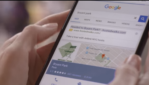
Guests Are Likely to Pay More Attention to Content Above the Fold

(Image source)
A common conversion question asked is: Do people scroll? In other words, is what you can fit ‘above the fold’ of the page the be-all and end-all?
An example of content above the fold in Google’s search results, courtesy of marketingsherpa
The short answer is that they do scroll. But, of course, there’s more to it than that. Heat map research by ClickTale of 80,000+ page views from thousands of websites shows that people scroll, but their attention spans take a nosedive right after. The study revealed that:
- 76% of pages with a scroll bar were scrolled at least some
- Visitor attention peaked at both the top and the bottom of the page, and otherwise decreased exponentially as they scrolled down
People have limited attention spans and are in a rush to find what they want, which is why you’ll get some visitors who don’t scroll at all. Why does viewing time jump up again at the bottom of the page, though?
This second burst of attention might be thanks to a psychological effect known as the serial position effect. The serial position effect states that people pay more attention to the beginning and the end of something – not the middle.
So when a guest lands on your site, remember that most of their time and attention will be on content above the fold. Make sure it hooks them!
Structure your content appropriately by considering the following:
- What are your guests’ primary concerns when clicking on to your site?
- How does the information placed above your fold (right now) address those concerns?
- How can you make above the fold content compelling enough for them to click or scroll down?
Use the Left Hand Side of Your Page Wisely
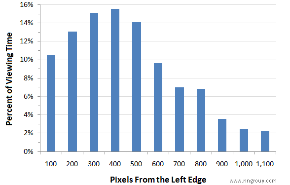
(Image source)
“Web users spend 69% of their time viewing the left half of the page and 30% viewing the right half. A conventional layout is thus more likely to make sites profitable.” (NNGroup)
As it turns out, people pay significantly more attention to the left side of a webpage.
This study found the left side of a website snatches 69% of the viewing time.
In a heat map case study by DennisPublisher.com, switching a Google ad from the right side of the page to the left (despite Google warning against the left) boosted click-through rates by 74.5% and revenue by 48%.
Try moving important elements like links, copy, or CTAs to the left side of the page and gauge the impact on your site.
Conclusion
Remember, you can’t cut and paste results of other websites. Your visitors’ needs will be tailored to your hotel, and your hotel site should be tailored to them.
Be sure to run heat maps on your own hotel website before making changes, and make sure you have enough results to be statistically significant. A good rule of thumb is 2000-3000 pageviews (counted separately for web and mobile), so don’t think you’ll be able to get actionable results in the first few days.
When analysing your heat map results, look out for where visitors spend more attention. Focus on where they click, where they scroll, and where they stop.
To summarize, strategize what content should be above the fold, use heat maps to find out which portions of your page attract the most attention, make emails scannable, and guide last minute bookings with deliberate visuals.
Are heat maps a part of your marketing strategy? If not, why? Let us know how you feel about heat maps in the comments.