Direct bookings are unarguably more profitable than bookings through third parties. Study after study has shown the benefits of convincing guests to book direct on your brand.com website. The difficulty, of course, is reaching guests and persuading them that direct is best. OTAs have massive marketing budgets and cutting edge research, and there’s no denying that they’re convenient. So, what do you need to do to persuade guests to book direct – and what mistakes are you making?
If you’ve got strong ads with tempting special offers up, plus dedicated landing pages, that’s a great start. However, what if you’re still not getting the bookings you’re looking for after all that effort? You might have a few serious leaks in your conversion funnel.
Creating a bounce-proof conversion funnel is an impossible dream, but you can certainly make yours bounce-resistant. In some cases, it’s about recognizing that your hotel website is a touchpoint at many different stages of booking: guests might look at it while they’re dreaming about a vacation, visit again when they’re doing research and comparing options, and stop by again when they’re finally ready to book.
Your website needs to be ready for every possibility.
Today we’ll cover 4 of the most common conversion-killers that are costing you your direct bookings, and more importantly, we’ll show you how to avoid them. We’re going to talk about:
- Remarketing
- Optimising Images
- Social Proof
- The Paradox of Choice
Let’s get started.
1. You’re not Remarketing
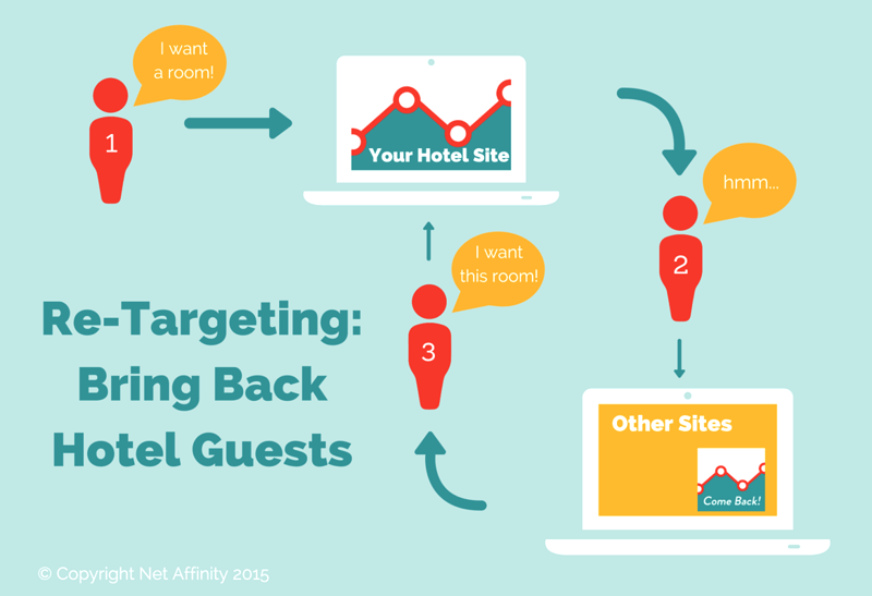
If you’re not remarketing to website visitors, you’re missing a valuable opportunity to scoop up guests who were uncertain or distracted mid-booking.
Remarketing is simply using web technology, like a cookie on your site, to target email or ad campaigns at users who’ve shown interest in your product or services.
For hoteliers, this means following up with potential guests who arrive at your site and express partial interest. Usually they do this by giving you their email addresses or initiating the booking process, but not following through.
You can remarket through social campaigns, paid ads on search engines like Google and via email. Email is the channel with the highest rate of return – if you’ve got their email address, they’re usually at least considering booking. However, you’ll reach a smaller audience if you aren’t using paid campaigns on social or search engines.
Hotel Urbano, an online travel agency, received a 38% higher return on ad spend and drove “415% more revenue with only a 304% larger investment” through remarketing.
Loews Hotels reported a $60,000 boost in revenue from a small $800 dollars invested. Remarketing was one of their “biggest successes,” and according to their team, it lead to a far greater number of direct bookings for their hotel.
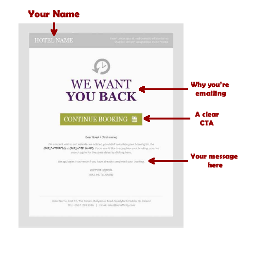
Net Affinity have noted that remarketing to those that have abandoned bookings can push a huge number of conversions—here’s an example of our e-zine remarketing:
This email can be sent hours or a day after a guest fails to complete a booking, asking guests if they’ve forgotten or if they’re ready to make their booking now. It might also offer a discount or further incentive, and highlight the benefits of booking direct.
Remarketing is a powerful way to snag more bookings from your hotel website.
Be sure to request emails early in the booking process to capture more leads. If visitors abandon the process, you can follow up with email remarketing campaigns that include promotions or special offers based on a customer’s activity in the booking process. For example, if they spent a lot of time on your spa pages, you have the option of sending them spa-based promotions.
2. Your Images are Old or Unflattering
When you’re buying something online, images are one of the most important parts of your decision. Guests won’t get to see your hotel before they arrive, so the images you put on your hotel website are the only chance you have to form a good visual impression.
You aren’t going to sway them to act with promises and words alone. They want to see what you’re offering them, and images are a great way to show them what to expect.
Images are scrutinized by visitors and are proven to boost time spent on site.
To get the maximum ROI from your images, focus on these things:
- Make sure your images are responsive. 30% of traffic to tourism and travel sites comes from smartphones
- Have your photographs taken by a professional
- Make sure your photos reflect your hotel’s personality
- Ensure that your images don’t reduce page loading speed. Slow loading speeds fracture conversions.
- Check that your image complements your call to action and draws attention to it, instead of competing against it.
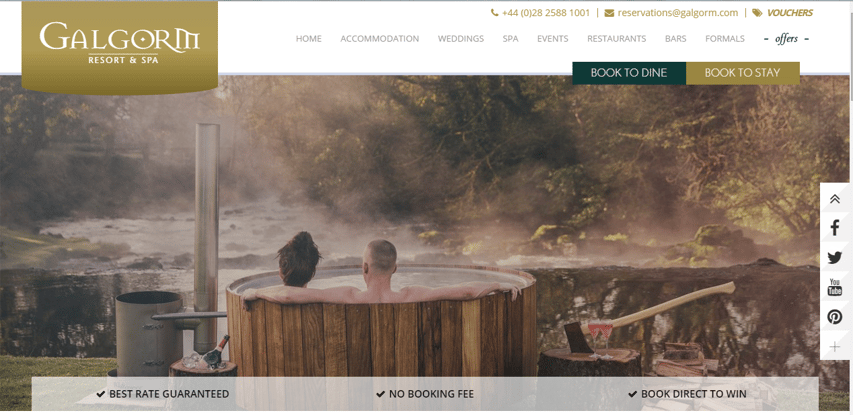
The Galgorm Resort does a nice job of using images on their site:
They have high quality, inviting images that don’t sacrifice loading speed. Their images convey the atmosphere of their resort and load well on mobile.
Here’s another example from Brook Lane Hotel:
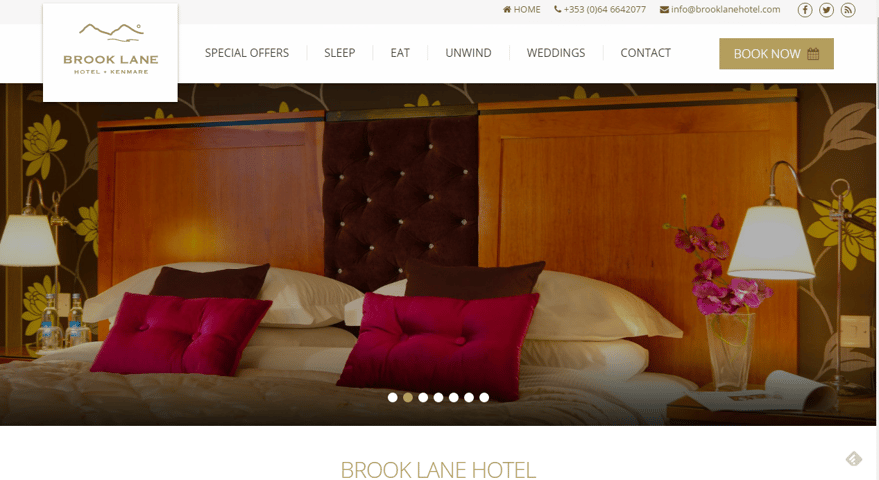
The color scheme is gorgeous; the images have a fast loading speed and are high quality. But more importantly, they capture the luxurious, personable experience the 4 star boutique hotel aims to create.
3. You’re Offering Claims without Proof
Expecting potential guests to believe your every claim without proof will hurt your conversions. Your guests are bombarded by ads and marketing messages. They’re constantly being sold to, and they shop smart. You can’t expect to make a claim and think they’ll just believe you.
However, reviews and testimonials are a different story.
Reviews, testimonials, and other forms of social proof are effective conversion boosters, because as humans, we care greatly about what others think of us. We’re more likely to do something if everyone else is doing it. This tendency is why sites like Yelp and TripAdvisor thrive.
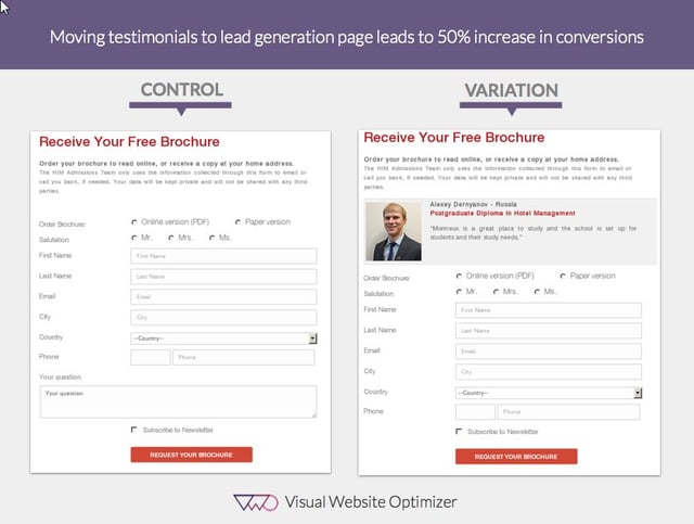
When the Hotel Institute Montreux placed a testimonial on their landing page, they lifted conversions up by a large 50%.
Image from vwo
When it comes to enhancing conversions with social proof, reviews are also effective tools for hotel websites.
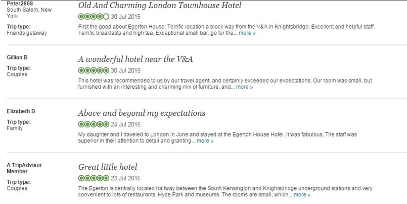
Take a look at these reviews from Egerton House Hotel:
They work well because:
- Each review tackles one main point. The reviews cover atmosphere, location, customer service and convenience, but no one review tackles all of them and there isn’t too much overlap.
- They give information on the reviewer. Information on each reviewer is provided on the left, detailing the type of trip and the name. This helps the reader match a person to the words and adds authenticity to the reviews.
- The reviews are recent. This adds to the credibility of the reviews and makes them more believable.
4. You’re Giving Guests Too Many Choices – Really!
A famous New York Times case study tested the influence of choices on buying decisions.
The test was carried out on two different Saturdays and had some interesting results. The first Saturday, 24 different flavors of jam were offered to participants. The next Saturday, only 6 different flavours were offered.
On the day with 24 different flavors, only 3% of people actually bought anything.
On the day with 6 flavors, however, 30% of people made purchases. This resulted in 600% more jam sold.
Too much choice can hurt conversions. This is called the Paradox of Choice, and it’s one of the most well-known theories in modern psychology. While autonomy and the freedom to choose are essential to happiness, being bombarded by hundreds of decisions a day adds stress and can paralyze decision-making. There’s a sweet spot in the middle, and that’s what you should be aiming for.
Hoteliers may be tempted to show multiple room types, multiple offers, packages and rates, all of which is sometimes presented as one overwhelming list. This typically creates an unpleasant experience for the person trying to book and increases anxiety.
To prevent your site from overwhelming your guests, make the booking process more digestible.
You can do this by:
1. Reducing add-ons in the booking process
Data shows that only 3% of guests actually purchase add-ons, and a huge list of add-ons isn’t worth the potential confusion it can cause in the booking process.
Does this mean you shouldn’t use add-ons? Nope!
You can limit use of add-ons, or use them later in the booking process to lighten the load.
2. Create Smaller, Digestible Steps
Speedy, short sentences and punchy paragraphs are easier to read than articles with huge chunks of text and page-long paragraphs.
Shorter sentences and paragraphs make you feel like you’re progressing, and you felt quicker doses of gratification when completing sentences and paragraphs faster.
Well, one way to make your booking process more digestible and less likely to overwhelm potential guests is to break things up and make them shorter.
Instead of chunking multiple parts of the booking process together, let your guest select the room first, then the packages, then the add-ons, etc. A well-designed booking engine is the bedrock beneath your book direct strategy.
Conclusion
To summarize: Be sure to remarket to hotel site visitors, optimize your use of images, show what others say about your hotel, and aim to make the booking process as frictionless as possible. These 4 things have been shown to be vital to conversion rates, and making use of all of them can give your direct bookings a big lift.
Need help implementing the advice above? Get in touch with us and find out how we can help you.
