A Toluna survey of over 2,000 consumers discovered that 53% of people found and booked their holiday online. Another 30% researched online first, and then booked their reservations offline. This means over 80% of potential guests research their hotel and travel options online.
That research shows that the stronger your hotel’s online presence is, the better your hotel’s business will be.
How do you go about making that presence stronger? To solidify your online presence, you need a stellar hotel website that’s capable of converting curious visitors into galvanized guests.
So below are 5 essential ingredients for a high converting hotel website that piques potential guests’ interest, overcomes objections, and fills up rooms.
Let’s go.
1. Reviews That Breed Trust
Reviews are an absolute must for any highly converting hotel website.
This is because, unfortunately, 75% of people don’t believe that companies tell the truth. However, 87% of people feel more confident in their decisions when they read reviews. Even better, over 95% say they find the reviews’ portrayal “accurate of the actual experience.”
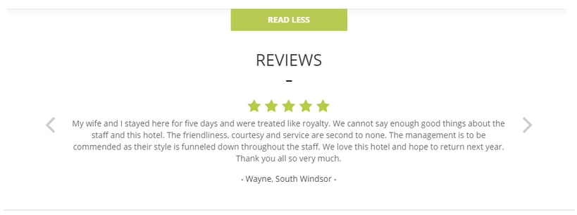
Look at your reviews. Do they have an easy-to-read format with the kind of information your guests will be looking for? Here’s an example from Net Affinity to get you started:
2. Landing Pages That Sparkle
80% of search traffic is sent to the company homepage.
This can be a big conversion-killer. Your homepage may be fantastically laid out and full of beautiful images, but ultimately it just isn’t targeted enough. Home pages are trying to appeal to all your potential guests: that’s their job!
Landing pages, on the other hand, are specifically targeted to segments of your customers. You can have a landing package for a specific vacation package, another for an over-55 offer, and another one inviting people going to a nearby concert to book their stay at your hotel.
Directing traffic to a powerful landing page grounds your hotel website. It’s what captures your potential guests’ curiosity, grabs their attention, and gets your visitor to book while their interest is hot.
Software company Axway boosted ROI by 291%, and saved $100,000 per year by customising and improving their landing pages.
When testing landing pages against generic webpages, Dell has seen conversion increases as high as 300%.
Looking for more info on making your landing pages sparkle? Check out our detailed guide here.
3. An Intuitive Design
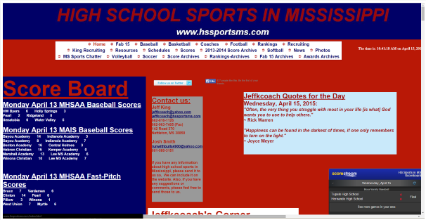
Here’s a site from an article written to tell designers what not to do:
The site does a few things wrong, but the main mistakes are:
- The text is incredibly small and close together
- The page is incredibly busy
- There’s no sense of direction
- There’s nothing intuitive about the layout
When it comes to your hotel website, you want to avoid these mistakes at all costs.
An effective hotel site will always have the end goal in mind. It adapts to the decision-making process of potential guests. You want to let your guests browse instinctively, without mental strain.
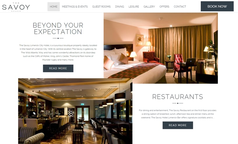
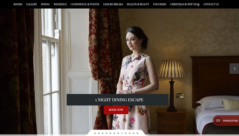
An example of this comes from the Savoy Limerick Hotel:
Here’s what they’ve done right:
- There’s plenty of whitespace, which reduces visual strain and makes content easier to consume
- Their navigation bar stands out, but doesn’t distract or cause friction
- They use contrasting colours to make their links and “Book Now” CTA button stand out
Basically, their site is intuitive.
- A Winning Value Proposition
There’s one thing that all hotel websites (and business websites) need, but many don’t have:
A clear value proposition.
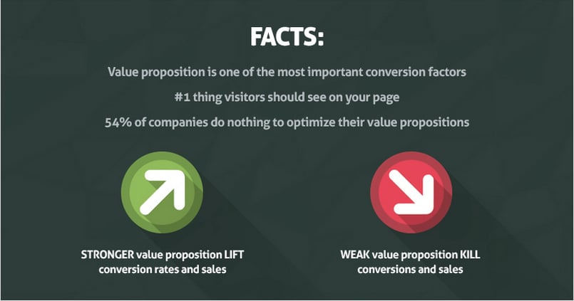
“Value proposition is the #1 thing that determines whether people will bother reading more about your product or hit the back button.” Peep Laja, Conversion XL.
A value proposition is the promise of value. It’s the reason why people will choose you over your competitors. In it’s essentials, your value proposition is a statement that:
- Shows how your product/service solves pains, fulfills needs, and makes things better
- Explains how you’re different from the competition and why you’re the best choice
- Tells the specifics of how people will benefit from your product/service
Crafting a winning value proposition isn’t a quick fix. It requires serious reflection about your hotel, your potential guests, and your competitors.
Despite the effort, it’s definitely worth it.
When hotel Jamaica Inn spiked their revenue by over 50%, guess what their first step was?
Creating a better value proposition.
And when online bedroom product retailer Down & Feather.co wanted to ramp up conversions, they strengthened their value proposition and received a shocking conversion boost…
Boosting the clarity, visibility and relevancy of their value proposition bumped conversion rates up by 145%.
To craft a value proposition that snags you more bookings, start with your customer persona, and ask yourself:
What makes repeat guests come back for more?
This will help you spot patterns and trends quicker.
Is your hotel value proposition clear?
Your guest needs to understand what you say before he can believe it.
Can your visitor quickly grasp your value proposition?
Your guest shouldn’t have to perform tedious mental gymnastics to understand you.
5. Story Driven Images
In the 1990s, Italian neuro-psychologists were studying the motor neuron activities of Macaque monkeys. By implanting electrodes on the monkey’s brain, they observed which areas of the brain activated when performing different actions.
One day, while reaching for his lunch, unusual monitor activity caught the attention of a researcher:
The area of the monkey’s brain that would normally react to reaching out for food–the ventral premotor cortex–fired up.
But the monkey wasn’t doing anything. He was just watching the researcher reach for his food.
This was a great find for the scientific community. It was direct evidence that we do not always use logical thought to process or predict other people’s actions. Instead–as later studies revealed–we feel them through mirror neurons.
So why are we telling you this?
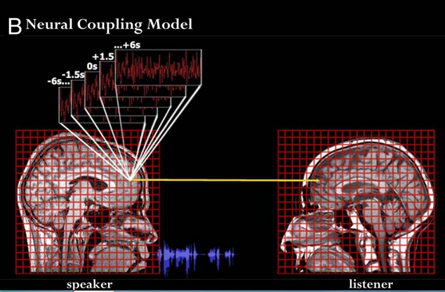
Stories pack a hefty emotional punch that makes them more “mentally sticky” than plain facts and statements. Essentially, our minds light up and respond – emotionally, intelligently, empathetically and otherwise – when we read fiction, watch movies or otherwise consume stories. That means that stories can have an effect similar to the triggering of mirror neurons.
(When narrating a story, speaker and listener brain activity is the same)
When you consider that 67% of consumers consider clear, detailed images to be very important and carry more weight than the product information and customer ratings, having a strong visual story is a no brainer.
To tell enticing visual stories that guests remember…
- Ensure that your images are relevant to your value proposition. Improving image relevancy can boost conversions by up to 18%.
- Use high quality images that have a fast load time.
- Ditch the cheesy stock photos and use images of real people.
- Make your images self-persuasive. Don’t just throw up an image of your spa or beach without thinking. Ask yourself how your image can get your potential guest to feel like he’s having a blast at your spa or beach.
Conclusion
The 5 ingredients mentioned above are essential for a hotel site that generates bookings.
With that in mind, how do you know if your images tell a meaningful story? How do you know if your value proposition is persuasive? How do you know where potential guests are struggling on your site?
The key is testing.
By constantly testing, you remove guesswork from the equation. With data on your side, you’re able to scientifically squeeze more ROI out of your hotel site.
What do you think makes for a hotel website that converts like crazy? Tell us in the comments below.
