Almost two out of five mobile shoppers have abandoned a travel booking on a mobile device due to poor user experience. This figure comes as part of a study by US-based Jumio, which estimates that in the UK alone £2.7 billion in the travel industry was lost in 2014 after consumers failed to complete a booking – and, unfortunately, things are improving only slowly.
Usability is one of the core problems facing hotels and users alike. One third of visitors report that apps or mobile sites are too slow to load. Navigation and payment process were also featured as reasons for abandonment, with screen size issues blamed by 21%.
If mobile weren’t such a strong and growing channel, mobile cart abandonment might be a minor issue. However, with mobile traffic surpassing desktop for many hotels, it’s anything but minor. As of December 2016, our clients see 58% of their traffic on average coming from mobile. However, desktop is still strongly ahead on revenue and transactions. According to Unbxd, across all online retailers and 500 million web sessions, mobile gets 63% fewer conversions than desktop.
So how do you ensure you’re giving users the best mobile experience to maximise conversion?
Here are our mobile experts’ top 6 tips to reduce mobile cart abandonment!
1. Transparent Pricing
A 2016 Sales Cycle study found that 53% of travel bookings are abandoned when the full price is only revealed at the end of the booking process. When guests see all the add-ons and taxes included, they bolt. This is especially an issue for hotels that show their rates as per person sharing or per room per night for longer stay offers.
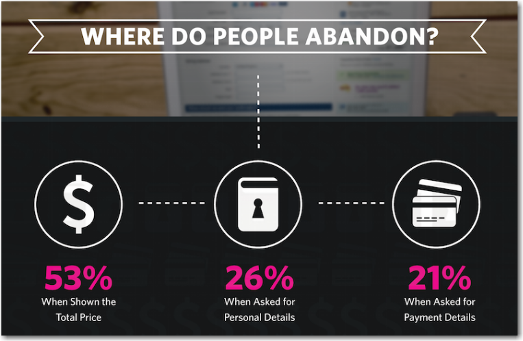
Source: Sales Cycle Study
Some recent analysis conducted by Net Affinity has shown that, while showing a per person rate initially draws more users into the booking funnel, there’s an alarming drop off once they see the full price. To convert more of your guests, show the full price up front.
The bottom line: The data indicates that a total stay rate should be shown up front on mobile to increase conversions and reduce mobile cart abandonment. You’ll lose a few users up front, but in the end more will book, and there won’t be any confusion or lack of trust over price issues.
2. Short Reservation Form
The constraints of mobile devices and the context of use – the actual conditions under which users are likely to be using their mobile, a.k.a. on the move and maybe in a moving vehicle – put strict limits on what you can expect users to do when they’re booking on mobile.
All mobile forms need to be as simple and straightforward as possible. Get rid of unnecessary elements to help users focus on the specific task. Reducing unnecessary distractions reduces mobile cart abandonment.
One obvious solution for hotels is to omit optional fields on the mobile reservation form. Do you really need the guest’s address? Is there an opportunity to get it when the guest checks in at the hotel? If you can, remove it from the form. It may be hindering your mobile conversions.
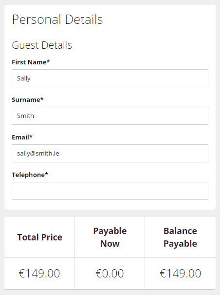
Net Affinity Mobile Reservation Form
3. Payment Process
Skyscanner, the travel booking site, saw mobile web bookings grow by 24% from 2014 to 2015, with mobile accounting for 42% of all conversions. On top of that, mobile visitors grew 60% in that time period, representing 59% of total visitors.
Mobile commerce is big business for the travel industry. However, mobile sites that don’t offer a quick and secure payment process are losing out. Typing in card details is a hassle on a traditional laptop or desktop keyboard – on a smaller mobile keyboard, it’s much worse. So what’s the solution?
One option comes from our benevolent technological overlords. Google and Apple are constantly developing their solutions for mobile payments. Google has recently announced the launch of Chrome 53 for Android. This new version brings support for Android Pay (their digital wallet solution), and will allow customers using Android Pay to make online mobile payments in just one click. However, since it’s a phased rollout, the update will not reach all users and regions at the same time. Adoption of digital wallets has also been slow to date in areas across Europe, but this is one to watch for coming years.
So what can hotels do right now to reduce mobile cart abandonment at the payment stage? One option is to consider removing booking deposits. Typically hotels don’t ask users to put down pre-payments when they book with online travel agents, so it may not make sense to offer the same option on the brand site.
However, the flip side of that coin is that users may be more likely to cancel if they don’t have a deposit on the line – weigh up the pros and cons. Also, review any terms and conditions at the payment stage to make sure they are absolutely clear to the user and aren’t hindering bookings.
4. Quick Loading Times
Mobile users want to browse quickly and buy quickly. If a mobile site is too slow to load, it’s going to push away a substantial base of your customers and cause mobile cart abandonment issues.
Every second really counts on mobile. 79% of web shoppers who have trouble with web site performance say they won’t return to the site to buy again. 44% of them would tell a friend if they had a poor experience shopping online.
When you’re designing your mobile site, be absolutely sure that the information on that site is 100% relevant. Make sure the imagery and video you’re using aren’t affecting site speed. Otherwise, you might be doing your site more harm than good.
5. Testing and Surveys
Google Analytics can help you to better understand how users flow through your site. Go to the ‘Behaviour Flow’ page in Google Analytics. At what point in the booking funnel are they leaving the site? When you know what pages you’re losing visitors at, you can examine those pages to try and find out what might be affecting their decision. Mobile cart abandonment is often hugely increased by one or two specific issues, like having too many rate plans loaded on mobile or not showing the full price up front.
Online usability testing is another option to take the guesswork out of the mix. Using these tools allows you to test precisely where your potential customers are experiencing friction. Companies like Hotjar provide options for heatmaps, scroll maps and user session video replays. If you take the data from these tests on board, they’re more than worth the investment.
Given most hotels’ traffic levels, A/B testing is not a feasible option. A/B testing, or split testing, requires huge amounts of traffic, and without that, the test isn’t statistically significance. How much traffic? Tools like this one from Evan Miller give a simple look, based on your conversion rate and how much of a change you want to be able to detect.
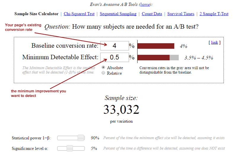
If you set the tool to calculate relative instead of absolute difference, that sample size jumps to 20 million per variation. A/B test simply require huge amounts of traffic, especially in industries that typically have smaller conversion rates and want to measure smaller changes.
However, a qualitative test could provide valuable insights for your business. Here are some possible options:
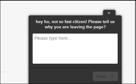
Option 1 – Exit Intent Poll in the booking process
Serve an exit intent poll to users who leave the booking process without having completed a booking.
Here’s an example from CitizenM:
Option 2 – Feedback Survey
This one is for users who have completed a booking in the last 7 days. Surveys can be delivered as exit intent pop ups on the booking confirmation page and via email.
Research shows that, to get the highest response rate, the survey should include no more than 7 open-ended questions and response rate can be improved by adding an incentive, e.g. a complimentary welcome drink on arrival. Based on the answers you get from qualitative research, website content should be reviewed and any potential issues addressed.
6. Remarketing
According to Boxever, more than 50% of travellers don’t have a set destination in mind when planning a trip. They’re browsing, price shopping or waiting for the right deal to jump out at them. So, even with the best user experience possible, many users will still abandon a cart mid-booking.
With this in mind, a strong remarketing strategy is vital for hotels. Use the essential remarketing trio: on screen prompts, email retargeting and paid remarketing.
On-screen prompts can be shown to users based on ‘exit intent’ or ‘page inactivity’. If a user attempts to exit the screen you can present a last minute prompt, and encourage them to remain in the booking funnel. Simply re-enforcing a ‘book direct’ message can keep people with the booking funnel and reduce mobile cart abandonment.
To get the most out of your email retargeting, it’s best to capture the email address as early in the booking process as possible. That way, if a guest does abandon, you can retarget them later.
The email you send should be personalised to the guest, mobile responsive and include the details of the abandoned basket. Make it as easy as possible for them to finish the transaction. Don’t forget to always use your property’s best imagery, and make sure the email is fully branded and professionally designed.
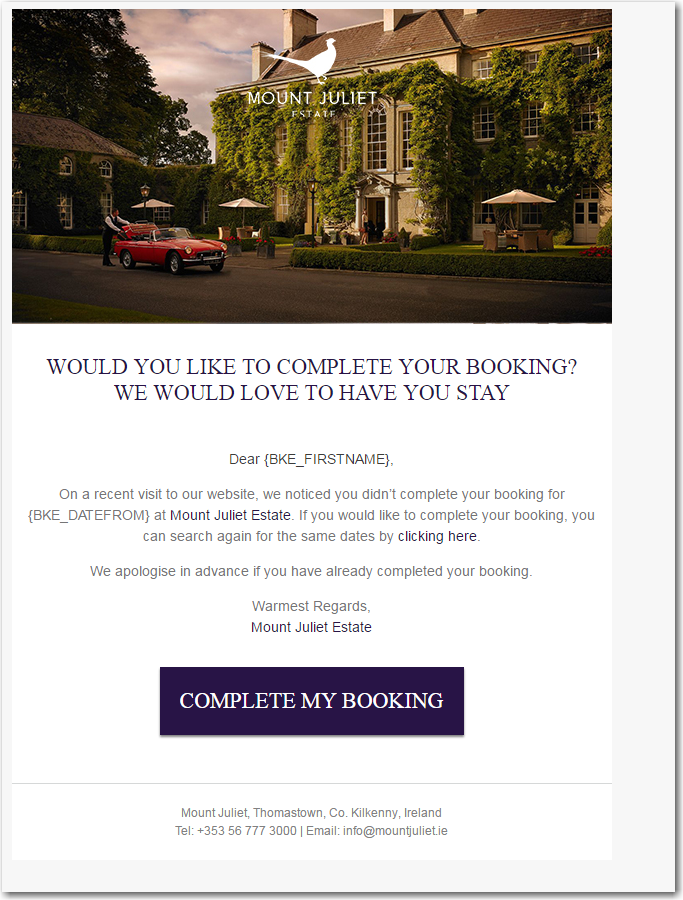
Send a retargeting email within the first hour of someone abandoning their cart. Don’t stop there, though! If the first email doesn’t convert the user, try again 24-28 hours later. Consider offering an incentive, like a discount or free breakfast, as a pull tactic. A max of two emails is recommended for retargeting.
Finally, paid remarketing works by following your leads around the web with related offers. Whether that’s on a social media site or on various websites across the internet, remarketing ads are designed to keep you first in the minds of your guests. Paid advertising platforms like Google and Facebook offer the ability to re-engage with these users, using either cookie lists or email identification.
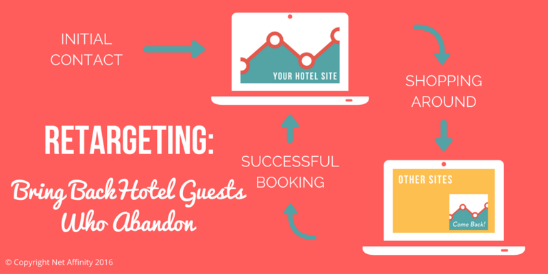
Just make sure to use frequency caps so users to see them too often and feeling harassed or followed. Our recommendation would be a maximum of 3 impressions a day.
Conclusion
These six tips are the first steps in a strategy to conquer mobile cart abandonment. Traffic on mobile is higher than ever, but desktops still generate more bookings. This is usually down to usability and trust issues – the 6 tips above are designed to fight those issues and get your mobile site the bookings it deserves.
Part of the lower conversion rate on mobile is due to psychological barriers and security concerns. More users today feel comfortable making smaller purchases on mobile, but prefer to make larger purchases like hotel rooms on desktop or even offline.
Mobile purchases lag desktop in terms of both ease and security. Almost two out of five mobile shoppers have abandoned a travel booking on a mobile device due to poor user experience. Players like Apple Pay, Android Pay and other mobile wallets are trying to change that, though, and they’re seeing success.
Getting mobile purchases to match mobile traffic is one of the great challenges of the next few years. When hotels and other online retailers start to see mobile conversion rates matching desktop, it will speak hugely to success they’ve had in creating a great mobile user experience.
What does you hotel do to persuade guests to book on mobile? Does it work? Share your best tips to reduce mobile cart abandonment with us below!
