
“Colors, like features, follow the changes of the emotions.” Pablo Picasso
As humans, we’re visual by nature. The fact that we can process images up to 60,000 times faster than words tells us this clearly.
It makes sense then, that colour plays a huge part in our perception of things and our overall decision making, in relation to purchases or otherwise.
While it’s important to keep nuances in mind (for example, different colours mean different things depending on the culture) and remember that colour alone won’t lock in a conversion, it plays a key role and should always be something you put time and consideration into. It’s such a big part of your brand and communications.
90% of snap judgments made about products can be based on color alone.
Not only this, but people may also buy things of a certain colour to try and be perceived a certain way, depending on the current connotations of that colour.
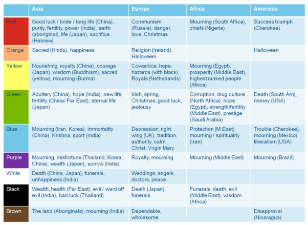
What colours mean depending on the country
What kind of influence does colour have over your guests’ decisions?
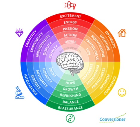
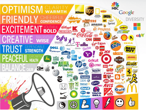
As a starting point, this colour chart gives us an idea as to how (in general terms), certain colours can help to define a brand personality or allude to its attributes, and how certain colours tend to make people feel.
Blue can symbolise trust, honesty, serenity.
Green can symbolise hope, growth, reassurance.
Yellow is known for symbolising optimism, friendliness, happiness.
Orange is uplifting, fun, rejuvinating.
Red is exciting, passionate, alludes to desire.
Purple is creative, alludes to quality, and can symbolise individuality.
Check out these brand’s chosen colours and decide for yourself whether they make sense.
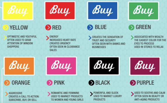
In the context of buying, here are some marketing ideas behind each colour:
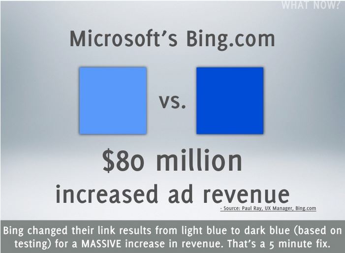
How has colour notably boosted conversion?
This case study from Bing showed their revenue springing up by $80 million after they changed the colour of a CTA from a lighter blue to a darker blue – the shade they changed to was ‘quite similar to the one used by Google.’
This case study from Content Verve also reinforces the value of colour:
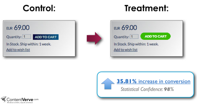
Changing their CTA colour from blue to green resulted in a 35.81% boost in their conversions.
Do what’s best for your brand
The case studies above highlight the conversion boosting power of colour, however the key thing to remember is that without staying to true to your brand and its personality, colour doesn’t have as much of an impact. Your optimum colours are dependent on your target market and your brand, what you want to convey everyday.
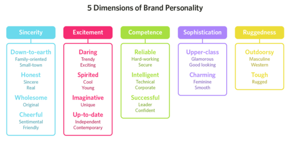
Psychologist and Stanford professor Jennifer Aaker has conducted studies on the topic of using the correct colours that support your brand personality. Her paper titled “Dimensions of Brand Personality” point out five core dimensions that play a role in your brand’s personality. Brands can sometimes overlap between two traits, but usually they are dominated by one.
How can colours affect your hotel conversions?
Before processing a word of copy or moving the cursor an inch, your guest will subconsciously form split-second decisions and opinions, based on visual content like image and color, about your hotel.
This means your colours need to:
- Compliment your brand
- Deliver the right message
- Draw attention to the right features (like your CTA)
You’ll convert more visitors into guests if you make a stronger first impression.
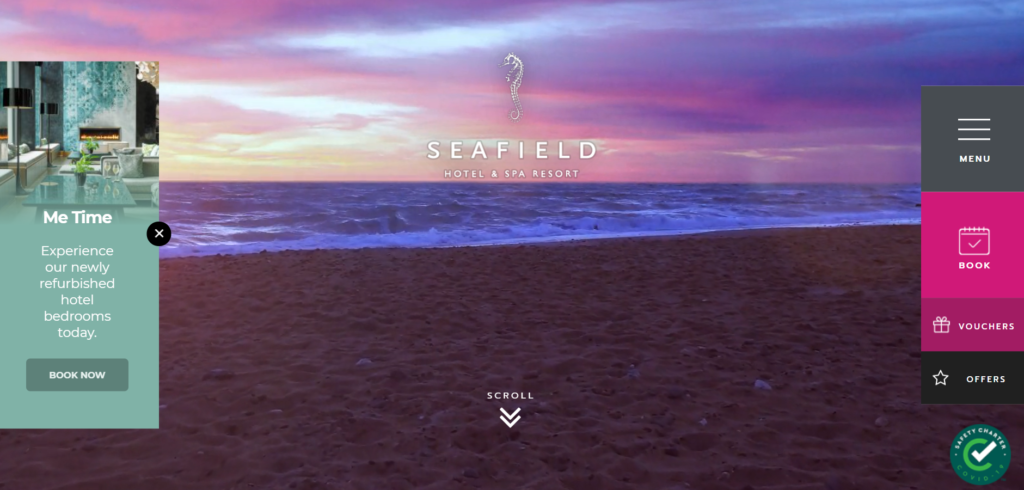
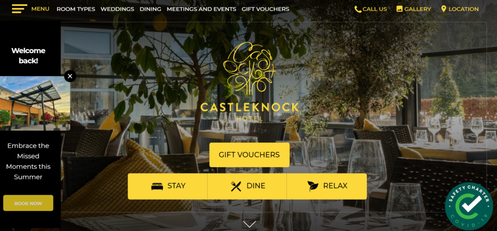
Here are some examples of hotels using colour correctly in relation to their brand and their brand personality.
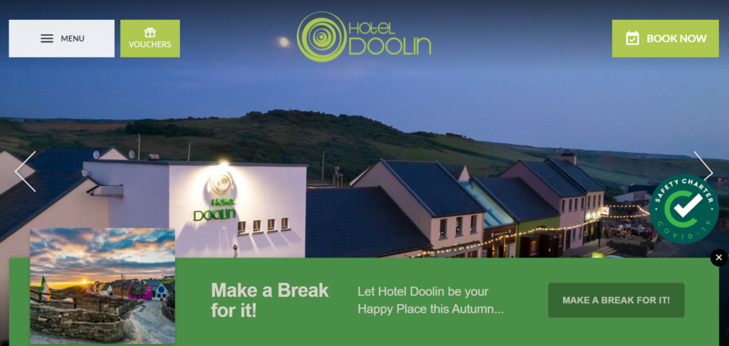
Splashes of yellow are seen as ‘fun, energetic and attention-grabbing’. It can increase confidence and feel inspirational.
Being aware of the power in colour
Using colour psychology to snag more bookings isn’t about “tricking” guests or preying on people’s emotions.
It’s about being fully aware of how your hotel brand’s colours convey the right mood and the right personality. It’s also about knowing how to use colours to amplify the message you’re trying to get across. It’s strategic knowledge.
Small tweaks here and there matter, and they can help hugely (keep Bing’s case study in mind).
You wouldn’t expect your hotel business to boom just because you upgraded 1 room or added a conference room, would you? It’s the cumulative effects of positive tweaks to your business that create a big impact.
Similarly when it comes to your hotel website conversions, colour psychology isn’t going to move mountains on its own, but it will play a huge part in the bigger picture.
Contact us at hello@netaffinity.com with any questions, we’d love to hear from you.
This blog was last updated in August 2021.