What’s the most important function of your hotel’s website design? It’s not the aesthetics. It’s not even, ultimately, what guests can learn about you from it. In the end, your hotel’s brand.com website is all about driving direct bookings.
You want potential guests browsing your site to complete the booking process, turn up at the front desk, and check-in. To do this, your site must have a design that is not only appealing, but highly converting.
While the aesthetics and content of your site matter, they’re only tools you’re using to drive conversions. It’s important to make sure they’re oriented to make guests take the steps you want them to take – direct bookings.
With that in mind, here are 5 design tactics helping hoteliers drive direct bookings:
1. Choose Between Responsive or Adaptive Design
As people have become more comfortable with making hotel reservations online, sales from mobile devices have soared. Net Affinity’s own data shows that in 2015, 58% of visits to hotel websites were made on mobile, and that number’s growing all the time.
For the travel industry as a whole, Criteo finds that airline and hotel mobile bookings made up 27% of all online bookings during the second quarter of 2016.
The facts above speak for themselves: your hotel site needs to be either responsive or adaptive (or you should consider a separate mobile site solution).
Making your site easy to navigate on all devices increases conversions, because guests can research and book from you with ease. Last minute bookings especially tend to be on mobile, so making mobile bookings as easy as possible is key.
What’s the difference between an adaptive and responsive design? Responsive sites ‘flow’ from one size screen to another. They hide elements and change layouts as needed (and specified in the code) for different devices.
Adaptive sites, however, use static layouts based on ‘breakpoints’ for different screens. So, for example, you might have one version of your site for large screens (desktops and laptops), one for tablets, and one for mobile. It’s common to create 3-6 different widths of your site.
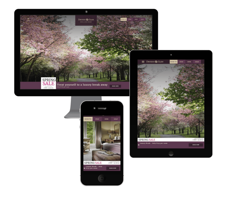
Below is an example of responsive hotel web design, as it might appear on a desktop, tablet and a mobile.
What are the pros and cons of each?
Adaptive
Advantages:
- Fast load time, as only necessary resources are loaded
- Only 1 site to manage
- Cohesive experience across all devices
- No device redirect (positive for load time)
- Easy to optimise because as devices shrink, sites can be optimised by removing features that slow load times
Disadvantages:
- High development costs for true adaptive design
Responsive
Advantages:
- Only 1 site to manage
- No device redirect (positive for load time)
- Cohesive experience across all devices
Disadvantages:
- Slow load time on mobile, as all resources are loaded for all devices
Note: Because responsive and adaptive are design choices rather than content choices, they don’t always account for different behavioural needs of mobile visitors. You must account for these needs regardless of which design you choose.
2. Simplify Navigation
Simple navigation is key to the guest journey. If they can’t find what they’re looking for on your site, your ‘virtual hotel’ won’t do the job it’s meant to.
The first thing to remember when you’re looking at your hotel website’s navigation is this: Navigation is a means to an end. The end, or goal, is for users to see your content.
Smashing Magazine puts it this way: “While content is supposed to be unique, surprising and exciting, navigating to it is supposed to be as simple and predictable as possible.”
In other words, there are plenty of other areas to show your creativity. Navigation isn’t one of them.
Before you start, make sure you’re looking at it from the user’s perspective. The goal is to make your site simple and straightforward to navigate for y our guests.
When you’re building your hotel website, start by creating a site map. This should be a structure of your website with the main navigation, the pages they lead to and any pages nested within these.
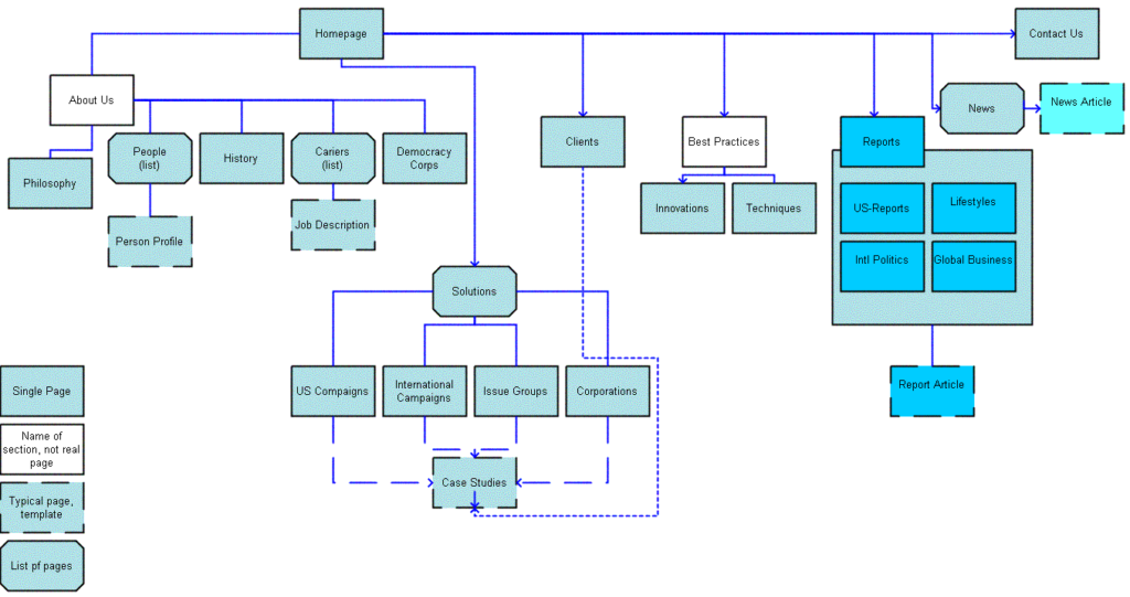
Image: Web Tuts
What what will visitors want to see first? Make a list of your most important sections. Try to stick to 7 or 8 as a maximum. You might include rooms, dining, spa, weddings, and events. Add or subtract items to these depending on your own hotel’s specific features.
Once you have those, it should be reasonably straightforward to figure out which pages will go “inside” those pages. For example, room types will be listed within your main rooms page. Menu pages will be linked to from your restaurant page.
Work with your web design team on this! Creating a site map that works for your users can be more trial and error than you’d like, and talking to an experienced team can help you get it right the first time.
After you have your intuitive, simple layout, it’s time to look at labels.
Keep it predictable. Call your restaurant page Restaurant, Food, or Dining. Avoid calling it Our Exquisite Edibles or something more obscure – while guests will probably figure it out, there’s no need to add the extra cognitive step!
The more mental ‘steps’ we have to take to get from A to B, the more confused, distractible and irritated we’re likely to be. That’s not a great frame of mind for making a booking.
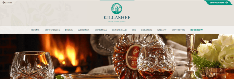
Here’s an example from Killashee Hotel of clean, clear hotel navigation:
The science of user experience is complicated, and once you have your navigation there’s a whole world of page layouts and other design choices to make. For example, people in the western world usually read from left to right and top to bottom. Contact pages are usually all the way to the right. The logo usually links to the homepage. The list is endless!
Don’t go it alone, and don’t feel the need to reinvent the wheel.
Whatever you decide, make sure you’ve got a professional designer (or a whole team of them) working with you every step of the way.
To sum up, focus on:
- Intuitive, simple site layout, keeping the users’ needs first
- Predictable labels for your pages
- Working with a good design team
3. Use Directional Cues
We tend to follow subconscious visual cues presented to us.
Numerous case studies have proven that visual cues, like arrows, lines, tunnel effects and even the direction a person is looking in are great for directing attention to specific elements on your website.
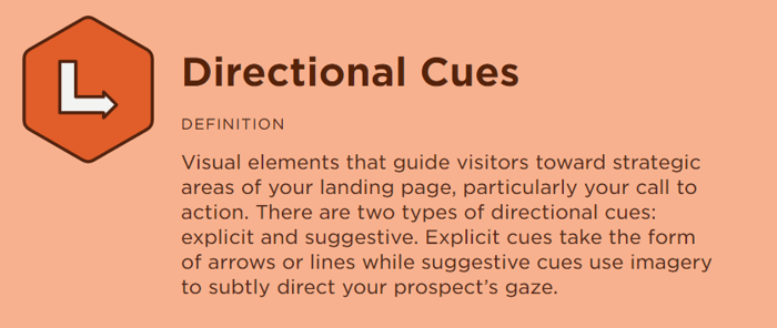
Source: Unbounce Glossary
Directional cues are a strong, effective way to draw more attention to your CTA, your copy, navigation bar or testimonials.
4. Make Your Call to Action Stand Out
Your call to action is one of the most important aspects in driving your bookings. How visible is it? How colorful? What text does it have on it? These factors can single-handedly spike or reduce conversions.
That’s why it’s important to make it as strong and prominent as possible on the page.
To ensure that your CTA draws attention:
- Use a color that stands out. It should contrast with the other colors on your page. To see how well it stands out, blur your eyes or walk way back from the screen. Is it clear what to click?
- Make your button look clickable. Give it a distinctive shape, and have enough space around it for it to stand out
- Make sure it’s a sensible size
- Experiment with visual cues: use A/B testing to find the best approach for your hotel
- Don’t use vague copy, invite your guest to take action
Looking for examples? Here’s 17.
5. Make Your Design Relevant To Your Hotel
- A case study from Strongview shows that increasing their emails’ relevancy to their target market boosted Cooking.com’s email open rates by 500%, and dropped their unsubscribe rates by 29%
- IDIO published another case study in which making relevant content for a health website boosted CTR by 32%, resulting in 55,000 more subscription sign-ups.
- In an article on call to action buttons, contentverve.com reveals that making their CTA copy more relevant to cutomers yielded over a 200% boost in conversions
Highly relevant images, copy, and overall design boosts conversions.
Faithlegg does a great job deploying a highly relevant design:
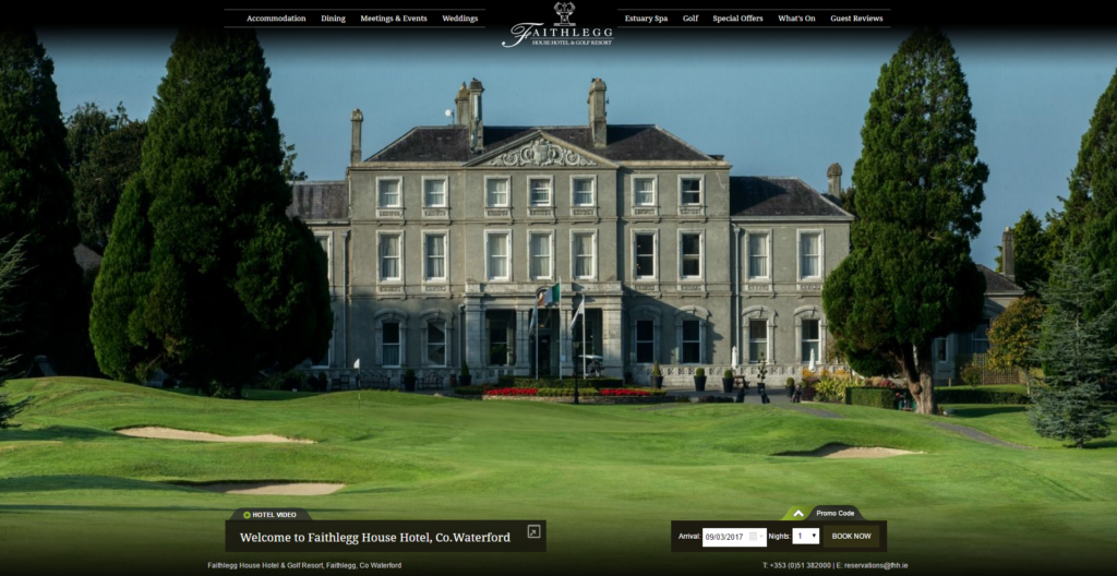
The color, images, and copy do a great job of inviting you to take a getaway at mansion in the countryside, which is a goal we can all get behind. Your website design should match your hotel’s atmosphere, whether that’s a cute B&B or a high-powered city hotel for business executives. Build your website for the guests you want.
To ensure that your design drives direct bookings:
- Ensure that you have a solid customer persona to work from
- Look at each element on your site. Ask yourself, does this clearly communicate what you’re about? Does it communicate it to the right customer?
- Read your copy without looking at images. Does it still paint an ideal picture to your ideal guest?
- Look at your images without reading copy. Do they broadcast the ideal message to your typical guest?
- Let your visitors do the talking. Test to see what converts better and optimize from there
To increase hotel bookings and site conversions, design is incredibly important. Your design must be simple, allow for swift navigation and communicate the right message to the right potential guests.
Are you looking to revamp your hotel website design for better conversions? Get in touch with us. Our award-winning team can help power up your hotel design for more bookings.