
We sat down for a chat with Dave Kearney, head of design at Net Affinity. Dave believes that the future of web design lies in adaptiveness.
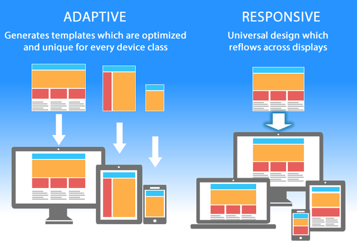
“Adaptive design is the trend. It’s certainly not the be-all and end-all, but from a commercial and conversion perspective, it’s where the future is.”
Responsive design—one layout that fluidly changes depending on the size of your screen—was a solution that came from the spiraling costs of maintaining and managing multiple sites, Dave explains. He doesn’t deny the importance of responsiveness, saying it “has its place,” but believes that from a conversion point of view it “can be a let down.”
Today, the needs of each type of device user are becoming so specific that responsive design alone simply isn’t tailored enough to service these needs.
Instead, Dave tells us, the way forward in the long run will come from adaptive design, where there are “several distinct layouts” for multiple screen sizes—different templates for each device, each the correct size. Each template is built for the distinct needs of that device, whether it be your phone, your tablet or your desktop.
This gets rid of the problems responsive design brings with it, like trying to load desktop-size images on your tiny phone screen. We’ve all run into the problem of a mobile site that’s cripplingly slow and overcrowded, even if it’s technically responsive.
Here are three reasons adaptiveness is the future:
- The amount of information downloaded on the user end is different, which makes adaptive sites faster and more efficient for visitors
- It makes sense to have as strong a mobile site as possible with the rising importance of mobile in hotel bookings. Adaptiveness ensures that nothing ‘breaks’ in the transition between desktop and mobile, because they’re on different templates.
- Adaptive sites are stronger from a conversion perspective: they offer more control when considering changes, and you can think about how individual device users engage with your site.
About the Designer
Dave is perfectly placed to know the answer to a big-picture question like that. Hailing from Dublin, he has a Bachelor of Design (B.Des.) in Multimedia Studies, Design & Visual Communications, Video Editing & Motion Graphics and an M.A. in Digital Media Studies and Technologies from the Dublin Institute of Technology on top of that. Along with his host of degrees, before he came to Net Affinity, Dave worked as a web designer for Media One with clients like Eircom, RTÉ, Bulmers and similarly high-profile companies.
Where did his interest in web design, that place where left brain meets right brain, come from?
Dave moved to County Meath at a young age, and said he spent most of his time in secondary school either working on his art – painting, drawing and illustration – or on a farm. After finishing secondary school, Dave did a portfolio course to fine-tune his skills and also worked in England for an art transportation company. At that point, all signs pointed towards him going into fine art.

However, talking to a few of his co-workers with fine art degrees as he drove and hung famous paintings all across the UK convinced him that web design was where his future was. When he finished his bachelor’s degree in 2003, Dave described the internet as still being in its infancy, but says there was “a spark there” that he was interested in being part of.
Ultimately, Dave made the move to Net Affinity to be part of a company focused on bespoke design, with project flexibility and room to stretch his creative muscles.
Trends in Conversion-Focused Design: Past and Present
For Dave, conversion-focused website design is fundamentally about composition and communication of the message, and the only limits are those imposed by the software, the hardware and, in some cases, common sense.
Talking about common sense, Dave tells us that in the early ‘00s, the cutting edge of web design was “all about Flash.” You know, that thing Adobe is constantly telling you to update or install.

Flash can do some amazing things today, but in its earlier form it was time consuming to code, resource-heavy, and there were some interesting – if headache-inducing – experimental 3D websites that it’s probably okay not to miss. Another problem with having a website based on Flash is that not everyone has the tech to support it, and it doesn’t work on mobile devices.
Flash is controversial at best. With mobile as the rising star in the world of hotel websites and online bookings, the world of responsive design can gladly leave Flash behind.
Conversion-Centred Design Today
Dave says that today, the world of web design is in a back to the basics period: think of some of the most sleek, beautiful hotel sites you’ve seen in the last few years. What do they look like? (in case you’re looking for ideas, Dave led the team on the award-winning Fitzwilliam Dublin site) Dave cites the Bauhaus German school of design when he talks about grid-based, flat, simple design.
Flashing neon titles for your pages are out. Simple, clear design is in. When you think about how to give your hotel a facelift, think about where form meets function, not about how to overwhelm your visitors with flashing offers and dozens of pages in the navigation bar.
One major consideration when you want as many potential guests to see your site as possible, Dave says, is “stripping back extravagant user interfaces” for guests who might have access to less broadband, and focusing on multi-device responsiveness. This means making sure your website loads quickly even on slow connections, and works across desktop, mobile and tablet.
Fortunately, this kind of stripped-back design is exactly what top designers and internet users everywhere are embracing as the new standard for good conversion-focused design.
A Word on Mobile
Dave is adamant that building a good mobile site is more than trying to cram everything on your desktop site into a tiny screen, or even hiding big chunks of it.
“It should be its own site,” he says, with “a whole different concept.” Today, mobile bookings for hotels are about a quarter of all bookings—in 5 years, with the way the trend is exploding, they’ll almost certainly be the majority.
To maximize on-site conversions, it’s important to conceive of your hotel’s mobile site as something more than a shrunk down version of your current site, the designer insists.
Take it from an expert: put just as much time into the concept for your mobile site as you do your desktop.
Clients: Communication is Key
We asked Dave about his experience working with hoteliers. What does he learn from them? What does he want to make sure they understand when he starts a new project?
In short, how should hoteliers and designers work together to make the best possible websites?
Dave finds that, in the end, communication is the key. Sometimes a designer or a client arrives at a meeting with “a pre-conceived perception of a particular design.” Often, for hoteliers, they come with a design based on their nearest competitor set—Dave encourages hoteliers not to settle.
Each bespoke website design should be tailored as far as possible to a specific hotel. Dave advises hoteliers and designers to “never be complacent with compromise – always strive to find a better concept.” Find a concept with your designer that is unique to your hotel, Dave says, and make sure it’s not a tug-of-war, but instead a coming together of ideas.
Hotels are different from one another and have different things on offer, and their websites should strive to reflect that, within the bounds of style, responsiveness and what is possible.
The heart of a successful website design is a client and designer working together. The designer educates the client on “the responsive nature of the web” and the whole bundle of things that go into designing and building a website, while the hotelier brings intimate knowledge of the hotel, its personality and what it has to offer.
The Takeaway
1. Adaptive design is more flexible and powerful than responsive design, and is the way forward.
2. Conversion-focused website design is about composition and communication of the message.
3. The world of web design is in a back to the basics period: think grid-based, flat, simple design.
4. Put just as much time into the concept for your mobile site as you do your desktop.
5. A successful website design needs communication between designer and client, and the design should reflect a hotel’s character.
What challenges has your hotel faced when working on your website? Where do you think the future of design is heading?
Words by Tayor Smariga.


