Landing pages are an essential part of a targeted, compelling book direct strategy.
So, you’ve got your hotel website up. You’ve done all the hard work that goes into getting visitors to your site. You’ve spent time and money on SEO, paid ads and even content marketing to show off your hotel’s amazing offers and specials.
With all these new visitors to your hotel website, you expect to see a corresponding rise in direct bookings. You’re not, though. There’s a slight rise, but the numbers are nothing like what you were hoping for when you poured time and money into a revitalized marketing strategy.
There might be a simple solution: your website has no landing pages.
What are landing pages? Landing pages are pages built for one purpose only. They might exist to capture a visitor’s information by signing them up to your newsletter, or to get them to book a stay with your Summer Escape package.
Why are they so effective? They’re talking to one person about one thing (or rather, one kind of person). The main body of your website is built for any potential guest of yours, but landing pages have a narrower, targeted focus.
For example, your spa page on your website is meant to tell every site visitor about your spa, but it isn’t focused on one particular demographic, like young mothers, and it isn’t about one special offer you have for your spa. A landing page for your special spa package for moms, on the other hand, would focus on benefits of your spa that are specifically appealing to mothers, like treatments for headaches or a kid’s play area they can stay in while she gets a massage.
When done right, landing pages bring direct bookings your hotel site because they:
Give you valuable, targeted leads: Many hotels direct traffic from their email, ads, and social media to their homepages. This can still lead to conversions, but it isn’t nearly as effective as using landing pages. Directing traffic to landing pages means you capture more leads right away, when they’re full of the interest that led them to click in the first place. Once they’re signed up to your email database, send them targeted offers.
Directly target your business goals: Your goal could be to get people to search for something, subscribe to a newsletter, or to book a room for a specific offer. Whatever it is, by attracting and directing your prospect’s attention to a landing page that focuses on a specific action, you shoot up your chances of success.
Provide useful insights about your audience: Landing pages allow you to collect information about your customers – through their booking details and/or enquiry forms.
Can be tested for maximum ROI: There’s no guess work with landing pages. It’s a perfect source of data. Your Google Analytics account allow you to test the effectiveness of your campaigns: even if you don’t have custom URLs set up, since your landing pages should only be linked to from a campaign (or campaigns), you’ll know exactly where traffic and conversions on that page are coming from.
Now you know why landing pages are awesome – but how do you go about creating them in a way that increases your conversions and gets you more direct bookings? Let’s take a look.
Use a Strong, Simple Layout for Your Landing Pages
Best practices for your landing page will vary, and you should test a few. However, the best landing pages will almost always have these:
- A Strong Headline
- A Hero Shot
- Key Benefits
- A Stand-Out CTA
- Not Much Else
That last bullet point is especially important. Cluttering your landing page – even with things like your full navigation bar – will distract the people who end up there. Unnecessary elements make it likely that your potential guests will click to another part of the site, find the offer unappealing, or simply leave altogether.
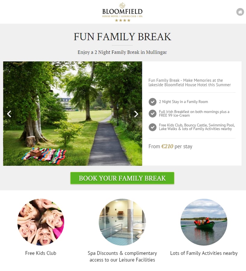
Here’s a look at a strong hotel landing page:
All this landing page from Bloomfield Hotel has is the title, benefits (some with pictures), a nice hero shot, and a call to action that stands out. That’s all it needs. While there’s no need for your landing page to have exactly this layout, this isn’t a bad starting point.
Those are the basic elements of your landing page – how do you make them come to life?
Create A Headline That Appeals to Your Guest Personas
Studies reveal that the typical consumer is exposed to a whopping 5,000 advertisements a day.
If your goal is to convince, motivate and sell, it’s an absolute must that we cut through the clutter.
The best way to do this is to have a killer headline that quickly locks your prospect’s attention. If your prospect doesn’t make it past your headline, there’s no way he’s going to hit to your “book now” button.
Advertising legend David Ogilvy phrased this best when he said,
“Unless your headline sells your product, you have wasted 90% percent of your money”
A case study by Content Verve revealed a huge 38.46% increase in conversions by simply tweaking a weak headline into a strong one.
So how do you go about creating headlines that convert?
We could spend hours dissecting high converting headlines, but here are two keys to success:
- Talk to your ideal guest: look at your customer personas, build a campaign designed to appeal to one or two of them, and write the headline in language and terms they’ll appreciate.
- Promise a benefit: a great offer, key information, or a captivating image. Think “Win a Midweek Break for Two,” “Discover the Best of Clare, or “Escape to Kinsale’s Sunny Shores”. Ideally, yours will be better than those!
If your headline does the two things above, you’re doing good.
Above is a great headline example from the webprofits.com’s landing page.
It’s straightforward, easy to read, and most importantly, it offers a great benefit to its audience, who are likely mostly made up of SEO geeks (that’s us!) and people who want to get to those coveted first search result spots on Google.
For more ways to power up your headlines, check out this infographic from Kissmetrics.
Don’t Use A Boring Call To Action
Everything on your landing page is designed to get people to do one thing:
Click on your call to action (think: the booking button).
The next step towards making a great landing page for your hotel, then, is to ensure that your call to action button stands out. Take a look at the landing page for the Perivolas resort below.

Can you spot what’s wrong with the call to action for the resort? Actually, can you even spot the call to action? It’s small, grey – which doesn’t stand out with the black background and other grey elements on the page – and there are other links on the page, which diverts attention.
Happily, there are easy fixes for all of this! Here’s how to fix those CTA woes:
- Change the colour of your CTA
- Make your CTA more central
- Adjust the size of your CTA
- Tweak your CTA copy
Some suggestsions for your CTA copy might be:
- Stay at Our Award Winning Hotel
- Book Your Stay
- Make Your Vacation Dreams a Reality
- Get Your Room Now
To find the CTA button that works best for you, start testing. If your landing pages have enough traffic, you can test different sizes, colours and copy. When you hit gold, you’ll know, because simple tweaks will cause big conversion spikes. If your landing pages have lower traffic, don’t worry about A/B testing – however, you can switch up the text every few weeks to see if that causes your bookings to jump.
Paint a Picture With Benefits
Your potential guest probably doesn’t care about your hotel. That sounds a little harsh, but we mean he doesn’t care yet. You haven’t had the chance to win his loyalty yet. He doesn’t care about how fancy your gardens are, or that you have a 5 star rating that you and your staff work hard to maintain.
What he does care about is how your hotel and its features will benefit him.
That’s why it’s crucial that you use your landing page to talk about how your hotel can benefit your prospect. Take a look at this landing page from Golden Sands:

It does a good job of showing how the features of its resort benefit potential guests.
One simple way to ensure that your landing page is more benefit driven is to use the “so what?” test.
All you do is read through any statements or features about your hotel and ask, “so what?”
Let’s say your hotel landing page makes the following statements:
- We have a children’s play area
- We are close to the sea
- We offer room service
Here’s how they become more benefit-driven and pass the “so what?” test:
- We have a children’s play area, giving you more quality time with your significant other.
- Our hotel is closer to the sea: you’ll save a ton on travel expenses, have a fun place just outside the door, and a great environment for you and the kids to play in.
- We offer room service on our mobile app, which means you can unwind after a long day and have all your needs met at the touch of a button.
Start by thinking about your visitor’s needs and how you meet them, then carry on from there.
Let Your Guests Do The Talking
If you’re not using social proof on your hotel landing pages, you’re missing out. Big time.
Social proof is extremely effective because, as humans, we care about what our friends and family think about us. People are also innately skeptical. This is even truer when making important decisions about accommodation and housing, and it’s easy for that skepticism to turn into a quick ‘no’ when you’ve got the entire internet at your fingertips.
However, we’re more inclined to do something if other people are doing it – so tell your guests about all the happy customers you’ve had!
People might doubt the claims you make about your hotel, but they’re more inclined to believe an honest testimonial from someone who has slept, ate, relaxed and lived in it.
Reviews and testimonials are powerful ways to use social proof on your hotel landing page. In 2014, a consumer study by BrightLocal.com showed that:
- 88% of consumers read reviews to judge local businesses
- 72% of consumers will act after reading a positive review
- 88% of consumers trust online reviews as much as personal recommendations
Here’s an example of a strong hotel landing page with a great testimonial:

This landing page does a great job of using social proof to overcome the natural objections we have when investing in something.
To get testimonials for your landing page, start by asking previous guests to put up a review on your site or elsewhere. You can even get more testimonials by offering small discounts on items at your hotel in exchange for some positive, honest words.
Conclusion
Boosting your direct bookings is well within your grasp. By focusing on converting more leads into guests with optimised landing pages, you can instantly attract more bookings to make your hotel stand out.
When it comes to creating killer landing pages, you have two options. You can use this article as a set of guideline to build your landing pages yourself, or you can hire experienced hotel website design experts to save you time and effort. You’ll see the benefit of landing pages either way, so don’t wait – get started now!
