Imagine a hotel laid out like a maze, without signs or predictable cues like a reception desk to let a guest know where they are. Your guests and maybe even your staff would wander, frustrated, from room to room for the duration of their stay – and you can bet they wouldn’t be back.
Well, that’s a lot like the feeling potential guests get when they visit a hotel website with poor navigation.
Good navigation is like good infrasturcture: notable only when it is absent.
Good, clean navigation means your average site visitor doesn’t need to think about the navigation at all – they just go to the pages they want to see. Your potential guests shouldn’t need to consider where you might have hidden the gallery pages, or wonder if you have a restaurant. They should be able to find exactly the information they came for.
Today’s post will show you how to avoid frustrating potential guests. You’ll learn how to streamline your hotel site navigation, which will significantly boost your engagement and conversions. When guests can see your beautiful rooms and read about your special offers with ease, they’re much more likely to book than the guest who can’t even find the ‘Book Now’ button.
Ready to learn how to streamline your site? Let’s get started.
1. Your Starting Point is the User
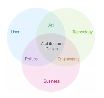
When people aim for better navigation, they usually use one of the two approaches below:
- They focus on aesthetics, and their concern is making things look better – they look at color schemes, read up on design trends, and delve into typography.
- They focus on one step at a time. They think, “menu goes here, button to the left, and logo underneath.”
Guess which one is better?
Neither. While these are both important considerations, as a first step they’re both wrong.
This is because your primary aim is to get your visitor to take some form of action, like book a stay at your hotel. To do this, you need to know:
- Your end goal. The specific action you want your visitor to take.
- The end goal of your visitor. What are they doing on your site? What needs are they there to satisfy?
By starting with these objectives in mind, you pave the way for a smooth navigation structure that satisfies visitors and gets you bookings.
2. Use Familiar Terms and Make Copy Clickable
Ever heard of cognitive fluency?
The idea behind it is fairly intuitive: the brain prefers to think about things that are easy to think about. The easier a choice is, the more desirable it becomes.
Cognitive fluency is closely linked to the “mere exposure effect”, which states that the more you’re exposed to something, the more you prefer it. Both of these psychological principles are relevant to smooth navigation.
Symbols and features becomes normal and expected, like knowing a circle with an arrow means ‘refresh’ on your web browser or that clicking on the three horizontal lines will open up a navigation bar (although there’s some fierce debate about that feature).
When a potential guest lands on your site, the navigation bar will be a primary point of focus. If it’s easy for him to use, he’ll see it as a stepping stone towards his end goal.
One way to make your navigation bar easier to use is to make the layout familiar to your potential guest, so he instinctively know what to do.
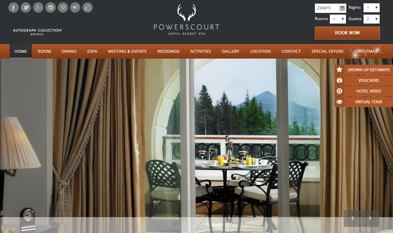
A simple, yet familiar navigation bar which can be used without much thought
This means you should stay away from designs that are too complex or crazy. Your pages should be named in a straightforward way. Your ‘About’ page link should be called ‘About’ or ‘About Us.’ Unless your restaurant is famous or has a name that clearly indicates it as a restaurant, make sure your dining page is just named ‘Restaurant,’ ‘Food,’ or ‘Dining.’ Calling it something like ‘Feeding Frenzy’ doesn’t help anyone, and it’s also a disturbing way to refer to a meal.
3. KISS: Keep It Simple, Stupid!
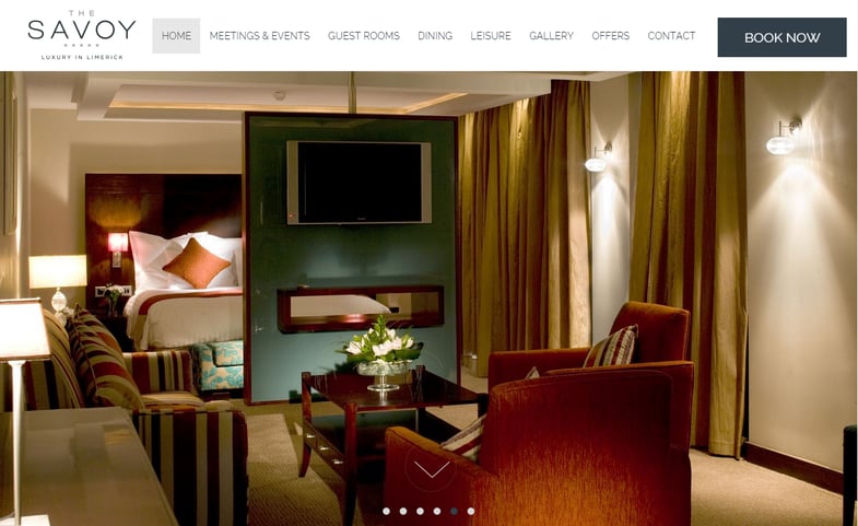
A clean and simple navigation design from The Savoy Limerick Hotel
According to a Google study in 2012, visually complex websites are seen as less effective, and simpler designs tend to do better.
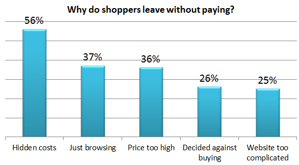
In another study by Business Insider, 25% of people reported they didn’t buy because a “website [was] too complicated” to navigate.
The lesson is obvious: The simpler your site navigation is, the easier it is for potential guests to meet their needs and come to a buying decision.
KISS is an age-old adjective used in fields from marketing to design. It means ‘keep it simple, stupid,’ and the message is clear. If you make things too complicated, you drive away your audience. People aren’t going to approach your hotel website like it’s a puzzle or an academic topic, and they shouldn’t have to.
4. Drop Down Menus: The Pros and Cons
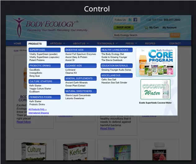
According to usability studies by the NNGroup, drop down menus are often annoying.
This is because our eyes are quicker than our mouse, and when we move the mouse to an item, we’ve already decided to select it…but the drop down menu rolls out more options. This creates an extra, often-unnecessary step, which causes cognitive friction.
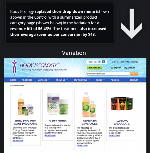
In a study by VWO, using a firm navigation menu instead of a drop down one boosted conversions by 56%.
Source
Keep in mind that there have also been cases where drop down menus have performed well, but that’s generally on bigger sites with lots of content and different sections.
In the case of your hotel, drop down menus are probably necessary in some areas, especially your booking engine. In other areas of your site navigation, though, think twice before using them.
To the frustration of usability experts, there’s never a black and white answer to conversion rate optimization. To find out what’s best for your hotel website, start off with best practices, and test from there.
5. Limit Navigational Options
Cramming your navigation bar with options will just frustrate potential guests.
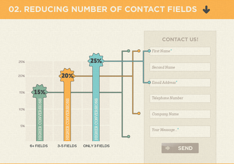
When Imaginary Landscape, a web design company, reduced the number of opt-in fields from 11 to 4, they boosted form submissions by 160%, and received a 120% increase in conversion rates.
Source
In another study by VWO, reducing on-page options boosted engagement by 17.8%.
More choices demand more thought. More thought, in turn, creates friction, which reduces engagement and conversions.
To keep site navigation digestible and still have multiple options, start with what’s most important. Only reveal more information once your visitor has expressed interest with a click.
For example, don’t immediately show your wedding packages and prices on the front page. Instead, show that you do weddings, but show specifics only after the person clicks through to the weddings page.
This will show potential guests only as much as they want to see, and make using your site more rewarding.
Conclusion
Having smooth site navigation can make or break your hotel website.
Use the steps above to make navigation on your hotel site more instinctive for potential guests. Remember: always tie the goals of your hotel website to the goals of your visitors.
What did you take into consideration when you were building your website and thinking about site navigation? How did it go? Please do comment below and tell us!
