It is said that it takes seven seconds to make a good first impression. The moment that you encounter with a stranger, it is those seven seconds in which you determine whether they are likable, trustworthy or someone to be avoided completely. The same method applies to your hotel’s website. By taking the minimalist approach you will ensure that your website accomplishes a good impression and engagement. Keep reading to discover how!
Less is More
We all know what an overwhelming task it can be to chose a hotel. There is an abundance of information all over the internet. Your potential guest has probably searched through multiple OTAs, meta searches and other hotel websites before arriving at your own. Therefore, you need to make their decision process as simple as possible for them. Rather than long-winded, complicated descriptions, use power verbs and sensory rich adjectives. Short and sweet sentences are more mentally digestible, therefore more appealing to your reader! According to Edgar Dale’s Cone Of Experience, people generally only retain 10% of the information that they read. By reducing extraneous content, you will showcase your hotel’s unique selling points, which is your website’s sole purpose! Drive the point home and follow this example from Seafield Hotel.

Furthermore, people tend to follow the directions that you give them. Simplify the site’s navigation and eliminate trivial page options and categories. This will help to improve conversion rates by encouraging your potential guest to click on the right pages and lead them to the booking engine. If your website’s user has to do a thorough search to find what they are looking for, it will result in frustration. This will not be beneficial to either of you! Read this post to learn more about cutting down the amount of choices that are showcased on your website.
 Don’t be a Loiterer
Ironically, a slow website is one of the quickest ways to drive a user away. The amount and the complexity of the content on your website plays a massive part on its loading speed. If you find that your website is taking longer than 3 seconds to load, it’s time for a clear-out! Unfortunately, this means the fancy hover menus, sliders and flash-based animations all need to go. Not only do they affect your website’s loading speed, but if your mobile site has a responsive design it will look disorderly, complicated and messy. A simple, straightforward website is easier to both build and fix with regards to symmetry, font, content and more. Save yourself the hassle of over-complicating things!

Furthermore, take some of the pressure off your website. It does not need to host everything, use embedding! Cut out features such as Interactive Maps, which are extremely heavy and will only slow things down. Not to mention, the majority of the time they do not function properly on mobile websites. Instead, link a map button or a still image to the Google Maps app directly to your hotel’s address. The same goes for videos. Host them on YouTube and embed them on your website. This will prevent them from using up precious loading time. By keeping your website as simple and as straightforward as possible, you will ensure that your UX is smooth and satisfying.
Play it Safe & Contrast
Another perk of minimalism is its reliability. Have you ever looked back on an old photograph and thought ‘what was I thinking?’. We are all too familiar with cringe-worthy fashion trends, and the same goes for your website’s design. Following the latest quirky and edgy website fad is tempting, but it is always best to go for an option that will remain classic. Going with a neutral theme has multiple benefits. Colours such as white and beige are often associated with luxury, elegance and sophistication. They exude clarity and organisation and are the one colour theme you can guarantee will never get outdated.
Furthermore, by stripping the canvas of harsh and vibrant colours, other design elements such as content and form will come to the forefront. A white canvas will contrast against a bold image of your hotel’s grounds, which is a point of visual interest. Furthermore, it will allow CTA (call-to-action) buttons to be more defined and visible. CTA buttons will get lost when placed in a crowd of a variety of bright colours. The use of contrast will ensure that they are as clear and as eye-catching on your website’s home-page as possible.
Conclusion
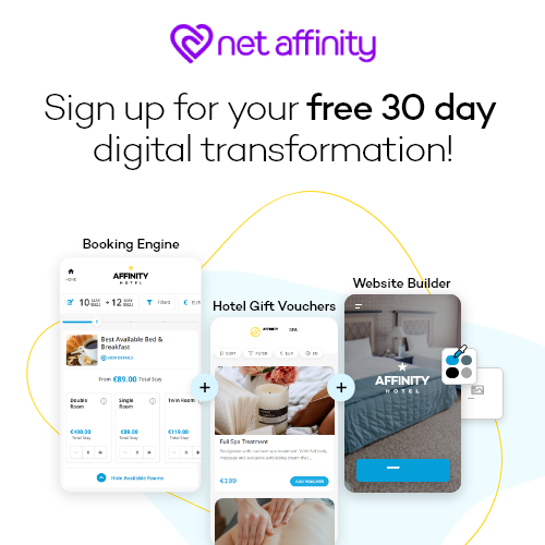
Is your website slow, cluttered and complicated? Then it’s time to give it a clear-out. The benefits of having a straightforward, simple web design are endless. A minimalistic design will enhance UX, keep your website in date, and increase conversion. Interested in a fresh website design? Take a look at our brand new, easy-to-use website builder!


