What’s the most important function of your hotel’s website design? It’s not the aesthetics. It’s not even, ultimately, what guests can learn about you from it. In the end, your hotel’s brand.com website is all about driving direct bookings.
You want potential guests browsing your site to complete the booking process, turn up at the front desk, and check-in. To do this, your site must have a design that is not only appealing, but highly converting.
While the aesthetics and content of your site matter, they’re only tools you’re using to drive conversions.
With that in mind, here are 6 hotel site design tips to help you convert more visitors into guests.
1. Stick To a Responsive Design
Today, more than 148.3 million people use the internet to make reservations for their accommodations, tours and activities. That’s more than 57% of all travel reservations each year (Statistic Brain), and it’s a far cry from what most of us would have predicted 30 years ago.
And as people have become more comfortable with buying online, sales from mobile devices have soared. Net Affinity’s own data shows that in 2015, 20% of all bookings were made on mobile, and that number’s growing all the time.
The facts above speak for themselves: your hotel site needs to be responsive (or adaptive).
It’s no longer safe to cling to a desktop-friendly design. Bookings are coming from every type of device, from desktop to mobile to tablet.
A responsive design adapts to the medium it is being viewed on. This means your hotel website will be as crisp and easy to navigate on tablets, TVs and mobile phones as it is on desktops.
Making your site easy to navigate on all devices increases conversions, because guests can research and book from you with ease. Last minute bookings especially tend to be on mobile, so making mobile bookings as easy as possible for frustrated guests is key.
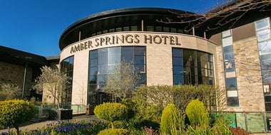
Below are 3 examples of responsive hotel web design, as they might appear on a desktop and a mobile.
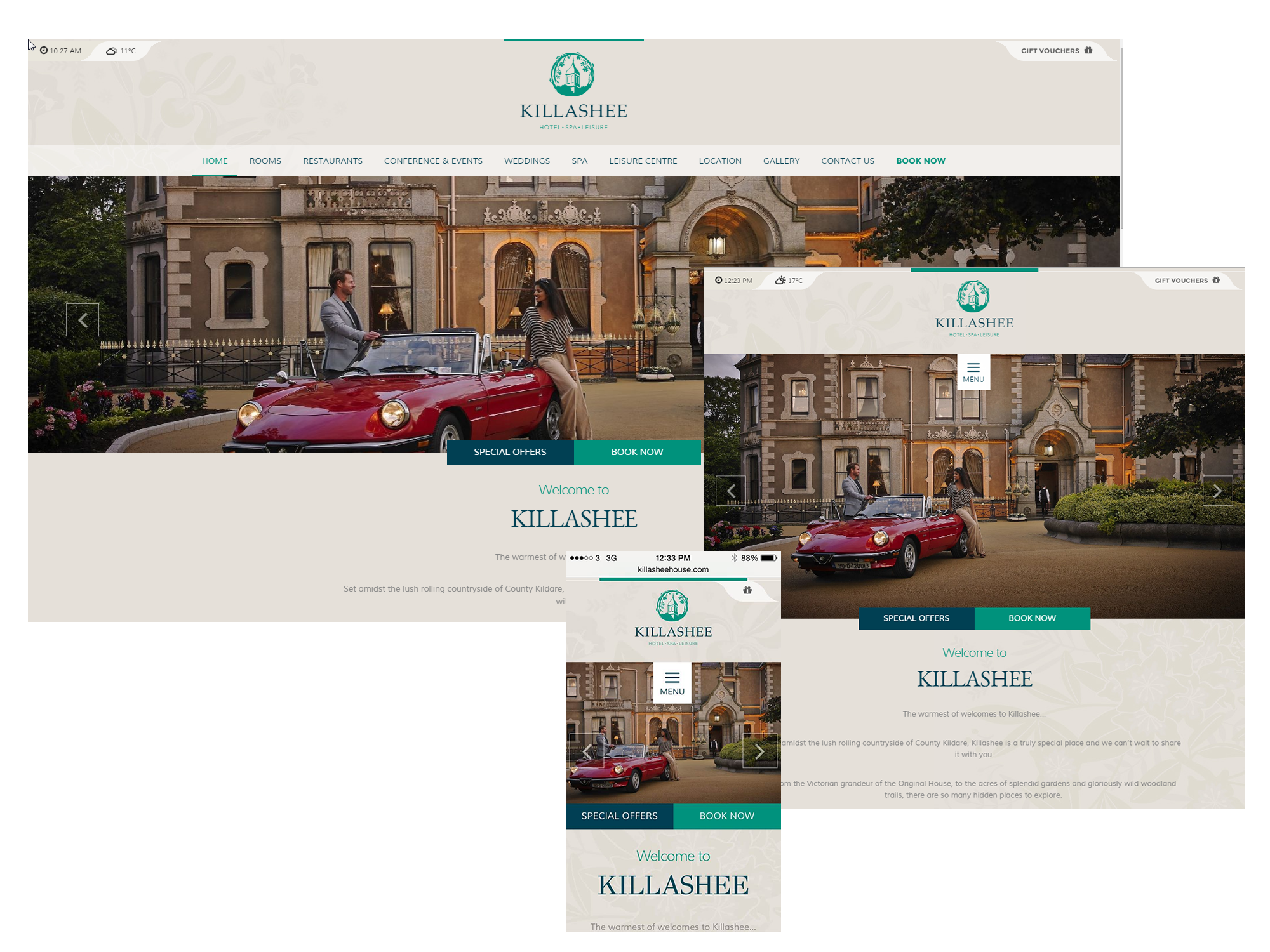
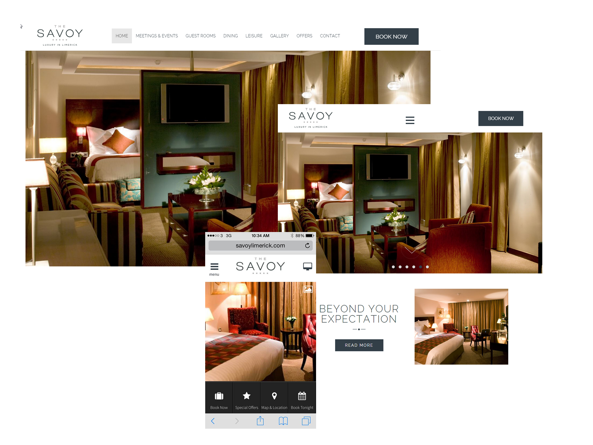
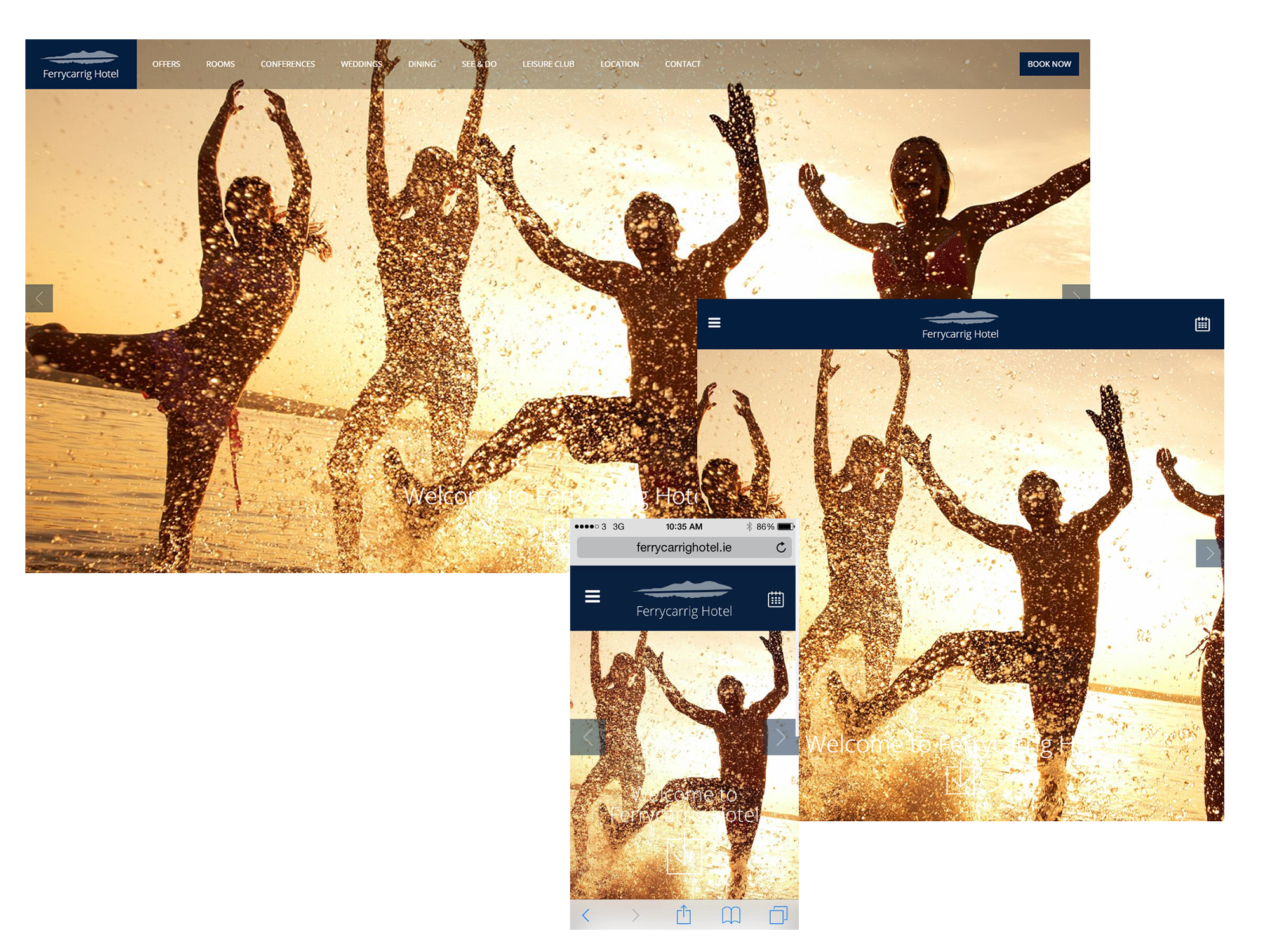
If you adjust the browser window size, and try these sites on other devices, you’ll find that they constantly readjust and respond to how you are viewing them.
For a deeper dive into how responsive design can ramp up conversions, check out this great article by Moz.
2. Make Your Navigation Easy To Use
Making your navigation bar hard to find is like hiding the map from the driver on a roadtrip – they may never get where you want them to go!
Let’s dive straight into an example of an usual, but effective navigation menu:
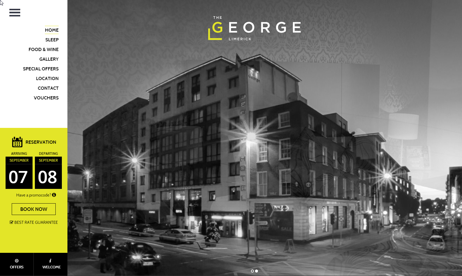
Why does it work?
The color and positioning of the navigation bar make it easy to identify, the choices tread the line between too limited and too complex (submenus and inside pages are your friends!), and the overall design of the page is simple. This makes it easier for people to find out more information and spot the navigation bar.
For a navigation bar that keeps visitors and gets them (eventually) to your booking engine:
- Make sure it’s where guests expect it to be. Why? People prefer – or find it easier – to visit sites they are familiar with. This is known as cognitive fluency.
- Keep the navigation bar simple. Too many options damage conversions. Don’t put a link to every type of room you have in it – instead, just link to ‘Rooms’. You can link to specific room type pages from there.
- Use a contrasting color scheme. Color should help make your navigation bars and links stand out, not blend in. This is a psychologically proven way (known as a “schema”) to draw attention to things, and it drives conversions.
- Use the serial position effect. Attention and retention jumps up for things at the beginning and end of lists. So, place important aspects of navigation like the ‘Book Now’ button at either end of the menu, with less important elements in the middle.
3. Keep it Simple
One of the basic principles of web design is keeping things simple.
This might sound trivial, but—as any website owner will tell you—it’s easy to get carried away placing widgets, tools and too much text on your site. When it comes to higher conversions, clarity and simplicity can’t be stressed enough.
In 2012, a Google study found that people judge websites aesthetically in 1/50th-1/20th of a second, and that visually complex or busy sites are usually regarded as less beautiful than their simpler counterparts.
The less visual work your reader has to do, the better.
4. Use Directional Cues
We tend to follow subconscious visual cues presented to us.
Numerous case studies have proven that visual cues, like arrows, lines, tunnel effects and even the direction a person is looking in are great for directing attention to specific elements on your website.
Chemistry.com has used this strong image on their homepage for years:
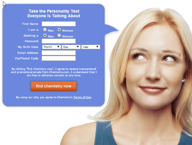
Using the woman’s gaze as visual cue, Chemistry’s call to action (CTA) draws nearly as much attention as the woman’s face does.
Other visual cues, like arrows or images that point towards something, can also be used to guide attention to an element.
This is a great, subtle way to draw more attention to your CTA, your copy, navigation bar or testimonials.
5. Make Your Call to Action Stand Out
Your call to action is one of the most important aspects in driving your bookings. How visible is it? How colorful? What text does it have on it? These factors can singlehandedly spike or reduce conversions.
That’s why it’s important to make it as strong and prominent as possible on the page.
To ensure that your CTA draws attention:
- Use a color that stands out
- Make your button look clickable. Give it a distinctive shape, and have enough space around it for it to stand out
- Make sure it’s a sensible size
- Experiment with visual cues: use A/B testing to find the best approach for your hotel
- Don’t use vague copy, invite your guest to take action
Looking for examples? Here’s 17.
6. Make Your Design Relevant To Your Hotel
- A case study from Strongview shows that increasing their emails’ relevancy to their target market boosted Cooking.com’s email open rates by 500%, and dropped their unsubscribe rates by 29%
- IDIO published another case study in which making relevant content for a health website boosted CTR by 32%. Resulting in 55,000 more subscription sign-ups.
- In an article on call to action buttons, contentverve.com reveals that making their CTA copy more relevant to cutomers yielded over a 200% boost in conversions
Highly relevant images, copy, and overall design boosts conversions.
Palm Island Resort does a great job deploying a highly relevant design:
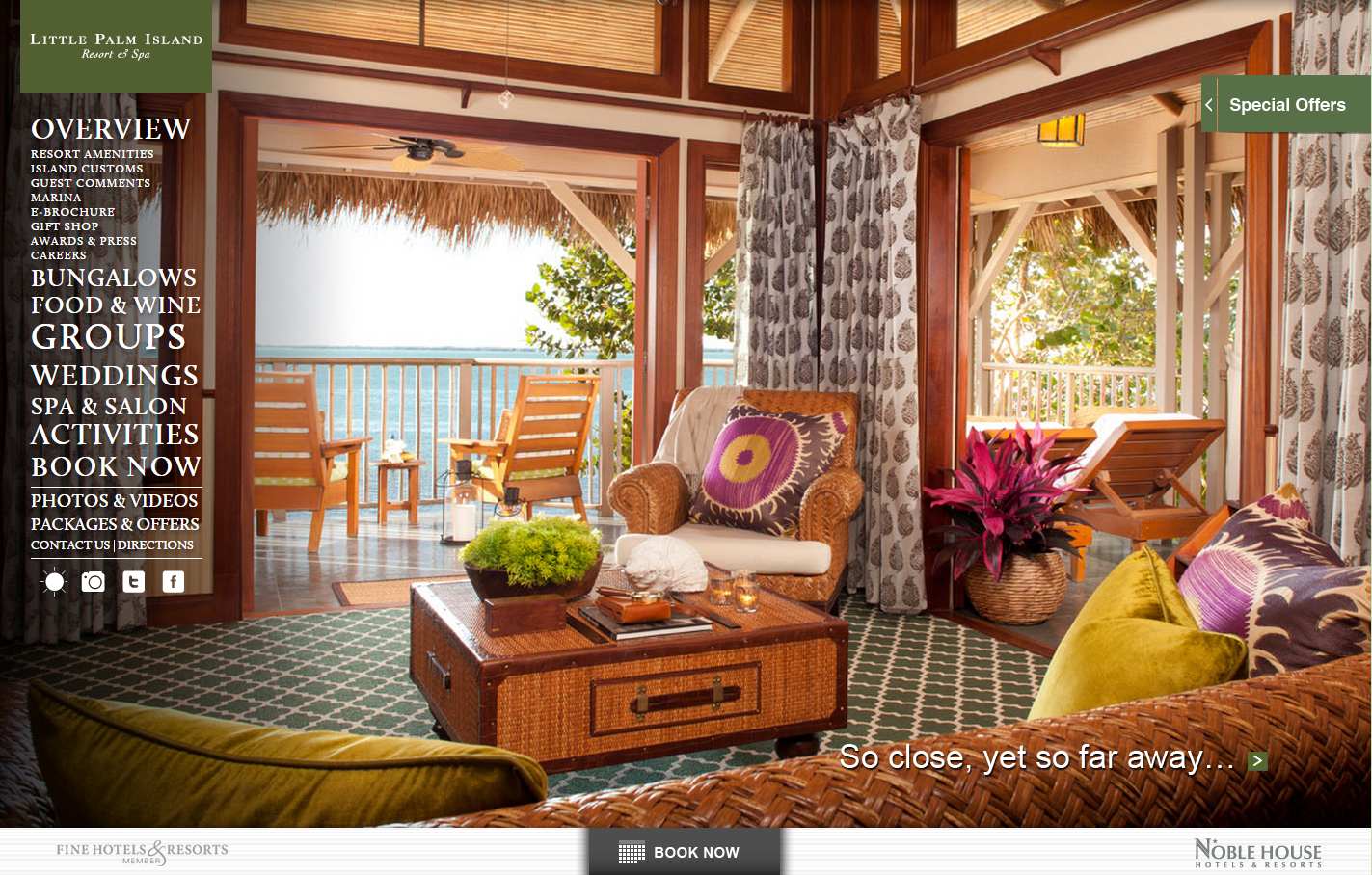
The color, images, and copy do a great job of inviting you to a luxurious romantic getaway holiday, which is a goal we can all get behind. Your website design should match your hotel’s atmosphere, whether that’s a cute B&B or a high-powered city hotel for business executives. Build your website for the guests you want.
To ensure that your design is relevant to your guests:
- Ensure that you have a solid customer persona to work from
- Look at each element on your site. Ask yourself, does this clearly communicate what you’re about? Does it communicate it to the right customer?
- Read your copy without looking at images. Does it still paint an ideal picture to your ideal guest?
- Look at your images without reading copy. Do they broadcast the ideal message to your typical guest?
- Let your visitors do the talking. Use A/B split tests to see what converts better and optimize from there
To increase hotel bookings and site conversions, design is incredibly important. Your design must be simple, allow for swift navigation and communicate the right message to the right potential guests.
Are you looking to revamp your hotel website design for better conversions? Get in touch with us. Our award-winning team can help power up your hotel design for more bookings.