Have you created a landing page to promote one of your hotel’s spring offers? If you’re looking to strengthen your landing pages, here are some top tips to give you a hand.
Spring might feel like it’s on the distant horizon, but now is the time to create your hotel and spring offers if you want to increase your sales. If you get your offers out now, you give your potential guests some time to plan their trip. It also gives you the opportunity to run the competitions and offers for a longer period of time, allowing you to gain momentum.
Just creating a competition and offer will not be sufficient. You need to promote it as much as you can to ensure maximum participation. The best way to do this is by creating a landing page that sharply focuses in on your offer. That way, you can drive all your campaign’s traffic to it.
Landing pages are designed to do exactly one job: converting visitors to hotel guests for one specific offer.
Therefore, today we’re going to discuss, in detail, how to create the best landing page for your hotel’s spring offers and competitions.
Keep Your Landing Page Free From Distractions:
The internet is overflowing with distractions. Once the reader exits your landing page, there’s no guarantee that they will return to resume reading it – they might not even remember visiting.
This is why you should limit the number of distractions on your offer or competition landing page to an absolute minimum. You should even take out unnecessary parts of the navigation bar – do you want people on the verge of booking your spring offer to get distracted by your weddings gallery?
The entire focus of the landing page should be to get the person to accomplish one goal. This could be to take part in the competition or to take advantage of the offer. You should be sending them to a participation page, a checkout page or an opt-in form for the offer. However, links to other pages and any other distractions should be eliminated.
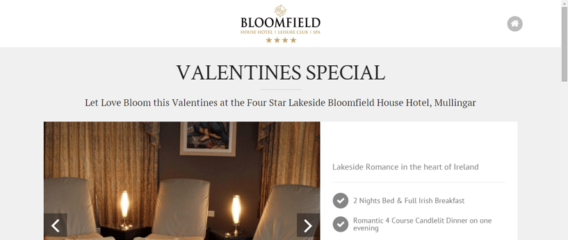
An example of one of Net Affinity’s favourite landing pages is this one by Bloomfield House Hotel. You will notice that the distractions are minimal. The only distractions are the buttons present at the top and bottom of the landing page. These aren’t problems, though, because they’re minor and only steer the person to the home page. Also, the button is fairly bland looking and doesn’t attract much attention.
Even the map is free of distractions that lead the reader away.
Another important point to note is that the images on this landing page are free of links. Quite often people leave the link inserted in the images on online marketing materials like landing pages and blog posts. This is another distraction that can force the readers to exit the page. When you’re building your landing page, make sure the images are devoid of any links. Only insert links in the images if you find that there is some important information on the image which can only be read by enlarging it and plays an integral role in the landing page – in an ideal world this shouldn’t happen, though.
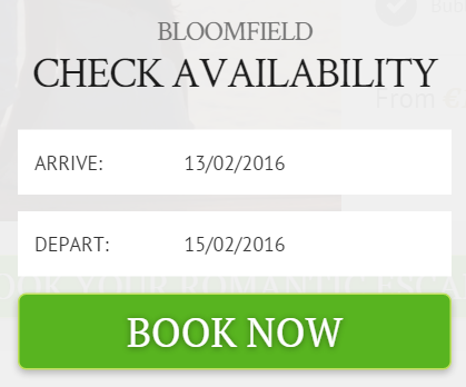
The scarcity of distractions on this landing page ensures that the whole focus is placed on the green call to action buttons.
Clicking on them will lead the reader to a popup which lets them check room availability.
Write Great Copy:
A well-designed landing page will only work if it contains words that get your message across to the reader. If you have already created the competition or offer based on some effective audience research, writing the copy should be a piece of cake.
Here’s a checklist of all the vital details your landing page should contain.
1. A curiosity-generating, shareable headline:
When you create a headline for a landing page, you typically focus on making it SEO friendly, curiosity generating and shareable. But for a seasonal competition or offer landing page, you can more or less forget about SEO. Why? The page is temporary. You will most likely redirect the page or delete it entirely at the conclusion of the competition or offer.
This is a great benefit for you, because you only need to focus on 2 things. Making sure your headline generates curiosity and is shareable.
To get your landing page headline to generate curiosity, a great thing to practice is the Zeigarnik effect. This states that people remember uncompleted or interrupted tasks better than completed ones. Things you’ve forgotten to finish tend to intrude on your thoughts in a way something you’ve ticked off the list just doesn’t.
Copywriters utilize this effect to their advantage by writing open loop headlines that give just the right amount of information to peak interest. To get the rest of the information, the reader needs to read the body copy.
This type of headline generates a lot of curiosity and convinces the reader to read the entire page.

An example of an open loop headline can be found on this landing page. The headline ‘Luxury Spring Offer’ just tells you that there is a great offer available. It doesn’t give you the full details. You need to read the body copy to figure out what’s so luxurious about it.
You can write a similar headline that gets more people to read the landing page.
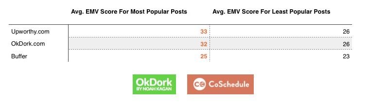
To craft shareable headlines, having strong emotional cues is a big help. A study by Ok Dork and Coshedule found that headlines with the most shares were highly emotional.
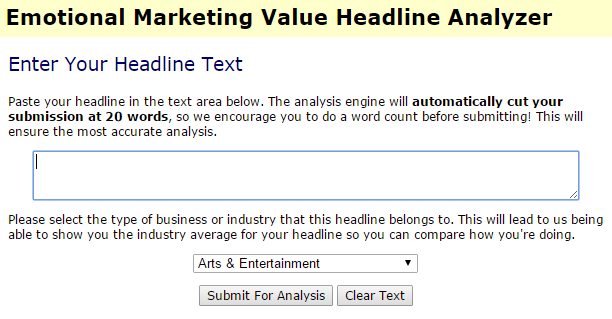
They used the tool Emotional Marketing Value Headline Analyzer to measure the Emotional Marketing Value (EMV) of headlines.
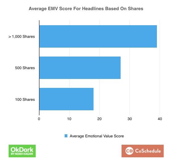
They then analyzed the number of shares received by the headlines to find that shares have a very clear relationship with EMV.
After writing your headline, consider analyzing it to check its EMV value. Keep modifying it till you get a decently high score. Aim for a score between 30 and 60%. The higher you score the better.
2. Explain the competition or offer in as few words as possible:
The body copy of your landing page will primarily contain details on how to take advantage of the offer or competition and the features of the deal or prize. This shouldn’t be hard for you to write.
The only tough task is to be as succinct as possible. Readers should be able to process the information quickly and share details on how to take part in a tweet (140 characters).
If the competition can’t be explained in a few words, then ensure that at least the prize can be.
3: Display value of the deal:
An easy way to get people excited about a competition or offer is by telling them how much it’s worth. This will get you more participants.
When people are deciding whether or not it’s worth their time, one of the factors they will ask themselves is ‘How much money is this worth?’ So make it really easy for them by displaying the price in a big colourful font on the landing page.
4. Have a great call to action:
Now that you know how to write an attention-grabbing headline and persuasive body copy, it is time to learn how to write a call to action as it gives the reader the nudge required to take then next step.
The best calls to action contain very little text and are in the form of buttons. They also attract the most attention. This is why you should create them using a colour that stands out.
You can easily find a colour that stands out and still looks good with the overall design of the page using Adobe Color. Visit Adobe’s color picker, check out the various combinations they have displayed and then pick the one that contains colours similar to your landing pages. Then choose the standout colour from the pastels and use it as the colour of the call to action button.
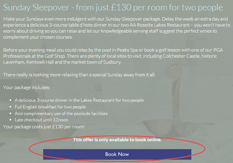
An example of a strong call to action can be seen on this landing page. The violet button is the only thing on the entire page with that colour and it suits it. It’s also opaque, while the rest of the landing page is translucent. This ensures that maximum attention is diverted towards the button.
But make a note that there is a massive flaw with this landing page. There are so many other things to click on, they’ve tacked on a signup to their email list, the navigation bar is distracting, and – maybe worst of all – you need to scroll down to see the CTA. They’ve got colour theory down, but don’t model your landing page after this one.
Display Time and Product Constrains:
Scarcity drives emotions such as greediness in human beings. When we realize there’s less of something, we generally want it more. Top marketers display the scarcity of products on their landing pages. They do this by showing the number of products left for sale, the number claimed so far, or the time left to take advantage of the deal or competition.
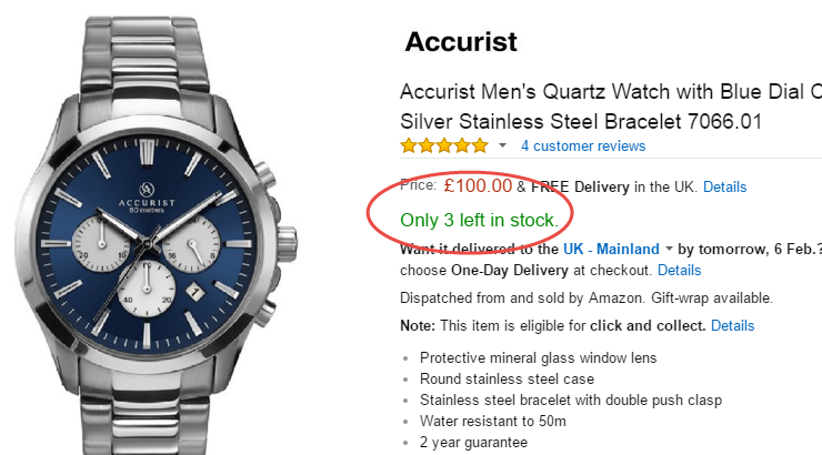
You might have already noticed this on Amazon. When a product is scarce they display the number of items left in stock. People driven by fear of the product being gone, or envy, will want to buy it before somebody else does. An example is the above screenshot of this product.
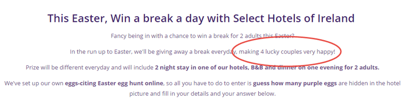
Another place you can see it on is the copy on this landing page, promoting an Easter competition. In the copy, they make it clear that there will be only ‘4 lucky couples’ who will win. This shows that the product is scarce and more people will want to take part. Don’t think it works like that? Take a look at the lottery.
Similarly, you can display time constrains by telling the reader when the competition or offer will end. Some marketers even add a live countdown timer which displays how much time is left to take part. A tool like Deadline Funnel can help you create this. Some landing page tools like Leadpages and Unbounce also have this countdown feature.
Display Social Proof:
People will always be skeptical about offers and competitions, especially if it sounds too good to be true. This is why it is important to show some social proof to get them to trust you quickly.
Easy ways to do this are by displaying testimonials from happy hotel guests, the number of people who have already participated in the offer or competition and so on.
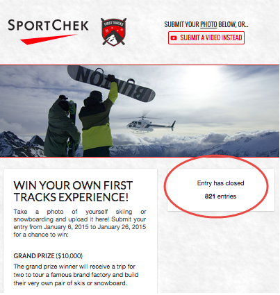
An example of a competition using social proof is the above one by Sport Check. They have clearly displayed the number of participants. When visitors see that hundreds of people are taking part, they too will be inclined to invest time to do the same.
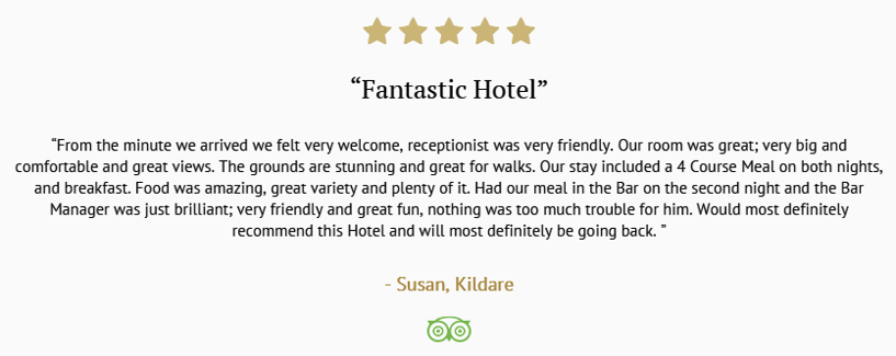
Social proof can also be displayed using testimonials as seen on the aforementioned landing page from Bloomfield House Hotel. They work really well because people trust what other people say about you more than what you say about yourself.
Test Before and After You Launch:
The biggest mistake people make with landing pages is that make the first draft of their landing page and immediately launch a massive paid campaign around it. The thing about landing pages is that there’s no magic formula. Landing pages perform based on the type of audience that visits it.
So, before you open the traffic flood-gates, you need to test different versions of the landing pages to see which one gets you the highest profit. So create different versions of the landing page. They could have minor differences like long Vs short copy, blue Vs red call to action buttons, video Vs no video and so on.
Drive traffic to these pages until you find a landing page formula that gives you the highest amount of return for money spent on advertising.
After you have your perfect landing page, you can drive higher amounts of traffic. You don’t need to stop there; you can keep trying different variations until the campaign ends, as long as you’re always optimising for the best possible page. This post should give you some landing page split testing ideas.
To sum up:
You need a distraction-free landing page with well-written copy, product or time constraints, and social proof. After that, you will need to split test your pages with minimal amounts of traffic to see which one gets you the best results. You can begin driving maximum amounts of traffic once you have created the highest converting landing page to promote your spring offers or competition.
What landing page best practices do you follow to promote your hotel’s spring offers and competitions? Please leave your comments below.