How can you grow direct bookings on your hotel website? Help your guests make a booking in as few steps as possible. OTAs spend a lot of their time and money on improving their conversion rate. It’s time for hotels to do the same. How? Start by streamlining the guest journey that takes users to your online booking engine.
With that goal in mind, we’ve outlined 5 strategies to simplify the guest journey. We’ll be releasing them in a short two-part series – this is part one. (Part 2 is now live here)
Travel researchers today have so many touchpoints that it’s incredibly valuable to appeal strongly and immediately to users. Millward Brown conducted a study for Expedia. They found that in the 45 days lead up to a booking, a consumer will conduct as many as 38 visits to travel sites. Shorten the booking journey so that they book while you still have their attention.
There are different “journeys” you might want your guests to complete, from filling out an enquiry form to booking a room. When you read the strategies below, make certain you’re clear in your mind about what the core journeys are on your site. Make each journey clear and simple.
Today, we’re focusing on the booking journey. After an overview of how hotels can simplify things and make the booking process itself simpler, we’ll look at factors you can control outside the actual booking process.
Here are the first 2 of 5 strategies to make the guest journey to your booking engine simpler – and to make your conversion rate soar.
- Simpler navigation: help guests find what they want easily and quickly
- Tools to aid recovery and retention: shorten the booking path, reduce booking abandonment, and showcase specialised areas
The Booking Process: Personalisation and Simplification
Tools and personalisation can be amazingly helpful within your booking engine. You can use technology combined with consumer psychology to shorten the booking path, reduce booking abandonment, and even showcase specialised areas like weddings and conferences. Speak to specific, active segments of your target audience.
For example, we at Net Affinity have found a few successful ways to tailor the booking process:
- Make room upgrade and enhancements optional features. That way, a hotel can remove them to quicken the process when they aren’t really necessary.
- Reservation forms should be shortened to only ask for name, email & phone as contact details. Ask for the guest address at the reception desk – there’s no need to put that ‘roadblock’ in your online booking process.
- Create a call to action that advises that there are “X rooms left to book!” This helps simplify the decision for the user by telling them they need to book soon or it will be too late. Questions of whether they should shop around for another week or two become irrelevant; suddenly, it’s down to a simple yes or no.
How can hotels simplify things themselves, without add-ins or specialized functions in their booking engine?
- Reduce the amount of room types – Make sure the difference between room types is clear
- Reduce the volume of rate plans – Clear rate plans names and conscience descriptions
- Have a clear price display – keep that display consistent on all rate plans, e.g. ‘Total Stay’
There’s a reason why OTA’s limit the types of rate plans you can show on their site – they only want the ones that work and those that are easy to compare. How do they know? They’ve spend millions on research and development to discover exactly how users like to shop on their sites. Independent hotels don’t have the same resources, but we can take advantage of the knowledge.
One other way to aid conversions is reassurance on the security of the booking process. This isn’t something that reduces steps to booking, but the reassurance makes it easier for the user to decide to continue.
Now that we’ve covered the booking process itself, let’s talk about how to get your guests there:
1. Simpler Navigation
Simple navigation is key to the guest journey. If they can’t find what they’re looking for on your site, your ‘virtual hotel’ won’t do the job it’s meant to.
The first thing to remember when you’re looking at your hotel website’s navigation is this: Navigation is a means to an end. The end, or goal, is for users to see your content.
Smashing Magazine puts it this way: “While content is supposed to be unique, surprising and exciting, navigating to it is supposed to be as simple and predictable as possible.”
In other words, there are plenty of other areas to show your creativity. Navigation isn’t one of them.
Before you start, make sure you’re looking at it from the user’s perspective. The goal is to make your site simple and straightforward to navigate for y our guests.
When you’re building your hotel website, start by creating a site map. This should be a structure of your website with the main navigation, the pages they lead to and any pages nested within these.
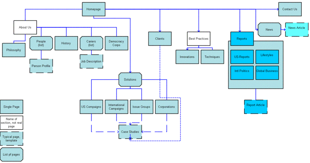
Image: Web Tuts
What what will visitors want to see first? Make a list of your most important sections. Try to stick to 7 or 8 as a maximum. You might include rooms, dining, spa, weddings, and events. Add or subtract items to these depending on your own hotel’s specific features.
Once you have those, it should be reasonably straightforward to figure out which pages will go “inside” those pages. For example, room types will be listed within your main rooms page. Menu pages will be linked to from your restaurant page.
Work with your web design team on this! Creating a site map that works for your users can be more trial and error than you’d like, and talking to an experienced team can help you get it right the first time.
After you have your intuitive, simple layout, it’s time to look at labels.
Keep it predictable. Call your restaurant page Restaurant, Food, or Dining. Avoid calling it Our Exquisite Edibles or something more obscure – while guests will probably figure it out, there’s no need to add the extra cognitive step!
The more mental ‘steps’ we have to take to get from A to B, the more confused, distractible and irritated we’re likely to be. That’s not a great frame of mind for making a booking.
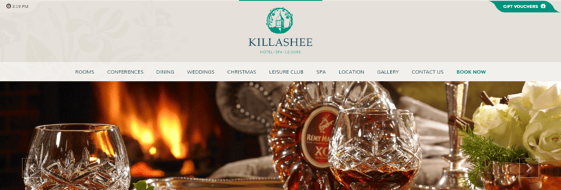
Here’s an example from Killashee Hotel of clean, clear hotel navigation:
The science of user experience is complicated, and once you have your navigation there’s a whole world of page layouts and other design choices to make. For example, people in the western world usually read from left to right and top to bottom. Contact pages are usually all the way to the right. The logo usually links to the homepage. The list is endless! Don’t go it alone, and don’t feel the need to reinvent the wheel.
Whatever you decide, make sure you’ve got a professional designer (or a whole team of them) working with you every step of the way.
To sum up, focus on:
- Intuitive, simple site layout, keeping the users’ needs first
- Predictable labels for your pages
- Working with a good design team
2. Tools to Aid Recovery and Retention
Booking Recovery Emails
What happens when a user abandons a booking? 81% do, according to SaleCycle. However, that doesn’t have to be the end. In many cases, they’ve abandoned a booking due to a desire to do more research, price comparison or simply checking with another traveler – not because they don’t want to book.
How do you get them back? First, make sure you capture their email as early as possible in the booking process. Without that, you can’t send emails!
Send an email within the first 24 hours asking if they’d like to complete their booking. If possible, include the guest’s name and the details (dates, room types) of their stay to make it personal.
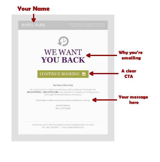
If the guest still doesn’t book, consider a second or even a third email a few days later. Try offering a creative discount, an ‘exclusive’ offer or something else as an incentive to book! It doesn’t take rocket science to figure out that offering a ‘10% off’ promotional code is more cost effective than paying 18% for a booking through an OTA.
Paid Search Brand Campaigns
Your brand is an extremely valuable asset. For Net Affinity’s clients, branded paid search campaigns provide a huge lift over unbranded ads.
Looking at Net Affinity’s clients on Google, which holds a market share of over 90% of searches across our clients, the numbers paint a clear picture.
When no brand ad is present, organic listings receive 30 – 40% of available clicks, with 60 – 70% of clicks going to other organic listings or paid ads by the OTAs. However, with a brand ad present, hotels are able to capture 60 – 70% of available clicks.
Tip: In order to get the most out of your marketing spend, look at your CPA (cost per acquisition) as a percentage figure. With OTA commissions starting from 15% upwards, your brand campaign should perform to a CPA below that, including your booking engine commission.
For example, if your booking engine commission is 4%, your brand campaign should ideally come in at 11% CPA or less, and you should keep spending on this campaign with no budget restrictions as long as the CPA is maintained at or below this level. Don’t shut yourself off from a channel that’s bringing in guests at a lower CPA!
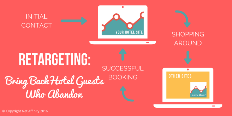
Remarketing
Remarketing keeps you in the front of your guests’ minds. When we navigate away from a website, it can be all too easy to let it slip out of our minds, until we couldn’t find it again even if we wanted to. Remarketing is a fix for that.
There are 3 primary types of remarketing: Retargeting through paid advertisements on other sites, retargeting through booking abandonment emails, and on-screen prompts when a user exits a screen.
Since we discussed booking abandonment emails above, we’ll discuss paid remarketing and on-screen prompts.
Paid remarketing is probably the most frequently used by hoteliers. Platforms like Google and Facebook offer the ability to re-engage with users. Through either a cookie placed on your hotel website or an email list, you can set up ad campaigns to re-engage with users who land on specific pages on your site but fail to complete a booking or some other goal.
A note of caution: you’ll want to make sure you’ve got frequency caps on your remarketing ads. This makes sure people aren’t seeing them too often and feeling harassed or followed. Our recommendation would be a maximum of 3 impressions a day, but there’s a little flexibility there depending on your business.
On-screen prompts tend to be either loved or hated. Nevertheless, the can and do work! On-screen prompts can be shown to users based on ‘exit intent’ or ‘page inactivity’. For example, you can present an on-screen message when a user exits the screen. This message can act as a last minute prompt, and encourage users to remain in the booking funnel.
Simply re-enforcing a ‘book direct’ message can keep people with the booking funnel and drive stronger conversion rates.
Creative minds can have fun with this technique, leading the guest into different elements of the website or offering ‘secret X% off’ codes.
Pre-stay Emails
Don’t wait until a guest arrives to start building a relationship! To gain the long-term loyalty of guests, you should be in touch from the day they make their booking.
Send your guest relationship-building emails. Start with a simple confirmation email, assuring them that their booking was successful, thank them for their booking, and invite them to get in touch any special requests or information they have.
Don’t forget about personalization – you have their email from their booking. Use it! Use an email service capable of personalization to some degree.
After the initial confirmation emails, you can begin emailing the guest again a week or two before they arrive (closer to the arrival date is better for business travelers; further out is best for leisure guests).
Let them know about local events happening during their stay, or unusual onsite amenities. Target these as much as possible. If you’re emailing someone who’s coming with children, let them know about family-friendly activities.
You can also use these emails for relevant upselling options, such as making a restaurant or spa booking. Lastly, don’t forget to remind them of their booking details!
Guest Reviews
Placing guest reviews on your own site and keeping reviews healthy across all the channels you’re on is a powerful way to demonstrate your value to potential guests.
Travel researches look to guest reviews to reassure themselves about their choices, to decide between properties, and to flag potential problems in advance. If you curate reviews on your own site, users won’t need to travel elsewhere to find them (and potentially not come back!).
Try to place reviews on key pages, such as room pages, special offer landing pages, and event pages.
That’s all for part one – keep your eye out for the next 3 strategies to simplify the guest journey later this week!
Words by Tayor Smariga