Here’s the bottom line for your direct conversions: hotels make more money when guests book direct. To encourage them to book direct, your hotel website needs to be at the top of its game.
When your guests book through an OTA, commission percentages usually vary from 15-25%, and you lose that money. This means that encouraging guests to book directly through your hotel website is in your direct interests.
Encouraging guests to book direct is one of the key steps to increasing profitability.
In many cases, when searching for a hotel on an OTA, the customer will visit a hotel’s own website – to “double check”, or look for more images or reviews. This creates an opportunity for the hotel to capture the sale.
Simple? Not quite – You need to tailor your website to convert visitors to customers.
Research shows that the design of your website is vital for conversion.
As a hotel, your website is your first impression, and where your conversion opportunity lies – designing your website for conversion will let you secure direct bookings and reap the rewards in the bottom line.
The conversion rate is a key metric for any website; it’s become much more than just another industry buzz word in recent years. In order to deliver healthy margins, hotels need to move towards conversion-centered design, rather than just what looks good (although we recommend that too!). Form and function should work together seamlessly.
The principles of good website design remain the same, whether it is a large website or a landing page. Crazy Egg puts it simply:
‘You aren’t actually interested in a better-looking site. You’re interested in a high-converting site.’
When your potential guests land on your site, your design needs to capture that visitor and get them to book direct.
Oli Gardner, Co-Founder & Creative Director at Unbounce, one of the best conversion optimisation resources around, has outlined 7 principles of conversion-centred design to consider. We’ve broken it down for you and your hotel site below:
1: Encapsulation
Direct your visitor’s eye towards the most important part of your website.
For hotels, this is your availability search box to drive direct bookings. Focus your potential guest towards your call-to-action (CTA).
You can use the tunnel vision effect to draw the eye, and grab your visitor’s attention.
2: Contrast
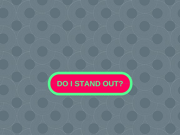
If want to make your call-to-action stand out, it’s contrast that counts. For example, if you have a page that is primarily green-hued, a red button will jump out.
Use contrast on your “Book Now” button and other major conversion buttons on your pages so that your main conversion target is dominant.
3: Directional Cues
Make it easy for your customers to find their way to where you want them to go.
Use directional cues, like arrows or a visual pathway to direct the line of sight to an end goal that you want them to reach – for example, your ‘Book Now’ button. If you want to boost your direct bookings, you want to highlight your Book Now button at every possible opportunity. It shouldn’t be hidden in your navigation or only on your homepage.

4: Whitespace
Less can sometimes be more.
White space (or blank space), is an area of emptiness surrounding an area of importance.
The purpose is to use simple spatial positioning to allow your CTA to stand out from its surroundings by giving the eye only one thing to focus on.
Simple, yet effective.
(See what we did there?)
5: Urgency and Scarcity
 By using classic psychological motivators like “urgency” and “scarcity” on your website, you can influence the demand for your hotel rooms. You can encourage people to book direct rather than feel they would rather go back to the OTA.
Proximity to the conversion goal of the landing page or the booking engine is key when it comes to signalling scarcity and building direct bookings. By ensuring your visitor understands that they have a deadline, you can make that click a little more likely.
For example, use encapsulation to highlight the scarcity statement – “Only 3 rooms left!” Put it near your call to action so there’s no visual or mental gap for the visitor.
Link this with a softer unique selling point (USP), such as “No Booking Fee” or “Best Rate Guaranteed”, to ensure your guest feels they got the best deal available.
6: Try Before You Buy
Trust boosts conversions.
A preview of quality can help people make informed purchasing decisions. For example, have a video, image slideshow, or wedding testimonials from past customers. This creates instant trust and legitimacy in a customer’s eyes, and it can be an important factor in boosting conversions.
The guest will feel sure that they are making an informed purchasing decision, and be more likely to book direct. A conversion-centered design should have creative ways to present these previews.
7: Social Proof
As we’ve said, trust is critical in customer conversion. Trust-building elements should be part of any design. Social proof is a great way to deliver independent feedback for you and your potential guests.
Testimonials are a common approach, and you can encourage your site visitors to read the great things your previous guests have said about your hotel through smart content design. Adding an explanatory headline above the testimonials (or customer logos etc.) can increase the power of social proof.
Customer behaviour is evolving, and people have more and more access to social proof. Revinate.com explains the change in behaviour:
‘In addition to visiting the hotel websites, [customers] will also read online reviews. Online reviews present another opportunity to draw customers to your own site, rather than having them return to the OTA to book.’
Responsiveness is Key
When applying the 7 principles above, you need to make sure that all your hotel’s website design features are focused on converting visitors to customers – especially optimised responsive design for mobile devices.
As mobile traffic continues to grow, responsive website design has reached near-critical importance.
However, a highly responsive mobile site delivers limited value if the conversion-centred focus of the desktop site is diminished in the optimisation. Quicksprout.com identifies the real question from a conversion standpoint when optimising a site for mobile devices as: what do I keep, and what do I trim away?
With a smaller screen, in order to take full advantage, greater consideration is required on which conversion elements are necessary, and which are just a bonus.
The “less is more” whitespace concept is often helpful when you optimise for mobile.
ConversionXL outlines 5 things to keep in mind when optimising responsive design for mobile conversions:
To sum up: direct bookings increase your bottom line, but as a result of poorly designed or unresponsive websites, many hotels are not fully capitalising on it.
The aim of your website is to encourage guests to book, and to book direct. This can be achieved through smart, conversion-centered design with the goal of redirecting guests from OTAs. OTAs offer a multitude of choice and comparison that can lead to your hotel missing a sales opportunity, so you want to move potential guests to your own site, where you have the opportunity to encourage loyalty and upsell them.
By following the 7 principles and optimising your desktop and mobile potential, you can capture site visitors and turn them into your guests.


