
In the fight to convert leads into bookings before the user loses interest and books elsewhere, site speed is what counts. Adding weight to the argument for mobile first design is that 60% of travel searches were made on mobile devices in 2016, according to data collected by Google.
For the past few years the industry has been talking about Responsive design, meaning the content on a website responds to the user’s behaviour, that’s to say their screen size, platform and orientation.
This eliminates the need for a different design and development phase for each new device on the market. The Responsive approach works with the desktop browser as its basis, and offers alternative, scaled down versions for other device/browser sizes. That works via CSS media queries, which check the browser size and adjust the layout and styling according to that.
However, there’s a growing trend in the industry to flip this on its head and begin by focusing primarily on mobile design considerations and then work up to a larger desktop version. In this article, I’ll discuss why mobile-first, or progressive enhancement, is the natural and logical progression for web design, and as with any new process, I’ll share the pitfalls to avoid along the way.

Content Hierarchy, Not Such A Bad Thing
We’ve all heard the expression ‘content is king’, mobile-first design means focusing on displaying content in the most rational way. The smaller screen size can only handle one module of content one on top of the other, without looking over-crowded or messy. It forces designers to choose the most relevant and important pieces to be put in the most visible positions.
Where writers might find it impossible to ‘kill their darlings’, web designers must be very clear in their objectives in order to achieve user friendly and visually appealing results.
Additional layers of content can then be added for visitors who browse using larger screens further down the process. This method offers a standardized user experience across all platforms and decreases download time for the most important content.
Keep Your Site Light
With mobile traffic outstripping desktop, and mobile bookings also on the rise, mobile websites or mobile apps are now a must for hotels. Site weight affecting the load time of the site is crucial for converting leads into sales on mobile.
Just as with content, the designer is forced to cut down on clutter such as fancy hover menus, sliders, flash-based animations from the start. Even fonts must be chosen according to what is legible on a smaller device.
Other things to consider with site weight is using fewer and lighter images, by compressing the files before coding them; avoiding interactive maps; hosting videos on YouTube instead of your site; and keeping forms to a minimum. This will ensure the mobile site loads faster and keeps the user in the funnel for as long as possible.
Exactly how long does your site have to load before you lose your audience? Figures by KissMetrics indicate that 40% of users abandon a website that takes more than 3 seconds to load, so taking note of these tips to make your site load faster is essential for increasing conversions. Here’s an article with more details on making your mobile site lighter.
Challenges For Designers
Because adopting a mobile-first strategy is quite different from a desktop development approach, it can be challenging for teams who are used to designing for browsing on computers, as most experienced designers today are.
Designing for mobile-first is far from a natural transition, it’s not comfortable for most designers. A mobile-first approach is restrictive in terms of space but it’s a challenge that needs discipline. This is especially true when it comes to content and convincing users that it is easy and safe to make a booking on the mobile site when their previous experiences likely indicate otherwise.
This process is currently more time consuming than older methods because it is new to both the designer, and the customer creating the website brief. If you are thinking about creating a new hotel website from scratch to work better for mobile users you will need to factor in more resources, as design costs for this type of website cost more than others.
What The Future Holds For Mobile-First Design And Booking Conversions
The aim of mobile-first web design is not to reverse the problem by creating a poor desktop experience instead of a poor mobile experience. Both mobile and desktop solutions should operate well for the user, therefore sales, engagement and goal conversions will follow.
As mobile continues to rise, and the mobile-first approach becomes king, future designers will become experts in this type of UX design and the process will become smoother, quicker and cheaper – that’s if another approach has not taken over before then.
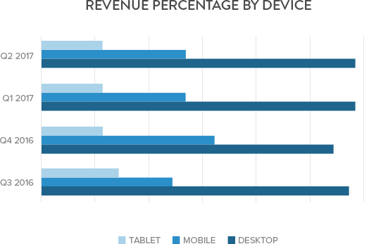
As of our most recent client data, desktop accounted for just 33% of total website visits with mobile and tablet taking the lion’s share. And with conversions predicted to follow suite it’s probably wise to make your hotel’s mobile experience as seamless as possible. Net affinity have been continuously working hard to improve our mobile experience and have recently upgraded our mobile web app to use the new AMP framework, which has already improved mobile site speed by 20%. Read more about this update here.