Our in-house design experts are always keeping us ahead of the curve when it comes to creating beautiful, perfectly optimised hotel websites. When we’re working with a client on the design or redesign of their website, one of the most important things to consider is the site’s user experience (UX). Why is this so? Seems obvious enough, but as you’re well aware, we are inundated with ads, websites, social media platforms, apps and everything else in between that we consume whilst ‘on’ multiple screens throughout the day. This chaotic overload of information has made it necessary for brands to consider how they can make their own website as visually pleasing and easy-to-use as possible. The easier your website is to navigate, the more people will convert. Why? No barriers!
Image cred: unsplash
As consumers in 2019 we want to feel cared for. We value experience first & foremost – in a wider sense yes, but this also translates back to what we expect from brands. Your website’s UX shouldn’t be underestimated, because it is what will influence your potential guest’s opinion of your whole brand – it goes beyond your website.
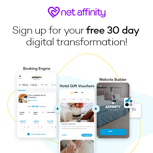
This doesn’t need to be something you spend hours upon hours poring over anymore! There are easy-to-use products available (like our new website builder!) that make it possible to save precious time and money by offering dynamic, exciting templates that generate quickly. It can be feared and assumed that using a template over a custom-made design will potentially limit your originality – this isn’t the case. Your content speaks for itself; beautifully designed templates will simply amplify this. Plus, in case we didn’t say it enough before… it’s cheap and quick!
What do you want a fabulous website for, anyway? To convert, of course. In order to convert, your website site needs to lead your potential guests, seamlessly, to where they need to be. Their experience with your site must be pleasant, simple, and hassle-free.
Here’s a few things to consider whilst perfecting your website’s UX.
Colours
Image cred: unsplash
The first thing to consider how to reflect your brand using your logo and the right colours. Colours and visuals are the first thing that will spark a feeling or recognition in your potential guest, and they encompass your entire identity. You might have a primary brand colour – have you considered supporting colours? Could you use different shades and variations depending on campaigns / seasons etc? Try this handy tool to make sure the colours you’re choosing go together and will make for a pleasing experience for your website visitors.
Consistency
Consistency with your branding, colours and visuals is super important. This is what can be handy about a website template – once you upload your logo and choose your colours, they will be applied across interfaces.
Labelling
Image cred: unsplash
Attention to detail, and detail, are key. Label everything! Think about where your potential guest is going or wants to go, when they land on your site. Reduce the steps they need to take. Remove all possible barriers that could inhibit someone from reaching a CTA. And pay special attention to the placement and labelling of your CTAs. Your potential guest also needs to be made aware of where they’re going if they click on anything, so use “open in new tab” option accordingly. Remember: well-written command names and familiar shortcuts direct users through your website and help them learn how to use it. In contrast, poorly chosen UI copy confuses people and forces them to spend time to figure things out… and do they want to spend time figuring your website out?! Not particularly.
Alt text
There’s several cases where good ALT text can play an important role on your site. ALT text is primarily developed to increase accessibility to your content across the web, and also to provide content to screen readers used by the visually impaired. Your potential guest could have impaired eyesight or could just be using a web browser that block images by default. Other instances where alt text comes in handy is when your potential guest has poor internet connection or is on a technically restricted device – the image won’t load, so the ALT text will show up instead. If you leave your alt text blank, users will see just a broken image.
Create a connection between your online world and your real world
Image cred: unsplash
Like a person’s social media profiles, your brand’s website is an extension of your brand. Its purpose is to show your potential guests who you are, and how you’ll make them feel when they arrive at your property. Use everything at your disposal to emulate your brand’s personality – photography, colours, icons, rich, useful/helpful content, video. Align your entire website’s tone with the tone your guests will pick up on and recognise when they arrive at your property. Make it a holistic experience they will remember, and more importantly, revisit and recommend!
If you’re interested in getting yourself an affordable, dynamic website, look no further than our brand new website builder.


