Most hotels know all about the importance of having an online presence. Creating a personalised, mobile-focused website is now a vital part of any hotel’s marketing strategy. However, not many organisations make full use of the wide variety of opportunities digital marketing has to offer, particularly when it comes to increasing conversions.
Landing pages are a hugely effective tool to truly get the most out of your hotel website. They are built with a single focus objective— to increase conversions, get more customers, or simply to build greater guest engagement.
Why are they effective?
We place a lot of effort into building our advertising, social media, and content marketing campaigns, but one area where many of us fall behind is the landing page. You can use a landing page for almost any purpose: to promote a special offer, sell a spa treatment, sign people up for your newsletter, or offer a discount.
However, the purpose of your landing page needs to be clear and linked to an appropriate call to action. Everything not directly related to people taking that action should be taken out, even the navigation bar. Your goal is to eliminate distractions.
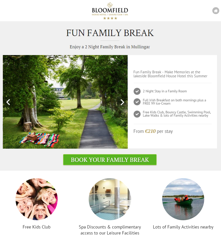
A great example of an eye catching, optimised landing page is Bloomfield’s Summer Family Fun Break offer page. The overall design is clean and designed to focus the visitor’s attention on the offer with a strong call to action.
Why can’t I drive traffic to my homepage?
If you’re still sending people to your homepage and hoping they’ll follow your product to the final ordering stage, your hotel is most likely losing sales and conversions. One of the main differences between your homepage and landing page is that they are targeting different types of visitors with different experiences.
People landing on your home page more than likely know you and your product.
They’ve most likely typed in your URL or Googled your hotel after somebody has mentioned you, or an article has told them about you. These type of visitors need to be nurtured, not sold. They need all the navigation and resources on your site so they can continue to get to know you better.
Visitors who end up on a landing page may not know you.
They may have clicked on an ad that linked back to this page and need to be convinced, cultivated and feel sure that you and your hotel can meet their accomodation needs. Your goal is to get them to identify themselves to you, so all navigation should be eliminated. You need to keep their interaction simple and direct.
When should I use my landing page?
According to Hubspot, 48% of marketers create a new landing page for each campaign. It’s a no-brainer; a landing page should be used if you are:
- Beginning a PPC Campaign
- Advertising in offline media such as TV, radio & newspapers
- Building your email list
- Want to target a particular type of client
However, not all campaigns are cut out to have a designated landing page. One of the most common issues with landing pages is that they’re created around broad categories like “Hotel Breaks” instead of being more specifically focused, like “Luxury Holiday Cottage Retreat in Kerry”. The aim here is to support your leads by laddering your sales funnel.
Which type of landing page best suits my campaign?
Different types of landing pages suit different the campaign objectives and campaign lengths. While landing pages can have numerous purposes, they can be broken out into two broad classifications: click-through landing pages and lead generation landing pages. Both types serve different purposes.
Click-through landing pages are single minded in their purpose. They want to convert people directly into sales with no ifs, ands, or buts. They work very well for products where you care more about selling a large quantity of that specific product than racking up a large list of leads.
Lead generation landing pages include a form on the page so that interested visitors can learn more about your restaurant or your special Christmas package. In return, you get their email addresses and the chance to impress and educate them with your products.
So, where do I start?
Creating a competitive landing page that converts well is not an easy task. If you want your landing page to consistently deliver results, ask yourself what you want potential guests to do when they get to your site.
Do you want them to see the trendiest amenities you have to offer? Do you want them to sign up to your email list? Whatever your purpose, having a clear idea of what you want your landing page to achieve means it can be set up to prompt and direct traffic in a way that increases the effectiveness of your online marketing.
Although there is no exact formula to making a perfect landing page, there are some common rules of thumb to increase your chances of making a winning one. Unbounce lists 5 steps to creating a successful landing page:
- Your Unique Selling Proposition
The start of a marketing campaign revolves around defining what sets your product or business apart. Your landing page needs to communicate this point immediately and clearly. This can be done in a few ways:
- Headline
- Sub header
- Reinforcement Statement
- Closing Argument
Your landing page’s USP is what grabs the attention of a potential guest. You have approximately 5 seconds to convince them this page and your hotel is worth looking into, and communicating the value of that search is how you do it.
- The Hero Shot
The hero shot is the visual representation of your offer. Images or videos can communicate ideas much more quickly than text. You need to get your guests to understand and place themselves in a scenario where they are staying in your rooms, eating in your restaurant and getting help from your concierge.
- Benefits of your Offering
Your list of benefits is what really sells the visitor on your desired action. Your headline and obvious value proposition grab their attention in less than 5 seconds, and these 3-5 benefits make them decide to engage further. This is why it is essential that this information is bullet-pointed or numbered, as any paragraphs on your landing page will reduce focus and push up your bounce rate.
- Social Proof
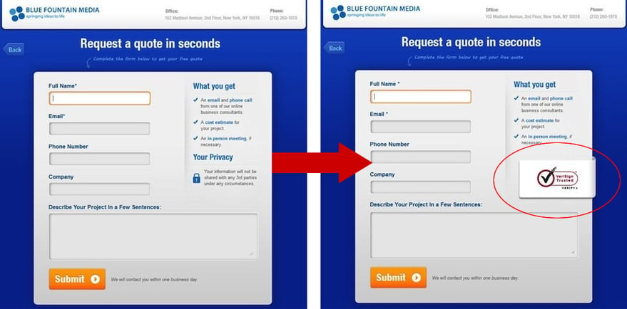
Social endorsements work by providing proof of the legitimacy of your hotel—the trust you’ve earned from your guests. Statistics have shown a 42% conversion increase due to the simple addition of a social trust symbol to a landing page, and there are dozens of other ways to show that people like you and your hotel’s atmosphere. There are a few great tips here.
- A Single Conversion Goal – Call to Action
Your CTA is one of the most important variables within your landing page. It gives the visitor a single option for action. Making it clear, distinct in colour, above the fold and appealing is a vital part of a successful landing page.
- Message Match
People who land on your landing page look for a continuous message from the original touch point, i.e. the link in the ad or email they followed. Are you using the same image in both? Make sure your titles, wording and images all match up. If they don’t, you could confuse potential customers and lose their interest.
You’re nearly ready—here’s some great graphics to help you on your way:
Here’s the contrast between a landing page and a home page:
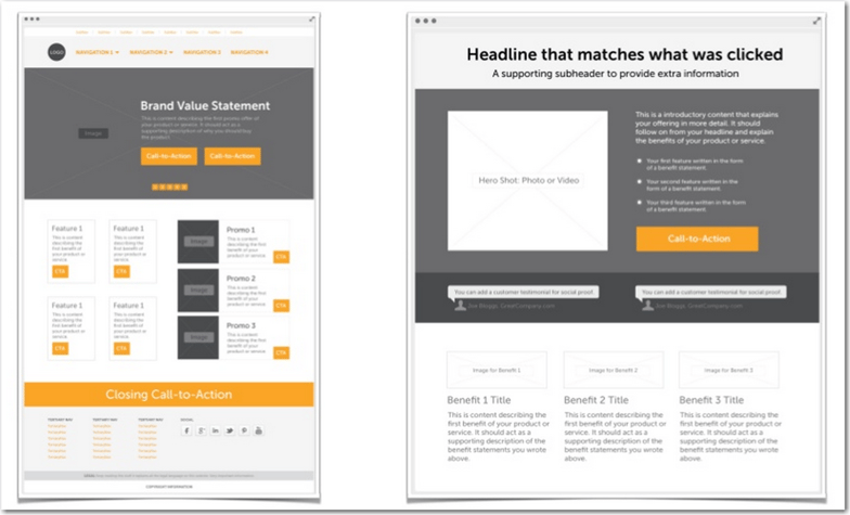
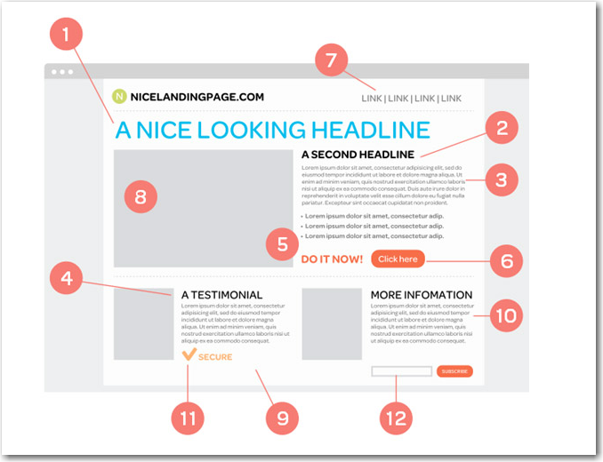
And here’s an ideal landing page: it should have an emotive headline, concise copy, testimonials or another kind of social proof, and—perhaps most importantly—a strong and prominent call to action.
Landing pages should be a very important part of your marketing strategy. They exist to capture a guest’s interest in a specifc offer or feature, in a way that a homepage is unlikely to do.
If you use your landing page to provide valuable information and offers to your guests and follow with strong calls to action, you will create a landing page that gets your guest from behind the screen and into your lobby.
This article was written by Lisa Nolan
