You might be getting an avalanche of traffic to your hotel website, but if that traffic isn’t converting into more bookings, your website isn’t doing its job, plain and simple.
Sometimes, navigating the rocky waters of conversion optimisation can be tricky. You could be ticking a lot of important boxes, but, like building a house of cards, a few wrong moves or mistakes can seriously undermine your efforts.
That’s why today’s post will cover 4 of the most common conversion killers that might be costing you bookings. More importantly, we’ll show you how to avoid them.
Let’s get started.
1. Not Remarketing To Site Visitors
If you’re not remarketing to visitors, you run the risk of allowing potential bookings to jump right out of your palm.
Remarketing describes the act of using web technology to target email or ad campaigns at users who’ve shown interest in your product or services.
For hoteliers, this means following up with potential guests who arrive at your site and express partial interest. Usually they do this by giving you their email addresses or initiating a booking process, but not following through.
Hotel Urbano, an online travel agency, received a 38% higher return on ad spend and drove “415% more revenue with only a 304% larger investment” through remarketing.
Loews Hotels reported a $60,000 boost in revenue from a small $800 dollars invested. Remarketing was one their “biggest successes”, and according to their team, it lead to “a far greater number of bookings” directly from their website.
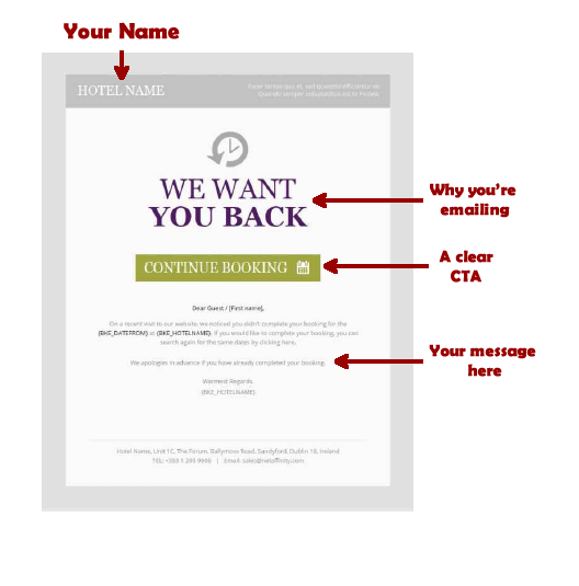
Net Affinity have noted that remarketing to those that have abandoned bookings can push a huge number of conversions—here’s an example of our e-zine remarketing and what it can do:
Clearly, remarketing is a powerful way to snag more bookings from your hotel website.
Be sure to request emails early in the booking process to capture more leads. If visitors abandon the process, you can follow up with email remarketing campaigns that include promotions or special offers based on a customer’s activity in the booking process.
2. Failing to Optimize Images
Think about the last time you purchased something online. You had a careful look at the product image, right?
Well, your potential hotel guests will do the same.
You aren’t going to sway them to act with promises and words alone. They want to see what you’re offering them, and images are a great way to show–not tell–them what to expect.
Images are scrutinized by visitors and are proven to boost time spent on site.
To get the maximum ROI out your images:
- Make sure your images are responsive. 30% of traffic to tourism and travel sites comes from smartphones
- Have your photographs taken by a professional
- Make sure your photos reflect your hotel’s personality
- Ensure that your images don’t reduce page loading speed. Slow loading speeds fracture conversions.
- Check that your image complements your CTA and draws attention to it instead of competing against it.
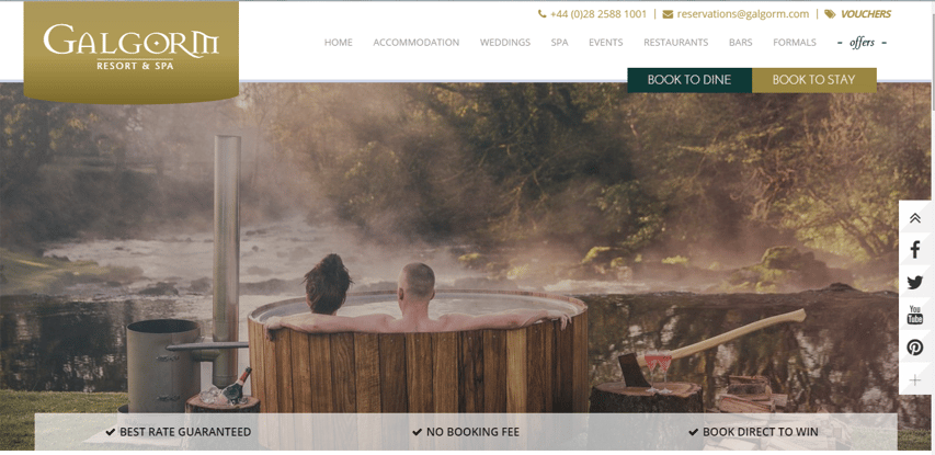
The Galgorm Resort does a nice job of using images on their site:
They have high quality, inviting images that don’t sacrifice loading speed. Their images convey the atmosphere of their resort and load well on mobile.
Here’s another example from Brook Lane Hotel:
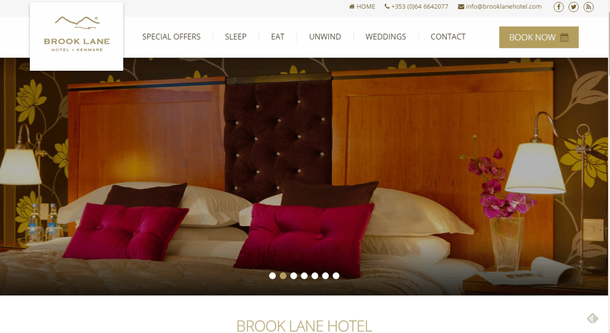
The color scheme is gorgeous; the images have a fast loading speed and are high quality. But more importantly, they capture the luxurious, personable experience the 4 star boutique hotel aims to create.
3. Expecting Guests To Accept Claims without Proof
“Platitudes and generalities roll off the human understanding like water from a duck. They leave no impression whatever.” (Advertising legend, Claude Hopkins)
Expecting potential guests to believe your every claim, without proof, will hurt your conversions.
Your guests are bombarded by ads and marketing messages. They’re constantly being sold to, and they shop smart. You can’t expect to make a claim and think they’ll just believe you.
However, they will believe reviews and testimonials about you.
Reviews and testimonials are effective conversion boosters, because as humans, we care greatly about what others think of us, and we’re more likely to do something if everyone else is doing it.
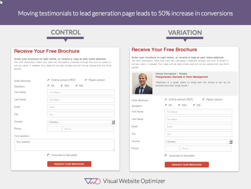
When the Hotel Institute Montreux placed a testimonial on their landing page, they lifted conversions up by a large 50%.
When it comes to enhancing conversions with social proof, reviews are also effective tools for hotel websites.
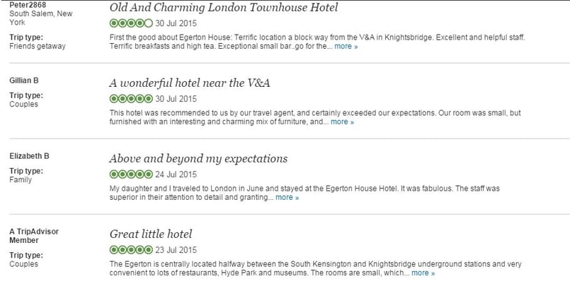
Take a look at these reviews from ergetenhousehotel.com…
They work well because:
- Each review tackles one main point. The reviews cover atmosphere, location, customer service and convenience, but no one review tackles all of them and there isn’t too much overlap.
- They give information on the reviewe Information on each reviewer is provided on the left, detailing the type of trip and the name. This helps the reader match a person to the words and adds authenticity to the reviews.
- The reviews are recent. This adds to the credibility of the reviews and makes them more believable.
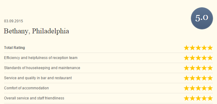
Here’s an example of a Net Affinity review page—as you can see, the review is large and detailed while still being clear, giving the reader every opportunity to inform themselves about what other guests think of your hotel.
4. Offering Too Many Choices
A famous New York Times case study tested the influence of choices on buying decisions.
The test was carried out on two different Saturdays and had some interesting results. The first Saturday, 24 different flavours of jam were given. The next Saturday, only 6 different flavours were offered.
On the day with 24 different flavours, only 3% of people actually bought anything.
On the day with 6 flavours, however, 30% of people made purchases. This resulted in 600% more jam sold.
The conclusion is simple: Too much choice can hurt conversions.
Hoteliers may be tempted to show multiple room types, multiple offers, packages and rates, all of which is sometimes presented as one overwhelming list. This typically creates an unpleasant experience for the person trying to book and increases anxiety.
To prevent your site from overwhelming your guests, make the booking process more digestible.
You can do this by:
Reducing add-ons in the booking process
It may seem like there’s no harm in offering a few add-ons. But data shows that only 3% of guests actually purchase add-ons, and a huge list of add-ons isn’t worth the potential confusion it can cause in the booking process.
Does this mean you shouldn’t use add-ons? Nope!
You can limit use of add-ons, or use them later in the booking process to lighten the load.
Create Smaller, Digestible Steps
Ever read an article with huge chunks of text and frighteningly long paragraphs?
Compare that to an article with speedy, short sentences and punchy paragraphs.
Which one was easier to read?
The second, shorter one, right? Because it made you feel like you were progressing, and you felt quicker doses of gratification when completing sentences and paragraphs faster.
Well, one way to make your booking process more digestible and less likely to overwhelm is to break things up and make them shorter.
Instead of chunking multiple parts of the booking process together, let your guest select the room first, then the packages, then the add-ons, etc.
To summarize, be sure to remarket to hotel site visitors, optimize your use of images, show what others say about your hotel, and aim to make the booking process as frictionless as possible.
Need help implementing the advice above? Get in touch with us and find out how we can help you.
