
Next year there will be an estimated 2.16 billion smartphone users in the world, according to recent figures from eMarketer. A separate report from online marketing company Criteo also shows mobile commerce transactions now account for 30% of all e-commerce transactions!
The world of travel is going digital and, more specifically, mobile. For hotels, it is vital to have a strong online presence, and it’s just as important to be easily findable on mobile.
So ask yourself: is your site mobile ready? And if it is, are you sure it’s the right kind of ready?
Today, we’ll take you through exactly why mobile is what everyone’s talking about. After that, we’ll go over the different options you have when you’re making a great experience for your guests.
Hotels and Mobile
If we look at the hotel sector specifically, we’ve seen incredible change with our clients at Net Affinity. Traffic to mobile devices grew 37% this year to date, while mobile revenue has grown 45%. We’ve also seen the booking lead time grow by 6 days.
Mobile Behaviour is Changing
Firstly, the recent changes in mobile behaviour are due to a number of factors. Here’s a quick snap of how society today interacts with their handheld tech, and why. This gives you some real-world context beyond the numbers.
The world of technology is undergoing more than a surface change, and mobile is embedded in our everyday. Your hotel’s marketing needs to reflect that, or be left behind.
1. Screen resolution
Mobile screen sizes continue to grow with the introduction of the iPhone 6 and Samsung Galaxy S6. The pixel density and screen quality have also improved, meaning more of the page is visible to potential guests without the need to scroll.
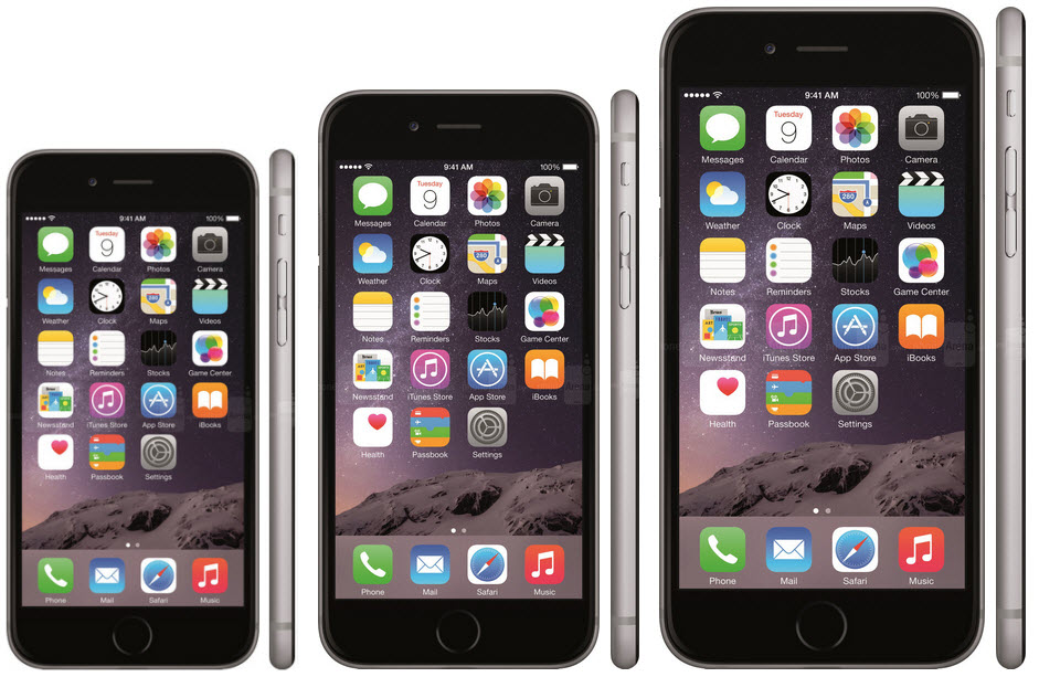
Image Source: Forbes
2. User Experience
Improved network speeds, longer battery life and increased processing power all make smartphones today work as efficiently as a laptop or PC.
For many in developing countries, a smartphone is their first computer and their only Internet-connected device. Since entry-level smartphones are now relatively cheap, many people who were never able to afford a computing device now have one in their pocket.
For the developed world, this also means that we’re more connected to our phones than ever, flicking through content and social feeds on our commutes and at school and work. We use our phones to answer any and all questions we have about restaurants, events and, yes, hotels.
3. Work
Employees keep their smartphone next to their computer, at hand to search, shop, text, email, tweet or post. On the road, we are also reliant on our smartphones to keep connected to work emails. This ‘always on’ culture is a modern phenomenon and impacts heavily on our mobile usage.
While perspectives differ on the benefits of being so attached to our phones, one thing is certain: we’re doing more online than we’ve ever been able to before, including making travel arrangements and booking hotels.
4. Home
Nowadays, people even multitask when they’re supposed to be relaxing. So when we’re at home watching TV, we also have a smartphone in hand, browsing, tweeting and posting.
In fact, 81% of us use our smartphones and televisions simultaneously.
So, what does this shift mean for hotels? It’s a game changer.
The European Context
According to a recent study from Dublin-based research firm Statcounter, Irish people are the biggest phone internet users in the western world, swiftly followed by Finland and Holland. Their statistics show that, of anywhere in Europe, North America or South America, 5 European countries are in the top 6 spots for mobile penetration, beating out South America, the UK and the European average.
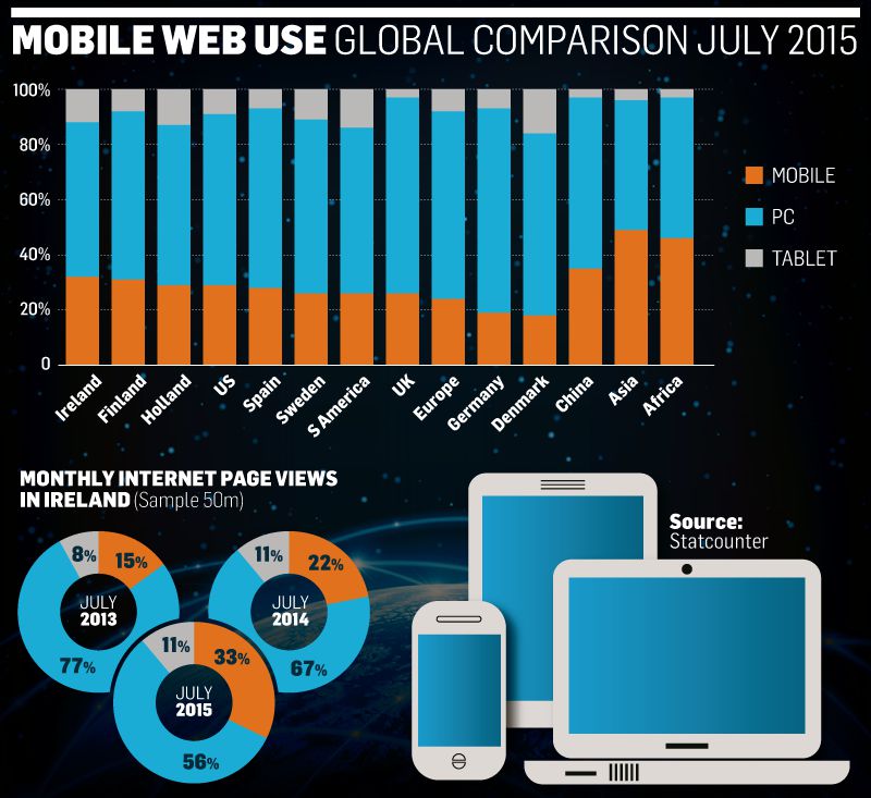
Image Source: Statcounter
Two years ago, just 15% of our web time was on mobile. This has more than doubled as people turn away from booting up laptops or desktop PCs to use their phones instead. The figures likely even understate how dominant mobile is, as they do not track app activity but only measure our use of internet web sites.
What does this mean for hotel bookings? These changes have revolutionised user behaviour and mobile is no longer just for last minute bookings.
In fact, at Net Affinity we’re now seeing the same booking pattern through mobile as desktop for many hotels. This is because people are using mobile for every stage of the consumer journey, from browsing to booking. Did you notice Hotel Tonight now offer a look ahead service for rates up to 7 days in the future? That’s a sign of the times.
“The adoption rate of mobile is twice that of the internet, three times that of social media, and 10 times faster than PCs.” (Emma Crowe, Somo)
The Future is Mobile
In April 2015 Google rolled out their ‘mobile friendly update’, often referred to as Mobilegeddon. This update means websites that are not mobile friendly, including hotel sites, will be penalised on search rankings.
This is almost certainly just the beginning. As long as users continue to use their smartphones to search, Google will attempt to give them the best experience. This means that Google will continue to tweak their mobile-friendly algorithm over time, adding factors they believe will help the mobile searcher—and slowly cutting out those websites that aren’t on mobile.
Design
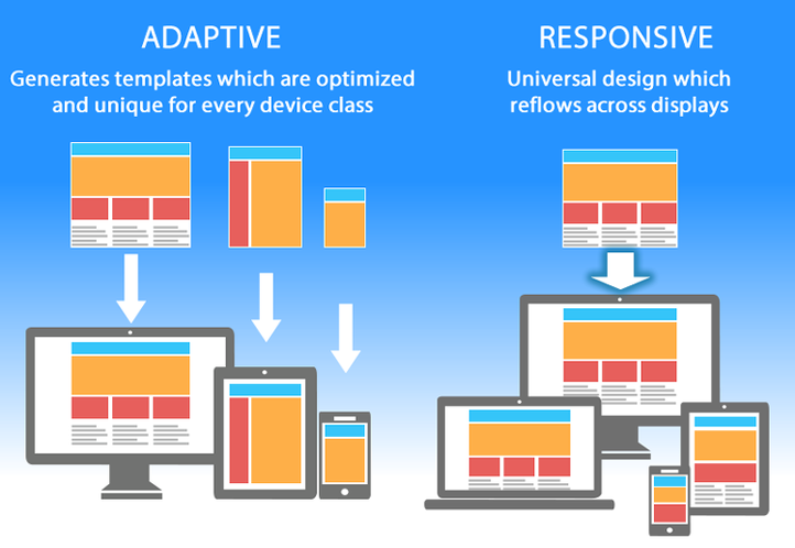
Hoteliers face two main choices for mobile website design: adaptive or responsive. Responsive Website Design (RWD) is one layout that fluidly changes depending on the size of your screen.
Adaptive Web Design (AWD), also called Responsive Design on the Server Side (RESS) customizes website content and the overall user experience to the device (desktop, mobile, tablet) the visitor is using. Basically, this means that each different device gets its own template, optimized for the best experience.
Adaptive design is all achieved from the same Content Management System (CMS), and ensures the maximum user experience, the most relevant information and the highest conversions per device.
There is not a one size fits all for hotels when it comes to design, but here are some important factors to consider when deciding on Full Responsive vs. Adaptive/RESS Design:
- Cost: A full responsive design typically requires more website design and development time compared to an adaptive/RESS design, which translates into higher website cost and longer delivery time. However, this isn’t always the case: more components may have to be designed and built using the adaptive design approach. Get a quote for both options when planning a new design.
- Design:Full responsive design is practical for “thinner” websites (around 15-20 content pages) which need a simpler design that renders well on all screen sizes and devices. For boutique or luxury hotels that want custom website design and engaging visual experiences, an adaptive/RESS design would be the preferred option (if budget allows).
- User Experience:Fitting the same website into every possible screen size via full responsive design may address the viewing experience across all devices, but may not fully accommodate other best practices. Things like user experience, relevancy of information and download speeds may suffer. Each mobile page needs to load all of the content of a desktop site. Mobile devices are generally much slower than a full desktop computer, so they’ll take longer to process all that content.
- Download Speeds:Full responsive designs typically suffer slower load time than adaptive designs. Each page has additional script that is needed to fit the page for each particular screen size and device. Although not a serious issue for websites with minimal content (15-25 pages), deeper content websites with larger imagery and lots of graphics may load at significantly lower speeds. (A smaller site can also still have loading issues if the amount of imagery on the site is substantial)
- Relevancy of Information:Users have different intents when they visit a hotel website on different devices. For instance, the always-on-the-go mobile traveller requires short, slimmed-down content with an emphasis on property location, area maps and directions, rates and availability, an easy-to-use mobile booking engine and a click-to-call property reservation number. Fully responsive websites won’t let you display different content on mobile.
- Conversions:Overwhelming a mobile user with the full 100+ content pages of the desktop website means the user may not be able to quickly find the information they need in order to make a smart purchasing decision.
At Net Affinity, most of our clients are using websites with responsive design for desktop and tablet, coupled with our unique mobile booking app, which tries to make booking easy and natural on mobile.
Some of our hotels are also starting to build their own adaptive mobile sites to capitalise on the changing landscape – it all depends on your specific hotel and your needs.
What does all this mean for your hotel?
If you’re using a responsive design – and in some cases, that’s the right choice – you need to make sure that you have an intuitive booking engine so the ‘extras’ from the desktop website don’t weigh down your booking rate.
Recommendations:
Choose full responsive design (RWD) for websites that do not need more than 15-25 pages of content. Designs should be simpler and content should be kept minimal so the user experience is not compromised.
Choose adaptive/RESS design for premium, luxury and boutique properties with deeper content (26 plus content pages), extensive imagery and/or a complex product
So, now you’re armed with the know-how to go forth and choose your website type. Look at your hotel, your current website and your guests, and use that data to decide which type of mobile site is best for you. In today’s landscape, mobile is king, and you’ve got to be prepared.
If you’ve got more questions about web design for your hotel, get in touch and we’ll be happy to help answer your questions!