Landing pages are essential tools for converting visitors from a marketing campaign into guests. They funnel your visitors into a single action-oriented page, which – depending on your goals – gives them the choice to:
- Book
- Bounce
- Subscribe
However, creating landing pages that book instead of bounce isn’t easy. This is especially true when you’re selling premium services like rooms, holidays, and travel packages. Research shows that building and testing landing pages is one of the top five challenges marketers face.
Today’s post will attempt to provide some ease. We’re taking you step-by-step through the process of creating high-converting hotel landing pages. We’ll walk you through the necessary steps for building a hotel landing page that wins bookings.
(Image source)
Let’s go.
Landing Page Ground Rules
(Image source)
You can’t build a high converting landing page without nailing the basics.
Neglecting the “rules” we’ve set out below will plunge your conversions over the metaphorical cliff before they even have the chance to reach the peak.
Rule 1: Send Ad Traffic to Your Landing Page, Not Your Home Page.
It may sound obvious to you, but research shows that nearly 40% of marketers direct traffic to a homepage, not a landing page.
Ouch.
Any type of promotional traffic – that’s traffic coming from your ads for competitions, vouchers, special packages and offers – you get should never be sent to a homepage. Why? Because your homepage is crammed with distractions in the form of information, links, and images.
Your homepage is designed to help people learn more about your hotel; but it won’t necessarily nudge them towards buying from you. This is especially true when they come expecting to see a specific offer or promotion. You absolutely don’t want to make them hunt through the side to find it, because the odds are that they just won’t bother.
Rule 2: You Need a Clear Headline
See the Airbnb landing page headline above? That’s an example of a strong headline. It is simple, clear, and tells the reader how he will benefit.
Your headline is the gateway to the rest of your landing page. If it’s confusing, boring, and fails to grab attention, your potential guest will go no further.
When crafting your headline, don’t focus on being cute or clever (you can do that later). Instead, emphasize value and clarity above all.
Rule 3: Clarity and relevance are paramount
Avoid flooding your page with text, and avoid using complicated jargon. Be as concise and clear as possible.
Once you have all your landing page content written down, revisit it with the goal of stripping away information that doesn’t help your visitor make a decision.
Rule 4: Have Digital Tunnel Vision
Your headline, your images, your copy, your colour, and design should all be focused on getting your reader to take one specific action.
This action may vary depending on your goals. You might want to get more subscribers, and follow with email offers. Or you might want to persuade visitors to book directly.
Either way, focus on one thing.
This means every single element on the page should be engineered to motivate your visitors to take one action. So no links to other pages, no excess information, and no random images.
To us, this sums up the basics of what’s necessary for a great landing page. Keeping those in mind, let’s take a look at some broader considerations.
Begin by Deeply Understanding Your Guests
(Image source)
Maybe we should have put this one first – after all, it’s fundamental to your landing page’s success.
Think about the two different types of guests:
- A 45 year old electrical engineer with a wife and 2 kids, who is looking for a short relaxed trip.
- A single, 27 year old graphic designer who is looking to absorb as much holiday and party time as possible.
Both will be looking for different experiences while staying with you. And it’s your job to understand and address that.
Try to understand as much of your guests’ thought processes as possible. Make sure you have a firm grasp of their main pains. Paint a vivid picture for yourself of what their typical online experience when browsing for hotels looks like.
To do this, use tools like analytics as well as buyer personas. This will help create a landing page message that’s aligned with visitor expectations, which plays a huge role in reducing friction and clarifying your message.
Craft a Solid Value Proposition
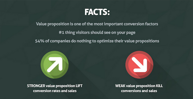
According to research by Marketing Experiments, “the biggest hurdle companies have is creating an effective value proposition; the second is communicating it clearly; the third is testing/measuring the value proposition.”
Your value proposition is not a slogan, it is not a positioning statement, and it is not a catch phrase. It’s something more than that – it’s why and how your hotel is a solution to your guests’ needs.
Below are three examples of solid hotel value propositions:
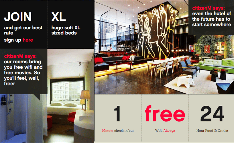
CitizenM Hotels:
CitizenM hotels are all about the future – and they believe the future of hotels is to have luxury accommodation at an affordable price. Their images reinforce their message, and they demonstrate their uniqueness with clarity.
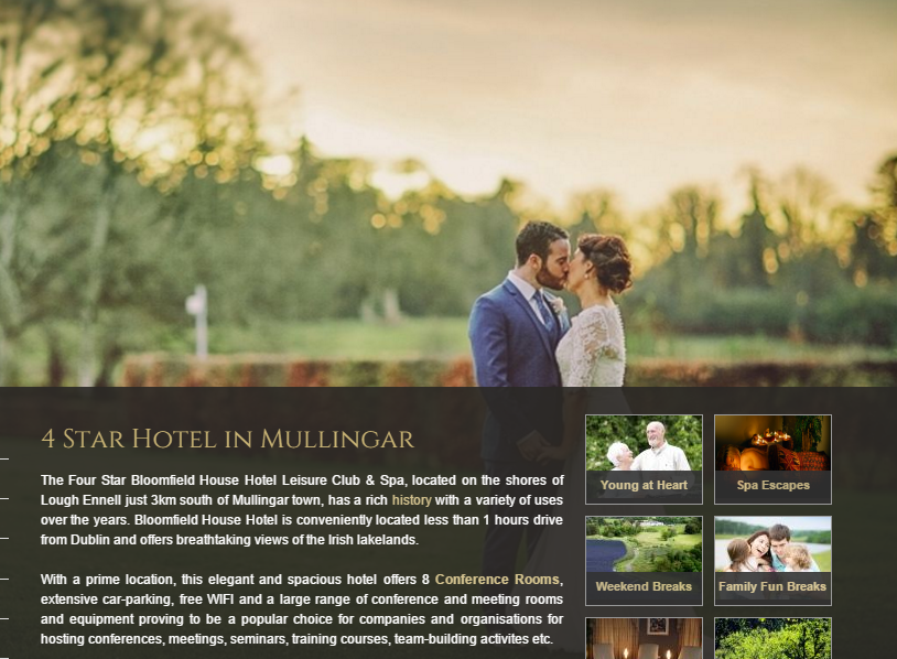
Bloomfield House Hotel:
Their copy adds a lot of punch to their value proposition. It doesn’t just tell you what you get. It spells out how the hotel can benefit and enrich your life. Bloomfield also does a fantastic job of specifically showing who they’re a perfect match for, and what they specialize in. You immediately form the picture of an “away from it all” hotel that’s great for things like meetings and conferences, as well as relaxing getaways.
The Hoxton:
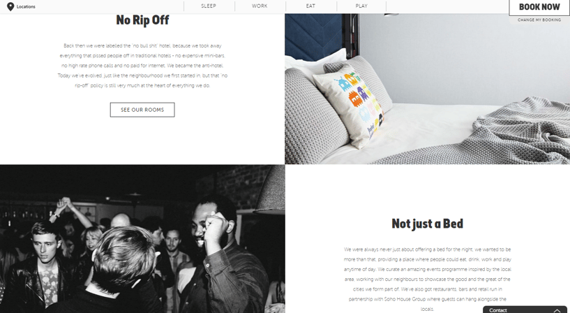
Their value proposition is clear, uses relevant images, and radiates a fun personality. However, what makes it powerful is how the hotel differentiates itself. They tell you how they’ve defied industry norms to give you an authentic experience that immerses you into your environment. They make you feel like a local, rather than a tourist.
A solid value proposition usually contains the following:
1. A Great Headline
This is usually the biggest benefit being offered or the biggest pain you’re solving. Either way, it has to quickly hook attention.
2. A Visual Element
Images are powerful communicators, and they can help reinforce your message.
3. A 2-4 sentence paragraph
This includes specific details of what you offer. Who is it for? What exactly does it do? And what makes you special?
4. Bullet Points
This is where you’ll list your main benefits and key features.
When your visitor lands on your page, the first thing he’ll think is “does this site have what I need?”
The goal of your value proposition is to make the answer a solid yes. It’s there to quickly show potential guests you’re the perfect match for them.
For more info on creating a powerful hotel value proposition, check out our post here.
Maintain Strong Message Match
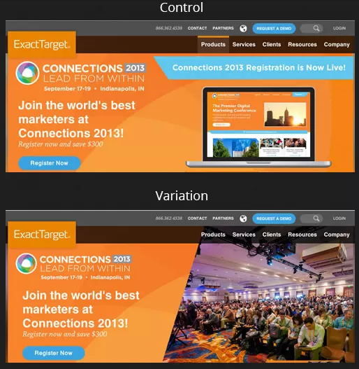
(Using a more relevant image lifted conversions up by 40.18%)
In a case study by strongview.com, increasing relevancy in email marketing increased conversion rates by 500%. And in another study by contentverve.com, improving CTA copy relevancy boosted conversions by 200%.
The more relevant your images, copy, and overall elements are to your visitors, the lower the levels of friction. This translates into higher conversions.
Optimize Your CTA
Your call-to-action is one of the most important aspects of your landing page. It represents the tipping point between bounce and conversion, and can singlehandedly lift up or crumble your conversion rates.
That’s why it’s important to make it as strong and prominent as possible on the page. To ensure that your CTA draws attention and fuels action:
- Use a colour that stands out: use a colour that’s complementary or at least sharply contrasting with the primary colour on the page, and don’t be afraid to go for something bold.
- Test different phrases or words in your CTA. This can have a huge impact on your CTA’s power.
- Make your button look clickable. Give it a distinctive shape, and have enough white space – e.g., uncluttered space – around it to let it stand out.
- Experiment with visual cues: you can try arrows, or have a person on the page whose eyes are focused on the button.
Conclusion
All the steps above will help you craft better landing pages. However, they’re still only the foundation.
If you’re not testing your landing pages, you’re only halfway there. A/B testing is the key to optimising those pages to get the most out of your campaign traffic. Testing 5, 10 or even more variations of your landing page will help you pin down the perfect one. Even Obama raised an additional $60 million using A/B Testing.
Our advice is to start with the most important elements like a bold CTA, engaging headlines, your hero shot, and strong copy. Then work your way down to the details. If you’ve got a different strategy for building the perfect landing page, let us know in the comments below.
