“How can I get more bookings and more revenue?”
This is the question that every hotelier must answer to keep his business alive. The question is simple, but answering it can be a challenge.
The challenge becomes even greater when you’re immersed in managing the day-to-day operations of your hotel. It’s hard to see the forest for the trees, sometimes – or, for a more appropriate metaphor, it’s hard to see the battlefield when you’re busy in the trenches.
Today’s post – and the infographic at the bottom – will briefly lift you out of the trenches by providing you with 18 tips that’ll help you get more bookings and boost your hotel revenue. Take a look at a map of the whole battlefield and find out where your strongest and weakest points are.
Let’s go.
1. Solidify Your Hotel Guest Personas
(Image source)
Who are your guests? Why are they staying with you? Are they travelling on business or leisure?
You can answer these questions by developing a solid guest persona or two. And when you do answer them, you’ll have powerful data that will improve and focus all your marketing and sales activities.
2. Use a Strong Value Proposition to Resonate With Guests
Here’s a scenario:
After searching for a hotel for a family holiday, your guest has narrowed the search down between 2 hotels. Your hotel is one of them.
If your hotel value proposition is strong, your potential guest should see why you’re the right option, know why you’re unique and be more likely to pick you. However, if your value proposition is weak, you’ll lose business.
Don’t underestimate the importance of a value proposition: strengthening your value proposition is essential to getting more bookings.
3. Speed up Your Hotel Website
Slow site speeds can fracture your conversions rates. Research shows that up to 75% of people will leave for a competitor’s site to avoid dealing with delays.
When you’re looking to boost loading speed, wading through the technicalities can be tricky. Luckily, we’ve got some hotel-specific advice you here (check out point 2)!
4. Make Your Hotel Gallery Page Sparkle
Your hotel gallery page is where potential guests come to find out more about you. It helps them decide if you’re the right hotel for them, by showing off your personality and your (hopefully!) polished rooms.
That’s why it has to sparkle.
5. Keep Your Site as Simple As Possible
According to a Google study in 2012, websites that are visually complex are seen as less effective and less aesthetically appealing.
This is why simplifying your design and navigation is essential. Along with making your site faster, it will help guests consume information quicker and leads to cognitive ease, beefing up your persuasive power.
6. Don’t Spoil Visitors With Too Much Choice
Too much choice causes friction, and friction damages booking rates.
Avoid overwhelming potential guests with choices. Limit your packages and navigational options to the essentials.
7. Bring Guests’ Emotions into play with Visual Stories
Research shows that:
- 67% of consumers consider clear, detailed images to be very important and carry even more weight than the product information and customer ratings (MDG Advertising)
- Travelers are 150% more engaged with listings that have more than 20 photos than with properties that have only a few photos (TripAdvisor, 2013)
Images pack a huge emotional punch and can help turn casual visitors into guests. But that’s only if you’re using them correctly.
8. Get Mobile Savvy
(Image source)
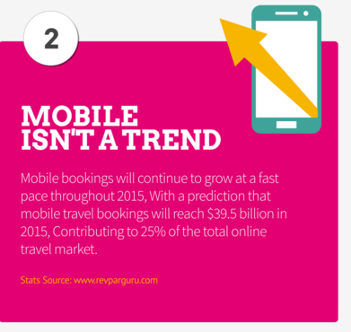
With over a quarter of the online travel market’s money coming through mobile, making your website responsive or adaptive for mobile isn’t a choice anymore. If you want to get more bookings, it’s a must.
Make sure you’ve got a separate concept for your mobile site as well. If it just looks like a shrunken version of your desktop site, odds are you’re trying to fit too many elements on too small a screen, and visitors will be confused as a result.
9. Peek behind Your Digital Curtains with Analytics
Your booking engine is full of useful data, and it can give you a serious competitive advantage. However, it can be a little intimidating to wade through all that big data to find the useful stuff.
That’s why we’ve created a practical step-by-step guide to help you find your booking engine’s secrets and unlock that competitive edge.
10. Ensure That Your Branding and Design Is Highly Relevant to Your Guests
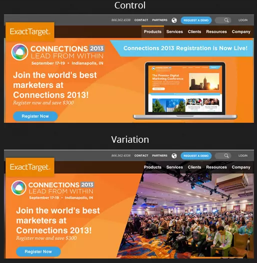
(Using a more relevant image lifted conversions up by 40.18%)
In a case study by strongview.com, increasing relevancy in email marketing boosted their conversion rate by 500%. And in another study by contentverve.com, tweaking CTA copy relevancy boosted conversions by 200%.
The more relevant your images, copy, and overall design are to the kinds of guests you get, the lower the levels of friction will be for your potential guests. That translates into more bookings for your hotel website.
11. Have a Compelling Call-To-Action
For the most part, focus in a marketing campaign is on email campaigns, ad designs, copy and images. Those are all important, but the importance of the call to action on your landing page or in your ad can get overlooked in the noise.
Your CTA represents the tipping point between a bounce and a conversion. If you want people to click and convert, you need to have a call-to-action that reels them in.
12. Be Benefit Driven
Don’t list your hotel’s features like this:
- A great spa
- A safe and fun play area
- A spacious conference room
Instead, explain how these features translate into benefits for your potential guests and say:
- We have a health spa and gym. That means you can let your hair down and unwind after a busy day
- We have a kids’ play area, so you can indulge in quality time with your significant other
- We have a spacious conference room, so you can hold meetings comfortably and communicate more effectively by using our boards and projectors.
13. Use Colour to Your Advantage
In this case study from Bing, switching links to a more recognizable colour amped up revenue by a cool $80 million.
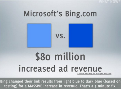
In another study by Dan Mccready from Dmix, switching the CTA button color from green to red boosted conversions by 34%.
(Image source)
When you use it properly, colour can impact your conversions and bookings. On the other hand, using colours to improve bookings is not about manipulating guests like a ventriloquist pulling strings on a puppet. It’s about using colour to compliment your brand and subconsciously communicate the right message.
14. Craft Exciting Copy
Good copy flows smoothly when you read it- there are no logical jumps or awkward phrasing. It shows your guests how you fill their needs and overcomes their objections to staying with you.
Bad copy, on the other hand, creates jagged, friction-riddled thoughts. It doesn’t address to the needs of your guest and fails to spark any kind of emotion or interest.
Looking for more info on writing compelling copy? Check out our guide.
15. Take Advantage of Retargeting
(Image source)
Research shows that over 70% of travel website users will abandon their bookings.
One way for hoteliers to combat this is to use retargeting to reach potential guests who’ve “slipped through the cracks”. Try retargeting and give yourself a second chance to win over guests.
16. Back Up Claims with Social Proof
Your potential guests are bombarded with tons of ads, and are wary of the claims that your hotel makes. They’ll be a lot more accepting of what other guests say about you.
This is why social proof is a must.
To implement social proof you can use:
- Testimonials
- Ratings and reviews
- Badges, awards or certificates
- Kind words from an “influencer” or popular individual
17. Have a Killer Landing Page
Many people focus heavily on SEO, PPC or content marketing…and rightly so. They’re great tools for getting potential guests through the door.
But there’s one thing that tends to get neglected, and that’s the landing page.
Slapping together a last minute landing page will undermine all your other marketing efforts. The landing page is where potential guests are converted into paying customers.
To ensure that you have a great landing page:
- Have clear copy that connects with your guest’s emotions and calls him to action
- Use a prominent CTA that’s aligned with your guest’s interests.
- Use images that reinforce the points you want to make
- Use a strong headline
18. Always Be Testing and Improving
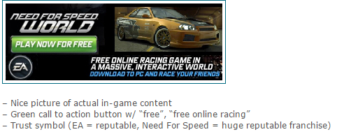
Which of these two game ads do you think converted better?
This one:
(Image source)
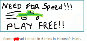
Or this one:
(Image source)
The second one was “expertly created” in Microsoft Paint.
And guess what?
Most people would just assume that the first ad would perform better without testing, and they’d be starving themselves of conversions and profit.
Don’t make the same mistake.
When it comes to getting more bookings, you can’t afford to take whimsical stabs in the dark and “go with your gut”. You need to ground your actions in raw results and data. And the only way to do that is to test and improve your concepts over time.
There’s your glimpse of the big picture, along with 18 ways to get more bookings and boost your hotel’s bottom line.
If you need help implementing the techniques above, don’t be afraid to give us a shout.
