There’s a variety of channels you can use to market your hotel. Social media, SEO, pay-per-click, and remarketing: they’re all useful tools.
Email, used right, can whiz past them all.
Your email list is a powerful marketing resource. It generates high quality leads, and can prove invaluable for guest retention.
According to the Direct Marketing Association, email marketing generates a whopping 2500% ROI.
But here’s the problem: If your hotel email list is starving for subscribers, your emails won’t be nearly as effective. Furthermore, even if you do have a decent sized list, your email marketing database degrades by 22.5% every year naturally. Yikes!
Today’s post will help you overcome that problem. You’ll learn 5 mistakes that are deflecting people away from your list, and more importantly, how to turn those mistakes into more high quality email leads for your hotel.
Let’s get started.
1. You Make Subscribing to Your List Hard
People like to do things that are easy. That means that the harder signing up to your list is, both in terms of guests understanding why to subscribe and guests understanding how to subscribe, the fewer subscribers you’ll get.
How exactly do you make subscribing easier? Start by cutting out the noise and telling guests exactly what you’ve got.
Here are 2 tips you can use immediately:
Tell Potential Guests What They’re Missing
Sometimes, being more direct in your marketing can work wonders.
By telling potential guests what they’ll be getting if they sign up – and what they’ll be missing if they don’t – you make it easier for them to decide to subscribe. This is because people are psychologically programmed to fear losing something more than they enjoy gaining something.
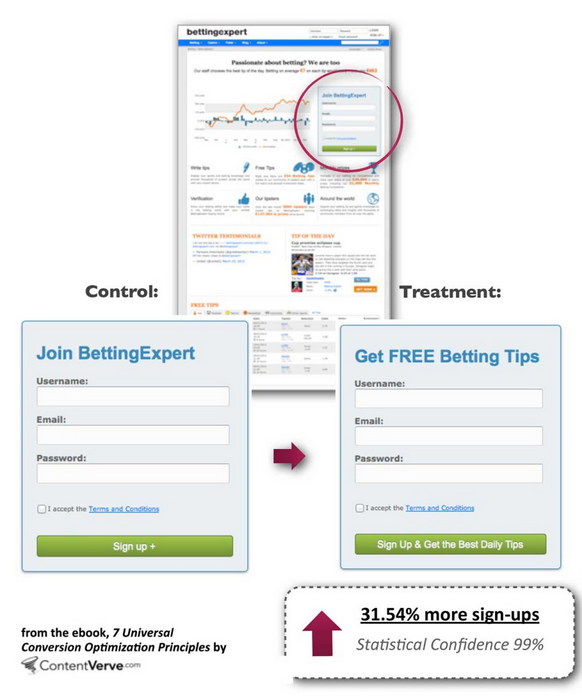
Online betting tips company BettingExpert had great results when applying this small tweak to their opt-in forms.
They found that the direct, informative version got 31.54% more subscribers than the other version.
Reduce Required Form Fields
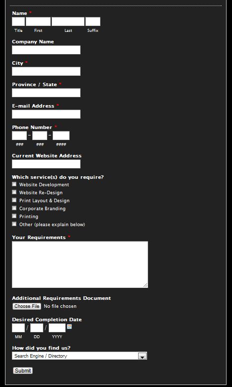
Would you rather fill out a form like this?
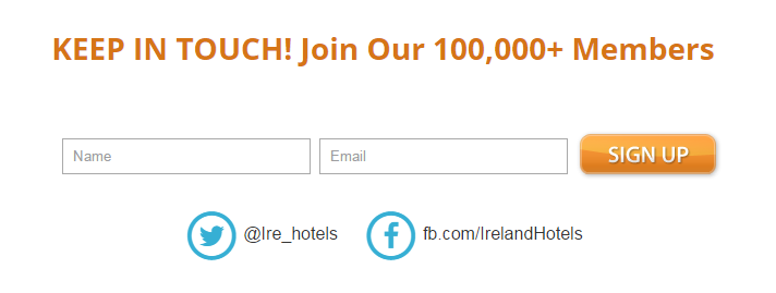
Or this?
The choice is obvious.
The first form would give the owner nothing but a high-converting back button. The second sign up form, on the other hand, is a breeze in comparison.
No one wants to give a stranger their phone number if they don’t have to—make the smart choice with your email sign ups and cut out the fields you don’t need.
2. You Have a Wimpy Call-To-Action
“Your call-to-action represents the tipping point between bounce and conversion.” (Michael Aagaard, conversion rate optimizer)
Having a weak call-to-action (CTA) is going to cost you big time. It’s where all that hard work you put into your copy, your designs and your branding can either push guests through to the finish line or let them run out of steam.
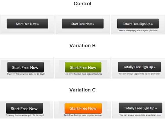
Your CTA might be a small element, but it’s a pretty powerful one. This study from Copyblogger shows just how effective changing your CTA can be:
There were no major changes to the calls-to-action. Only small tweaks in wording.
And those small tweaks resulted in an 81% conversion boost with variation B (the green button), and a 95% conversion boost with variation C (the orange button).
To magnetize your hotel opt-in form CTA:
- Use powerful language, no fluff.
- Stick to one call-to-action
- Make your button stand out
- Experiment with images in the form
Finally, remember to prioritize relevance and value over everything. The more relevant your CTA is, and the more value it indicates to your visitor, the higher opt-in conversions will be.
3. You Don’t Reward People Who Subscribe
Sony boosted conversions by 300%. Dropbox is worth billions despite spending very little on advertising. And in their early days, Paypal grew by 7-10%, every single day.
Guess what all these growth stories had in common?
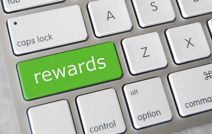
If you said a reward-based strategy to spur people to action and make them glad they signed up, you’re right.
Potential guests might subscribe to your list if you just ask them. But you’re guaranteed to shoot up your subscriber count by offering visitors a reward for signing up.
Not sure what opt-in rewards to use? Here are a few ideas to get you started:
- Travel guides that include popular attractions near your hotel
- Hotel discounts and special deals for subscribers
- Email-only monthly contests and giveaways, advertised across your social channels
To create an opt-in reward that potential guests will love, start by looking at things from their perspective. Focus on helping them solve a problem or filling a need.
4. You Don’t Split Test to Find the Best
You might think split testing is too complex, or are unsure of how to get started.
Don’t worry – it’s not rocket science! All you do is compare one page element against another to see which converts better. Then, when you find your winner, you stick with it and keep optimizing.
For the little effort required, split testing has a huge ROI. You can skyrocket your conversions and bookings without having to fork out cash for more traffic, exposure, or reach.
You just tweak on-page elements for better results.
In fact, marketing experts like Glen from ViperChill have claimed that–with split testing–it’s even possible to double subscriber growth with 10 minutes of work.
So what split tests should you run to snag more hotel email subscribers? You can test:
- Your call-to-action
- Your opt-in box design
- Your CTA color
- Your opt-in reward
- Your opt-in box location
And keep in mind that common wisdom and best practices aren’t always correct. When you split test, you’ll detect the details behind what makes your specific hotel audience tick.
5. You’re Not Using Pop-ups
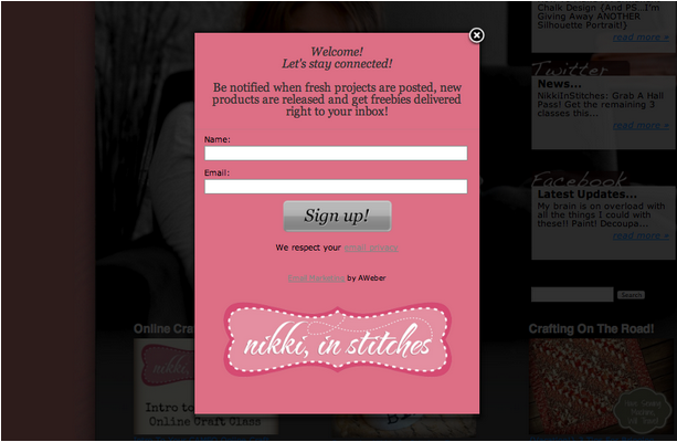
Nikki McGonigal, a food craft blogger, experimented with a pop-up box form for her opt-ins. After 8 months, she found that it got her 7,000 additional subscribers.
And when popular blogger Darren Rowse gave pop-up boxes a try, subscriptions leaped from 40 to 350 a day.
If you aren’t already using them, give pop-up box forms a shot.
Bonus Tip: Rocket Your Subscriber Count with Content Upgrades
Content upgrades are a lesser known technique for spiking your subscriber count.
It’s prevalent in the content marketing world, but can also be used to improve your hotel email list.
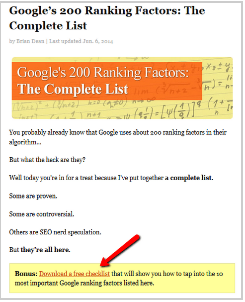
So what exactly is a content upgrade? Unlike traditional “site-wide” opt-ins, a content upgrade is bonus content tailored for page-specific information.
For example, let’s say your hotel caters primarily for survival enthusiasts and adventurers, and an eager survivalist lands on your site.
He’s seen your “site-wide” ebook for making sure your holiday goes smoothly, but he doesn’t subscribe.
Now, while exploring your site, a special “survivalist” offer hooks his attention. The offer is based on various survival activities, and your visitor clicks through.
This is where the content upgrade comes in:
While he’s scrolling through the details of your offer–or after he finishes–he’s given the option to sign up for a page-specific report called “5 Lessons From Survival Pros On How To Master The Outdoors.”
There’s a higher chance of him now signing up; because your offer helps extinguish a specific burning problem. It scratches his immediate itch.
Content upgrades have been proven to skyrocket conversions. Brian Dean from Backlinko boosted conversions by 785% after offering content upgrades. And Tim Soulo from Bloggerjet.com soared conversions by 300%.
Give the content upgrade a try. You’ll be surprised at the results having page-specific bonuses can have.
Conclusion
To summarize, make signing up as easy as possible, experiment with pop-ups and content upgrades, improve your call-to-action, and test. By following these steps, you’ll snatch up more subscribers and reel in high quality leads for your hotel.
How are you currently growing your hotel email list?
